Table of Contents
Class Info
- Date: Monday, November 4
- Meeting Info: P125
- Lecture: Download Link
- Topics: Project 2 Critique, Intro to Project 3, Principles of Color
To-Do Before Class
- Project 3 is DUE:
- Review the complete Project 3 Guidelines to make sure you have completed all phases of this project.
- Take a well-lighted photo your finished inked composition and then protect it with tracing paper for safe keeping.
- Post ALL of your Project 3 work. Follow the How to Post Your Work guide and include the project-specific details found under Project #2 Deliver. Remember to add the category Student Work > Project 3 Posts.
- We will look at your completed work during the critique next class.
Project 2 Critique
Let’s take a look at the completed Project 3 posts together and use the project vocabulary to describe the work. Specifically let’s observe the uses of shapes, lines, and textures.
- When presenting your work, start with following: your name, the title and theme of the project, what you feel you did successfully, what you can improve on next time.
- Your peers and the professor will provide supportive, constructive feedback.
- You will have an opportunity to revise your work based on the feedback and improve your work and your grade.
Discussion: Principles of Color
Color
- The quality of an object or substance with respect to light reflected by the object
- Used to attract attention, group different elements, reinforce meaning, and enhance visual compositions.
- Can convey an attitude or an emotion, create emphasis, and variety. Color can contain subjective meanings without words or images.
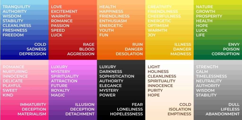
Color Theory for Designers, Part 1: The Meaning of Color
Hue – Color in it’s purest form
Value – Refers to the lightness or darkness of a color; indicates the quantity of light reflected.
Saturation – the brightness or dullness of a color
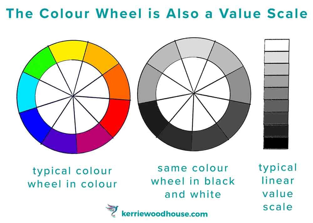
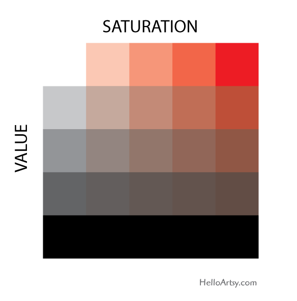
Color is relative. Meaning when we look at an object or subject we are seeing color that’s reflected onto it.
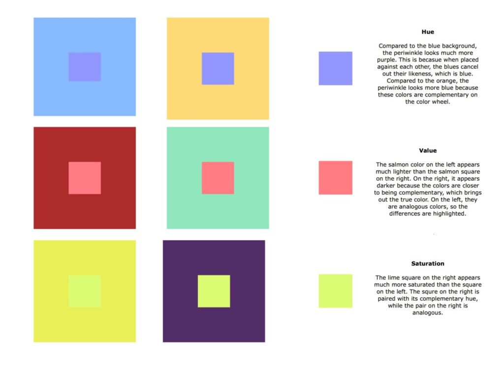
Colors Basics: What is color relativity
CMYK & RBG
In regards to graphic design CMYK and RBG are ways we create color.
CMYK – Cyan, Magenta, Yellow, and Black (K=Key)
CMYK uses subtractive color mixing, meaning it layers the 3 colors on top of each other to create other colors and black. It’s used in printing and for larger files. Also goes with Pantone to produce vivid colors.
RBG – Red, Blue, and Green.
RGB uses additive color mixing to create white. Used for digital designs and small files. Produces many more colors than CMYK can.
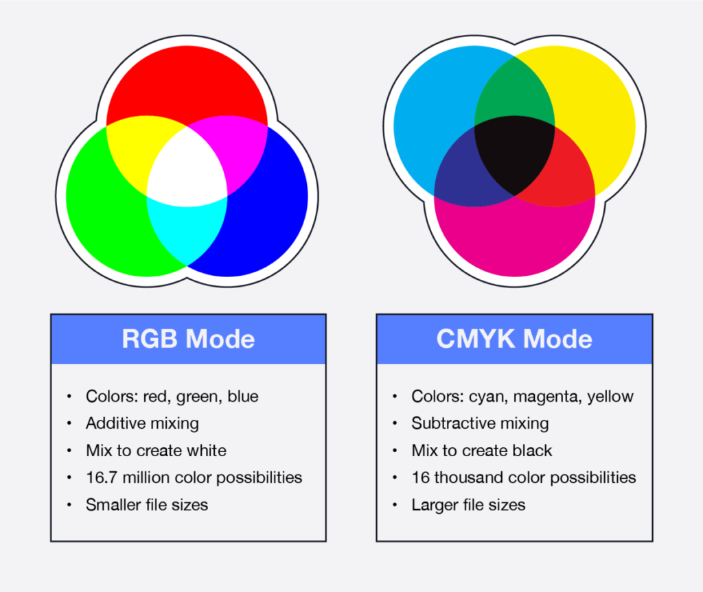
RGB vs. CMYK: Understanding the Differences
To-Do After Class
- Take 10 new photos with your phone or camera. Crop the images into squares.
Materials needed for NEXT CLASS
- pencils
- sketchbook
- bristol paper
- acrylic paints
- brushes
- palette
- rags
- 2 water containers


