#1 AIGA Design Ethics & Guideline
The four chapter form the AIGA Guide are essential topics to know and to put in practice in the design field. In many communication design courses taken at the NYC College of Technology, many Professors have talked about copyright. During a project assigned by a show producer , I was asked to create social media posts in order to engage users to their CUNY TV YouTube channel. This was a good exercise to cite sources and finding open source fonts. I was not required to sign a NDA document when I started the internship.
The AIGA guide is certainly a broad update in what previous professor have taught me in foundation Communication design courses . During my freshman year, a professor gave a lecture about Shepard Fairey Obama poster. Her lecture sparkle my interest about copyright infringement. I believe that the artist who created the Hope poster was not fulled immersed into copyrighting and its consequences. Although the image taken by Associate press, the artist manipulated in vector art still had a flair of the original photograph. Little did he know that a illustration manipulation led him to make headlines all over the world about copyright.
A good amount of Professor have also added valuable information about stock images, citing sources when using body copy and open source fonts. During my senior year , I had to rely extensively in stock images for advertising design campaigns. The common stock images( royalty free ) sites for images are the following:
- Pixabay
- Pexels
- Unsplash
Although these websites are royalty free, I still cite them in my design work. Due to the heavy demand of stock photography, nowadays we can find stock vector and mockup files that are also royalty free.
#2 Exhibition
In Praise of Painting
I attended this exhibition held at the Metropolitan museum of arts in Manhattan. The exhibition showcases fine Dutch art of the seventeenth century. 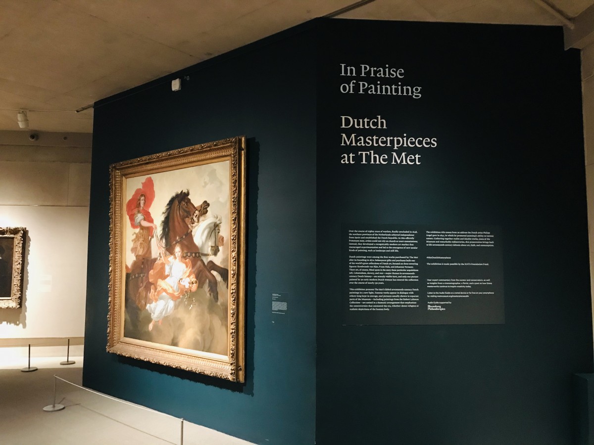
Gamepiece with a Dead Heron
Jan Weenix, Dutch,1695
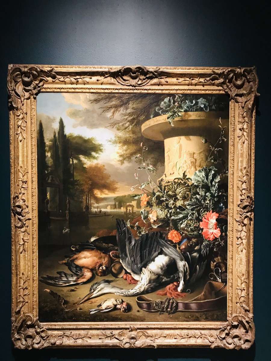
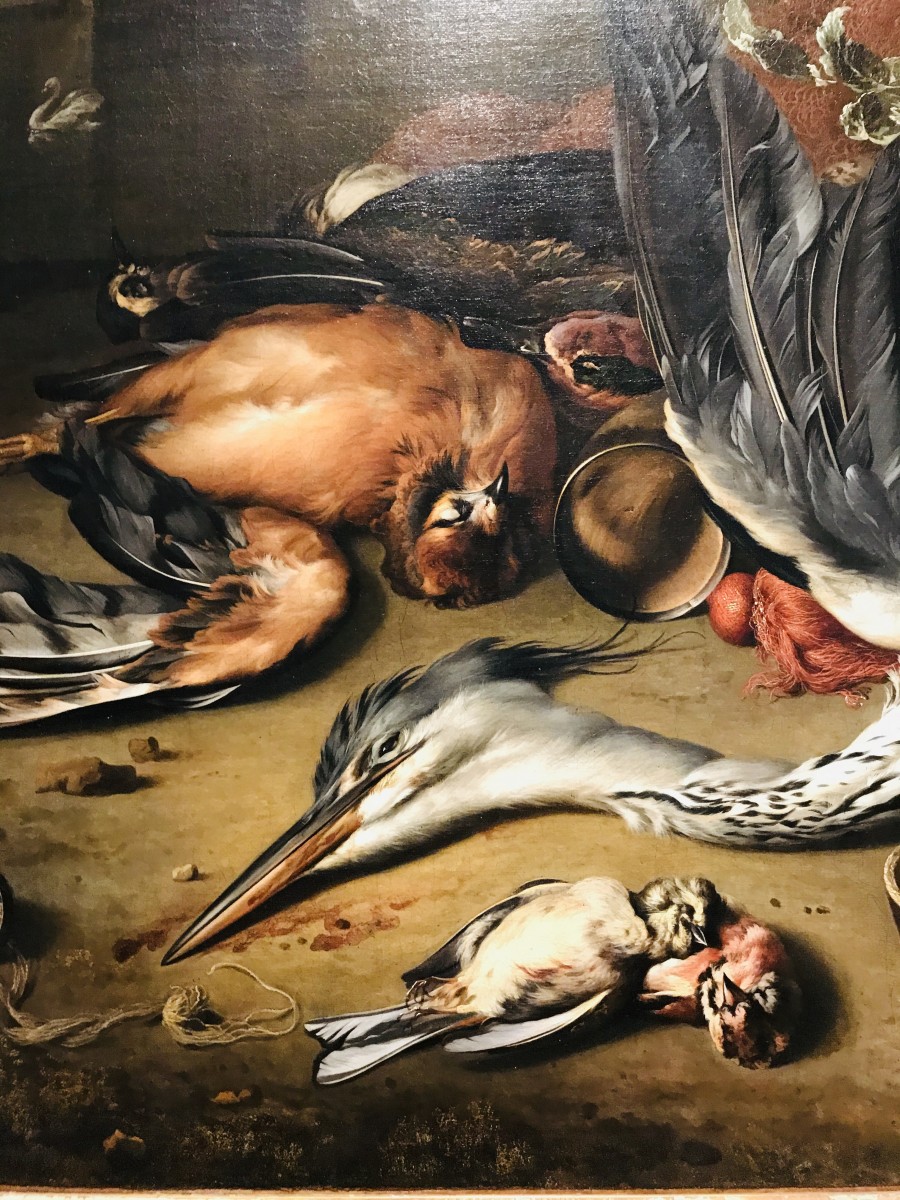
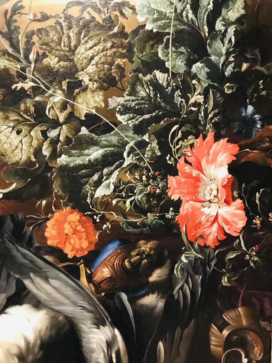
This painting shows the portrayal of life and death . The Astonishing portrayal of herons are unusual, they are death and it’s the main focal point while the flowers and the scenery in the back are depicting life in full bloom . The urn has the signature of the artist in the front edge. The bottom part of the urn is decorated with carving in which appears to be a scene of a woman , a head bust and a children.
The spray of flowers are located in the lower corner of the urn; they are flamboyant and the leaves provides a great sense of movement. The artist portrays one flower in full bloom and two other smaller ones, they are in full bloom. The flowers, leaves and vines are adjacent to the urn, they stimulate a sense of feather. The green color is vivid throughout the spray ,they are a few leaves in dark brown color depicting their last stage of life. The rays of light are facing towards the urn and the herons; they provide a major contrast to dusk that is occurring in the landscape .
 Although the herons are death; the artist provided a good amount of detail in the feathers and the placement of their bodies. Is this painting really depicting death? It’s quite intriguing to not see blood spilled near them . However the artist depicted death in non condemning way . The baby herons are laying down with delicacy. The scene is the back is misterius.
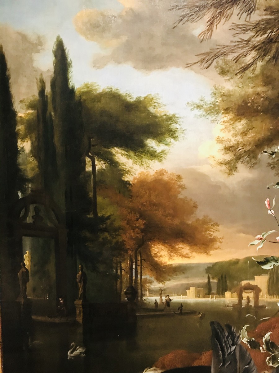
The artist portrays a lake with two swans swimming , bushes, an aristocrat family enjoying the dusk. The artist provided an interesting look in the dark clouds; they portray a coming of a storm combined with the dusk and the last sight of blue skies. The trees provide a great sense of vitality in this painting; they are in a variety of types and colours . Undoubtedly the painting of provides a visual delight in the representation of life and death and an unusual approach in fine arts
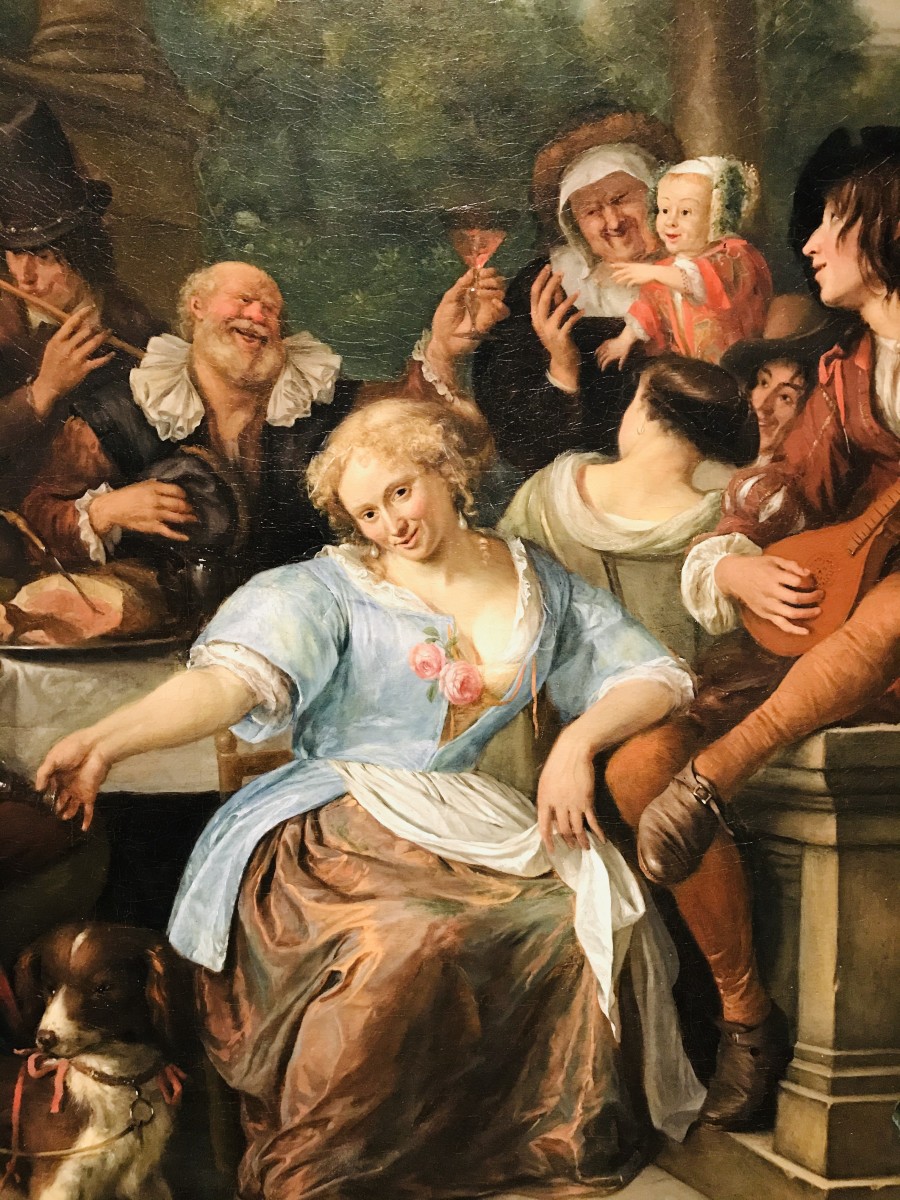
Merry Company on a Terrace
Jan Steen, Dutch,ca. 1670
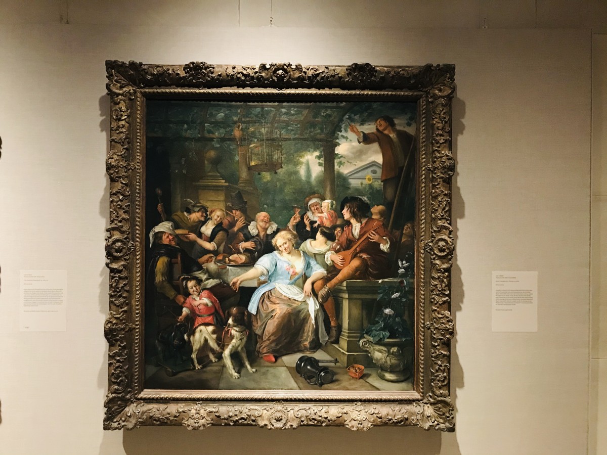 The dazzling painting of Jan Steen entitled “Merry Company on a Terrace”, the housewife looks quite sophisticated. She has blonde and curly hair and her facial expression is quite astonishing.The entire family is on a superb gathering in which includes wine , food, camaraderie and music surrounded by greenery at dusk.
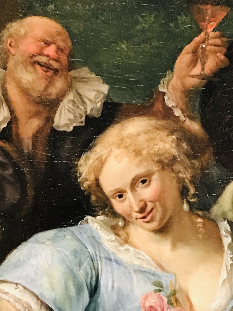
The housewife has just drank a glass of wine; her garment has a particular sheen that captivates the viewers in which she reveals a provocative top garment in light blue slightly exposing her robust breast. Her skirt has intricate pleats in bronze color , she has a keen eye to detail due to the delicacy of the old roses hanging out in the left of her top garment and the red shoes. She also has mischievous look after a glass of wine or perhaps two glasses. Her elbow is resting quite comfortably on the knee of a young looking individual playing the mandolin , while her husband has drank more than one glass of wine and is quite joyful.
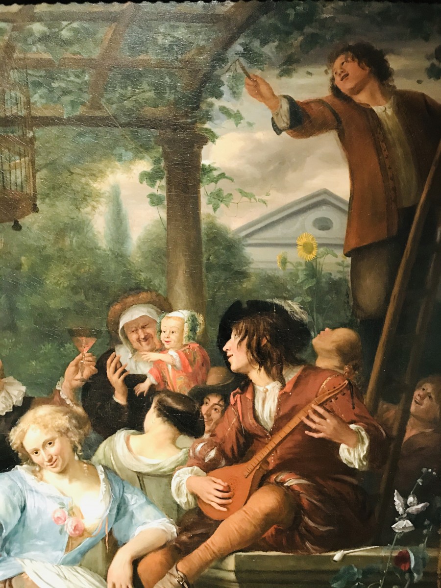
The guests are also living the moment out loud; a middle age couple are in the midst of a very close conversation, probably convincing her for a date. The flutist is keeping the gathering alive with delightful melodies, in which is seemingly to be one of his main sources of income. A elderly couple, specifically the father of the housewife is satisfied and raises the glass to toast near a child, while the elderly woman is preventing the child from reaching the glass.
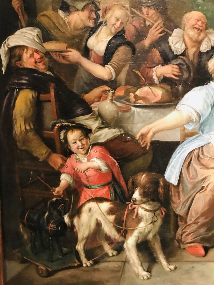
The sound of a mandolin is playing in the reckless family gathering, the musician’s expression is comfortable just like the sound of his musical instrument. While the honorable guests of the affair are living their moment, a little child is wearing a vibrant red gown and plays with a dog and a dark colored wood rocking horse. The scene where the gathering is taking place feels surreal; at glance there is an ancient Greek parthenon structure in the background, while the gathering is quietly taking place in a backyard surrounded by bushes and sunflowers plantations. The painting shows a superb level of craftsmanship; throughout the composition There are colors such as ocre, burgundy, burnt orange, moss green and off white. The facial expressions are so unique, each individual has a different expression such as: humor, laughter , joy, freedom, mischievous, romance and witty. Their garments are so exquisite, a galore of ruffles, hats and gowns are making the gathering a special one because they are representing their identity.
Apollo and Aurora
Gerard de Lairesse ,Dutch, 1671
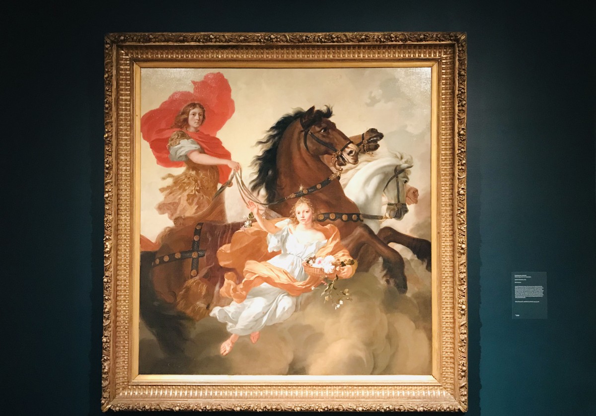
This colossal painting portrays a surreal scene in the sky. In the painting we notice elements such as horses, a young couple in which it seems that are celebrating their wedding day. The young lady ” Aurora” has a heavenly pale blue dress with gold star pattern she is floating in the air holding a banquet of flowers such as roses, chrysanthemums, honeysuckles and white blossoms.
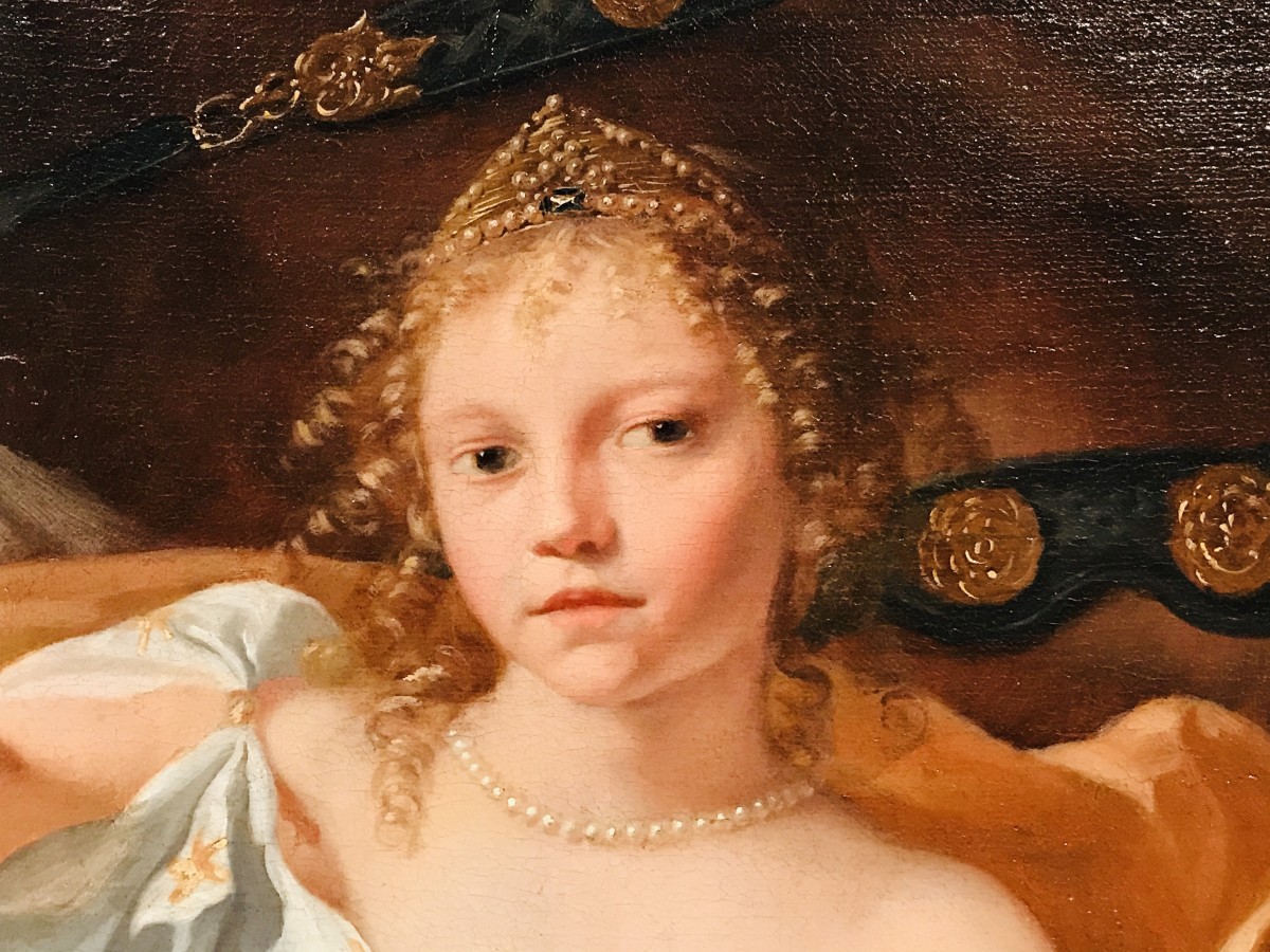
Her gold tiara blends with her blonde curly hair; her sheen pearl collar embellish her beauty. Her bronze shawl wraps her with delicacy. Apollo’s garment has a touch of sophistication. In contrast to Aurora, he appears to be serious. Apollos is leading a herd of horses , he is portraying authority within this painting . 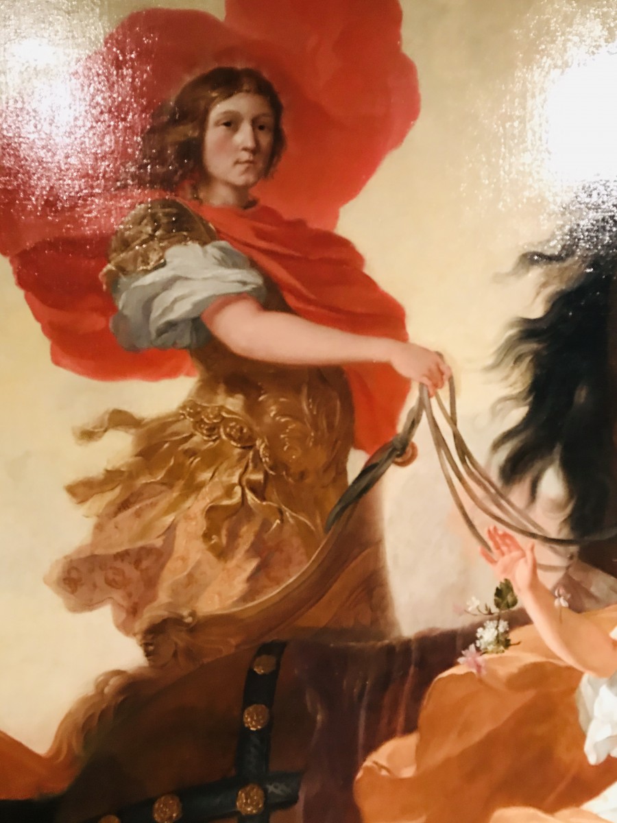
#3 Networking Event
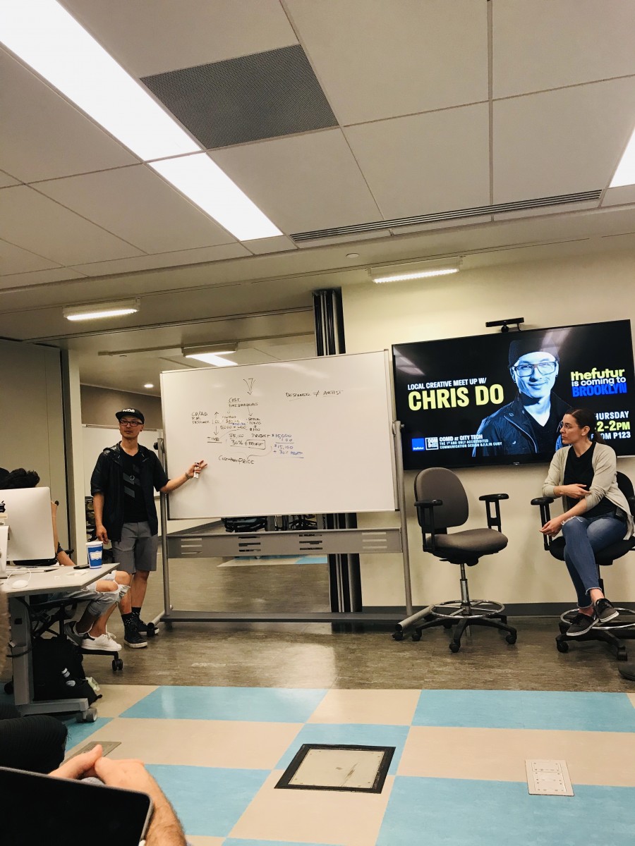
Creative Meet up with Chris Do
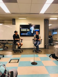
I attended this networking event hosted by the Communication Design department here on campus. I follow a good amount of design related accounts on Instagram and Chris Do’s account stands out from the crowd.
Chris Do is an Emmy award winning director, designer, strategist and educator. He’s the Chief Strategist and CEO of Blind, executive producer of The Skool, and the Founder of The Futur— an online education platform that teaches the business of design to creative thinkers.
He has a strong passion to pass the knowledge to others and his instagram post endorses his passion for teaching. The room was fully packed with emerging designers and working professional ranging from freelance designers to industrial designers.
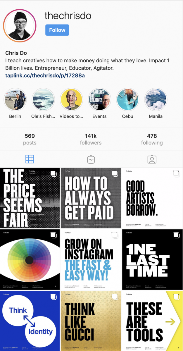
He focused interesting topics such as Generalist Vs specialist and how to narrow down your skills as designer for a specific market. There are many subcategories for Graphic Design :
Branding , Video , Typography, Motion, Illustration, Layout , Animation, Layout , Identity Design and Packaging .
In These categories he suggested to focus in one and to narrow it to a specific market , for instance : “I’m a D.C. based Typographer who makes Illustrations for vegan based products. “
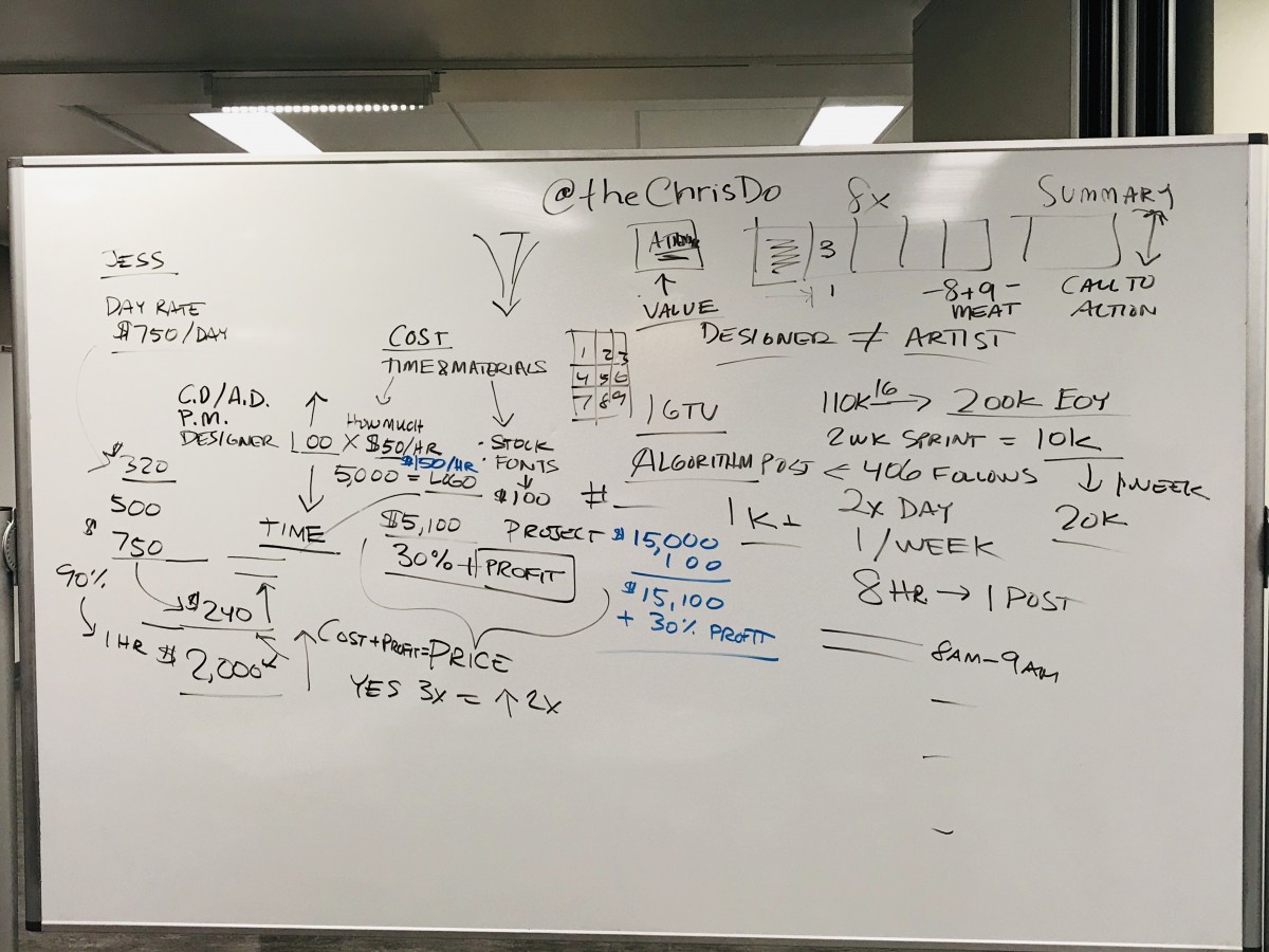
He also gave valuable tips in order to sell yourself as a designer wether is an hourly rate vs project. The audience had mixed opinions; almost half of the room voted for hourly and the other half voted for project. One guest stated that she charges $ 750 per day in which I divided into 8 working hours , comes as out $93 per hour. Chris do agreed that it is convenient to do hourly because as the time moves forwatd you get more experience and your daily rate will increase. He brought out the term logo quilt in which is a shortcut to identify a individual or agency who has worked with major brands such as Yahoo, Apple, Google .
Chris do has a passion for teaching; he does not keep a single skill for himself. He taught how to increase popularity in social media and how does posting twice a day can increase followers . His interactive post’s are unique, quite attractive to designers and aficionados. He disclosed his technique to make them his single signature. He stated that the main page for a carrousel IG Post should have the Value , followed by an introduction and subsequently expose the content; He suggested that it should end with a summary.
During his discussion I sat down next to a designer from California, he moved to NYC for a better opportunities. He stated that he charges $ 1000 for a logo and he is an avid fan of Chris Do because in his Ig post he is learning how to become a better designer.
Chris main core is to provide coaching to emerging designers who attempt to make a living in the creative world of design.
#4 Networking Event
Black / Excellence
The Art of Khary Randolph
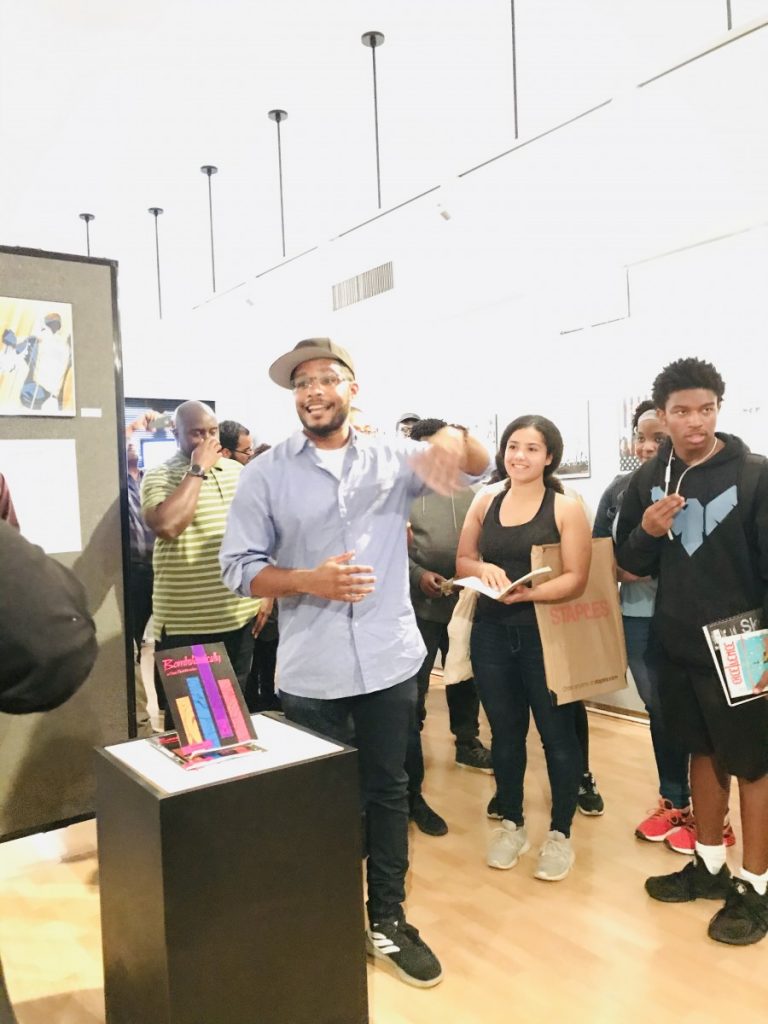
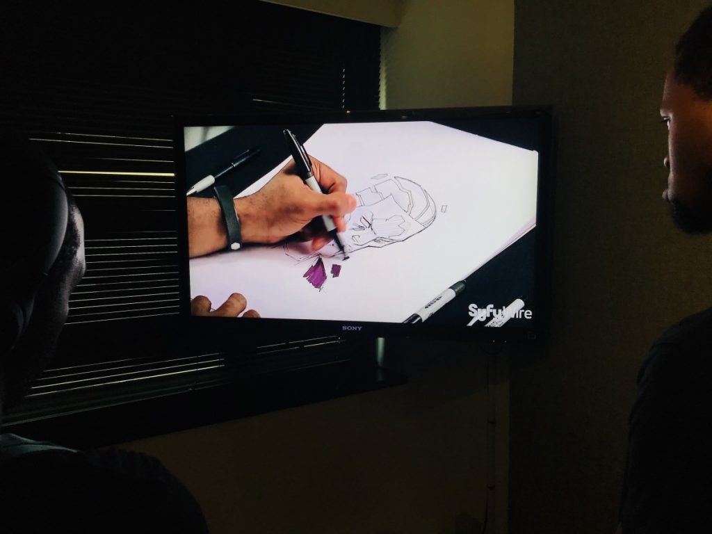
I attended the opening reception of SVA’ 00 Cartooning and Illustration graduate Khary Randolph hosted by the Communication Design department at the Grace Gallery. During his career , he was worked for major projects such as Spider-Man, X-Men, Hellboy, Teenage Mutant Ninja Turtles, Boondocks and Teen Titans.
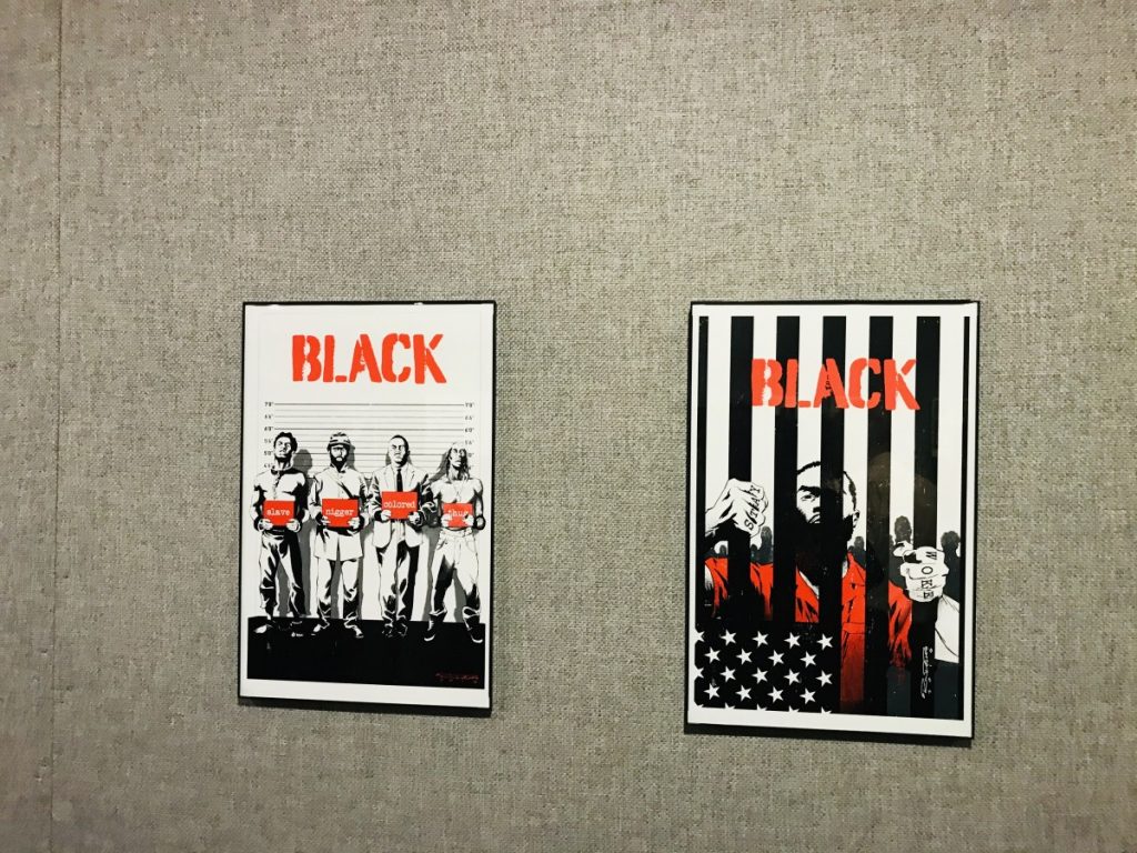
The evening reception portrayed an array of his design work that included, anime characters and a video of his design process. This gallery has something in common; I noticed that the curators posted the black and white rough next to the finalized poster. Besides anime characters, this show also showcased posters about social inequality . The ones who stoop up from the wall are entitled ” Black”. These posters depict 4 common titles for a particular race. His design work depicted a high level of artistry in which he is highly comittted to deliver to his followers.
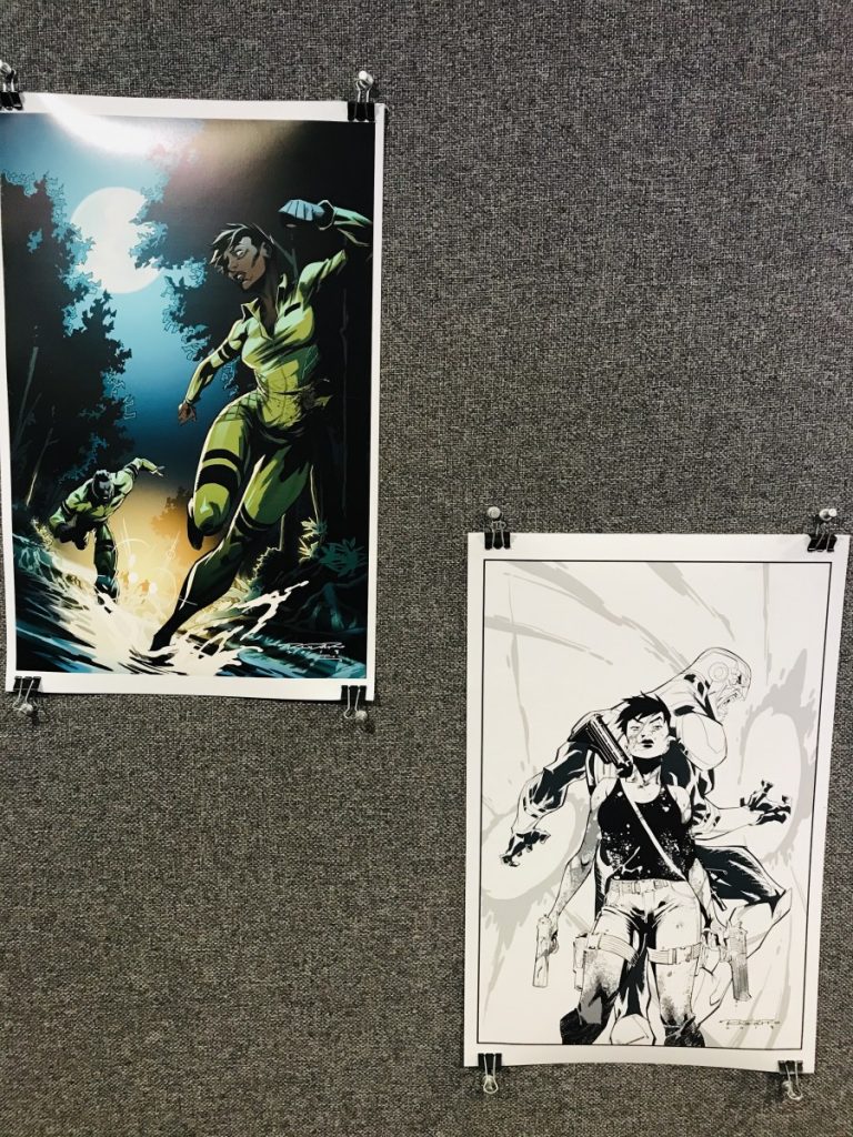
To learn more about his work , a plethora of his illustrations can be found in his website
https://kharyrandolph.myportfolio.com/work
#5 Creative App
Create – Graphic design + Draw
In a need of a quick logo for your social media account ?
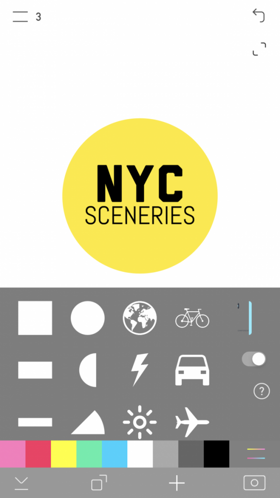
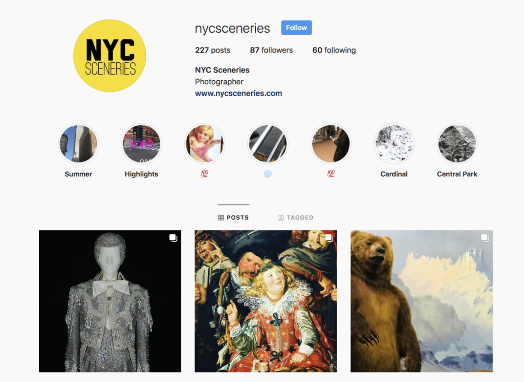
Create is the ultimate graphic design app at your fingertips. I started a photography blog entitled @nycsceneries on instagram and I needed to create a quick word mark for my account. I started to search a numerous amount of apps in my iPhone and Create was the one who stood up from the crowd.
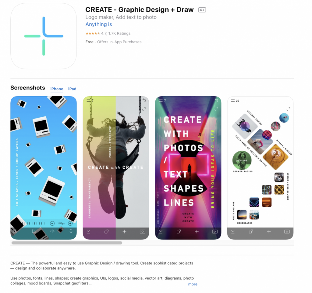
This app is quite useful to create ligatures and word mark suitable for social media accounts. I found it quite useful to use it during my commutes between work and college. the app allows you to create basic shapes with the free version; moreover, you can upgrade for $5 to download their vast selection of vector and iconography. With this useful app I designed the logo for my photography IG account.
#6 Creative App
Canva
This app allows you to create an array of design with already existing templates. I came across this app while I attended a one to one resume interview at the Professional Development Center at City Tech .
This app has over 60.000 templates that ranges from IG post, stories, resume, flyers, infographics and it also allows you collaborate with a team.
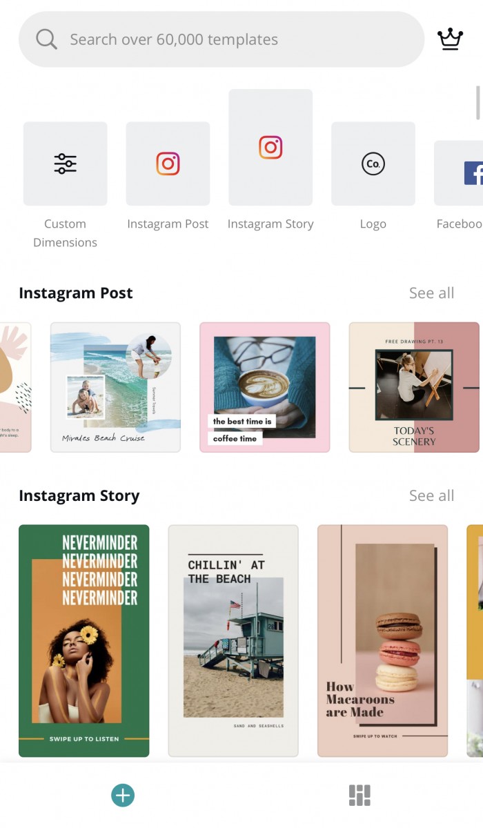
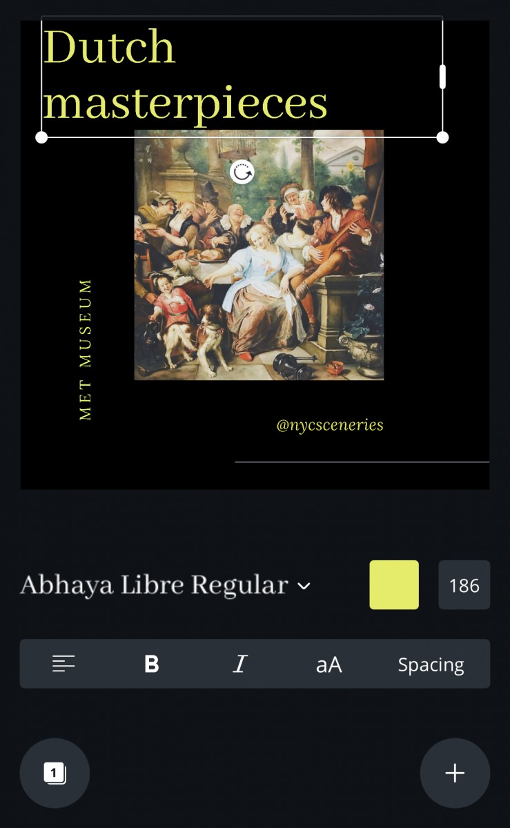
The photo below is a screenshot of the app while I was working in a IG Post for the exhibition that I attended at the MET museum. I designed this Ig post with a canvas template .
#6 Creative App(Additional entry)
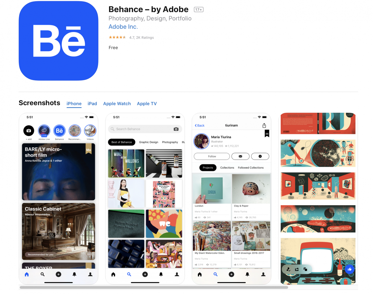
Behance
The free App to showcase your Communication design work.I came across behance during my sophomore year. I was captivated of the large community of artists from all over the world. With this app you are able to create an account using your adobe ID. This app has certainly helped to showcase my graphic design work. You can also view and get inspired by creatives from all over the world. In the latest update, you can now share live stories similar to Instagram.
#7 Webinar
10 Adobe Illustrator Tips by Nic Brown
I always strive to keep learning new things, and adobe illustrator is a software that I use the most and this webinar showcased 10 different tips in a detailed way. I have taken the introductory course in illustrator entitled “Raster and vector “, and the upper level class ” Vector Art Editing”. I feel that each instructor has a different approach to explain each tool in illustrator, but this webinar I can go back and watch as many time I need when I leave school.
These are the topics that Nic Brown, our Director of Product & Design of eLearning brothers covers :
- Select Shapes with Same Fill
- Replacing Global Colors
- Outline View
- Offset Path
- Shape Builder
- Clipping Masks
- Opacity Mask
- Transform Effect
- Layering Multiple Strokes and Fills (using the appearance panel)
- Object Blend
His logo process starts with shapes in which its a different approach to design logos
