These are my Visual Quote Concepts ;
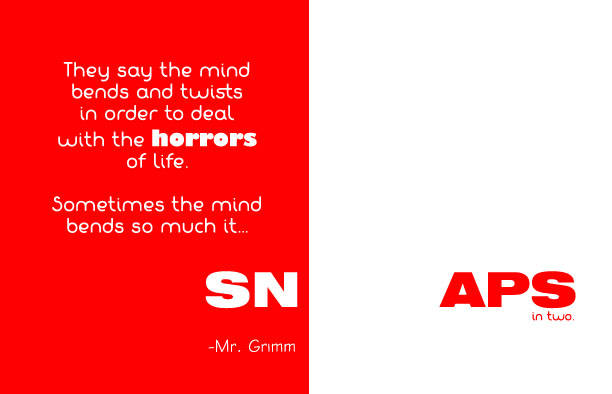
Visual Quote Concept 1 ;
The idea behind this design was supposed to be simple. The bright red symbolizes the intensity of what the horror should be to cause the brain to snap. On the left, you can see it taking over. It should be bright, right in your face, wild, out there, exploding and that is everything this color symbolizes. The white part is like the after effect. There is barely anything left and the only this remaining is the little bit of red, like a reminding of the horrific situation. The image is simple, yet to the point.
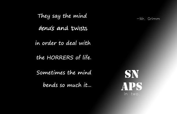
Visual Quote Concept 2 ;
The inspiration for this design was good against evil. The gradient was supposed to represent evil taking over good. The horrors are taking over whats left of the brain. All you can think about is the evil, there is no more good left, you’re brain is tired of adjusting and changing to fit what you believe is sane. It’s finally cracking, and it can’t take much more.
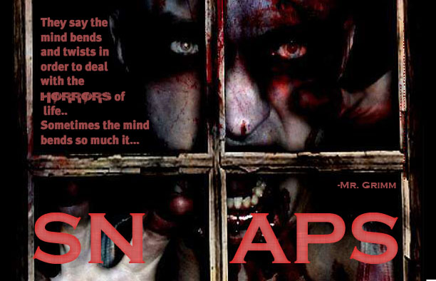
Visual Quote Concept 3 ;
The idea behind this was to scare you. After your brain snapped, you can only see this image in your head, and your mind keeps replaying the same horrific incident all over again. You just can’t get over it. You never will, you finally cracked.
This image was supposed to freak you out. I needed something horrific to show what the mind can really “bend and twist” to call normal. This is a zombie, and instead of being scared, a lot of people now just find them “cool” or “creepy”. Nobody is really scared of them anymore. This just shows how much our brains adapted to what we see, murders, vampires on TV, violence, children getting killed, suicide and much, much more. As we see it all, we don’t think twice on it, because our minds are used to those images and it will take a lot more to actually “SNAP” it in half… but eventually it will happen.


