

Background
Converse is a globally recognized footwear and apparel brand, and we are required to create a collaboration campaign for Converse.
I choose Slowacid as the collaboration partner. It is a South Korean streetwear brand known for its edgy and modern designs, marking an interesting intersection of fashion and culture. Slowacid is known for its playful and experimental approach to fashion, including unconventional color combinations and innovative garment construction.
Reflection
This campaign contains high-impact visuals, social media engagement, and influencer partnerships to reach and resonate with a broad audience. The use of bold, creative imagery and narratives that highlight the fusion of both brands’ identities can enhance brand visibility and consumer interest.
Double Spread
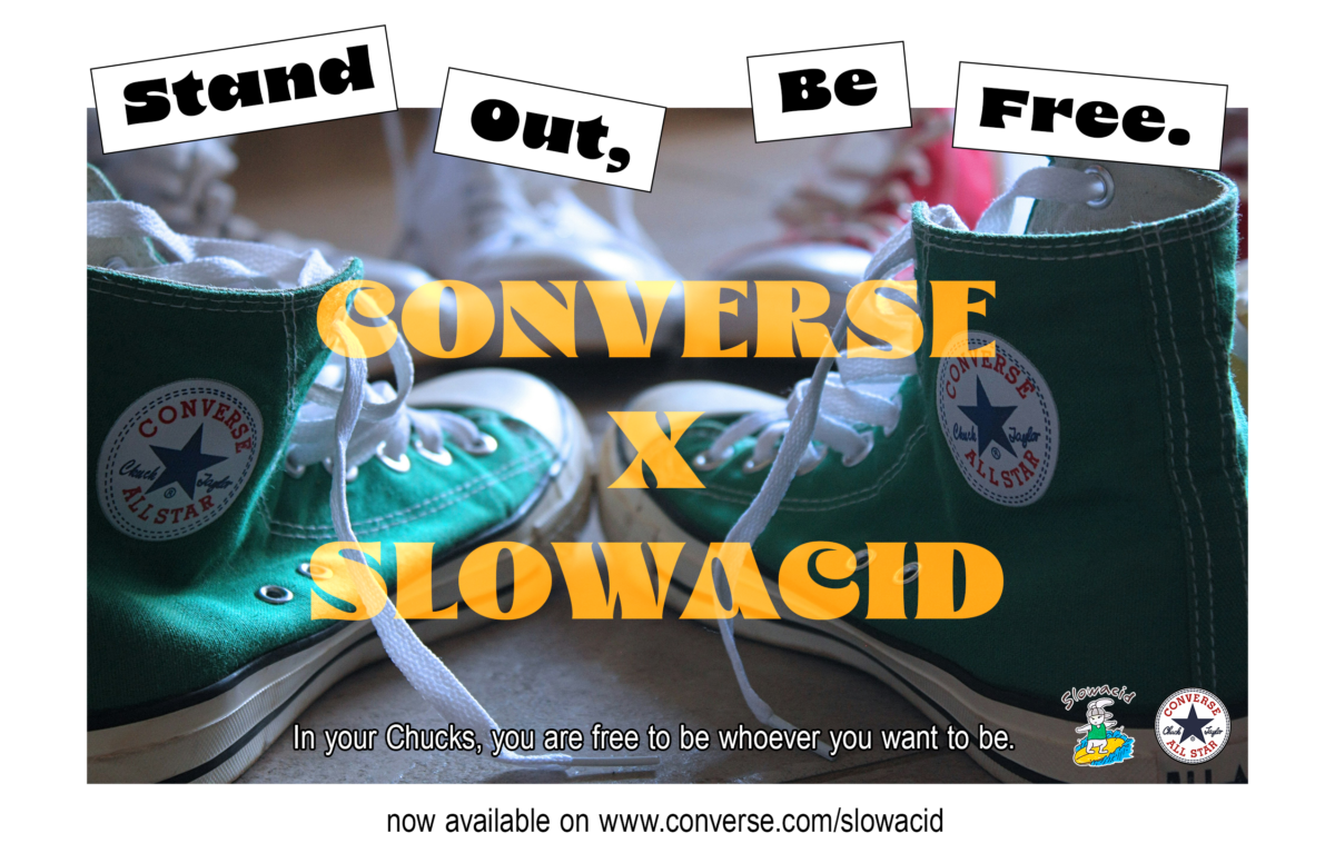
The slogan of this campaign is “Stand Out, Be Free”. “Stand out, Be Free” has a rebellious undertone, suggesting a break from conformity and traditional paths. It appeals to those who pride themselves on going against the grain and who are often drawn to alternative lifestyles, fashions, and cultures. The slogan implicitly supports diversity and inclusion. It acknowledges and values different perspectives, backgrounds, and experiences.
The collaboration appeals to the audience’s desire for authenticity and self-expression. These products are designed for those who want to make a statement and be recognized for their bold fashion choices, highlight stories, or testimonials from young influencers or everyday wearers who feel empowered and free to be themselves when wearing the collaboration pieces.
It also encourages consumers to explore new fashion territories, mix and match styles, and express their creativity through unique fashion choices. Innovative designs resulting from the collaboration set new trends in the fashion industry. By blending Converse’s timeless appeal with Slowacid’s modern edge, the products stand out in the market as trendsetting pieces.
Instagram carousel
The design of the Instagram carousel contained lots of geometric shapes. They offer a high degree of versatility, allowing for endless creative possibilities. Each slide in the carousel can explore different compositions, color schemes, and arrangements of shapes. This versatility can help maintain the audience’s interest as they swipe through the carousel, with each slide presenting a fresh and intriguing design.
Geometric designs are often associated with modernity and contemporary trends. Utilizing this style in an Instagram carousel can position the content as current and fashionable, which also matches Slowacid’s brand aesthetic: a contemporary street style. This modern appeal can attract a younger, design-savvy audience who appreciates clean, minimalist aesthetics and innovative design approaches.
This Instagram carousel offers a blend of visual impact, versatility, and modern appeal. Its ability to simplify complex information, create consistent branding, and evoke emotional responses makes it a powerful tool for engaging audiences. By leveraging the clean lines and structured nature of geometric shapes, designers can create content that is not only aesthetically pleasing but also highly functional and accessible, enhancing the overall user experience.