
Alexander Tapia
COMD 1112
2/9/19
NASA’s Logo
NASA (National Aeronautics and Space Administration) is an agency of the United States Federal Government. It was founded on July 29, 1958 in the United States. Its founder was Dwight D. Eisenhower. NASA is responsible for the civilian space program, and aeronautics and aerospace research.
NASA has had different logos throughout its time. NASAs first logo was created by James Modarelli. He worked as an in-house illustrator for the agency. The first logo meant a lot of things. The logo had a yellow circle, around it was a red chevron that symbolized NASA’s journey to explore the stars and the unknown. It also had a smaller, white circle near the yellow circle. It had a shooting star going around, and stars. The logo had “NATIONAL AERONAUTICS AND SPACE EXPLORATION” surrounding the logo itself. This logo is only used for formal agency events. A lot of the same elements would be implemented in Modarelli’s second more modernized version of the logo.

NASA’s wanted a more modernized logo. The illustrator that made the first logo took the challenge and modernized the logo. This version of his logo kept some of the elements that his old logo had. He kept the red chevron. The red chevron is meant to symbolize NASA’s mission to explore the stars and the unknown, it also represents aeronautics. The stars and shooting star are meant to symbolize space and space travel, the unknown and NASA’s movement to accomplish its goals. This is all on top of a round blue shape, which represents a planet. The worlds reaction to this new modernized logo was positive. This logo is named The NASA insignia. This logo was nicknamed “meatball” because of its shape in 1975.
In the 1980’s NASA wanted to modernize and redesign their logo. They wanted the logo to reflect their time period. Where everything was more modern. This new modern logo was designed by Richard Danne and Bruce Blackburn. This was not a logo, they created a logotype. The board of the company agreed to this new logotype but weren’t sure that people would respond positively to the new logotype. Even though this logotype won the “Award of Design Excellence”, it only was used for 17 years. This logotype was later nicknamed “worm”

There’s a huge debate dating back to when NASA changed their logo back to the “meatball” logo. This debate about NASA making a mistake with going back to Modarelli’s second design as their logo. People have named this debate “meatball vs. worm”. People have been debating about which logo fits NASA and their goals. People that pick the “meatball” logo over the “worm” says that the “meatball” has more significance. People feel nostalgic with the “meatball” logo. People that choose the “worm” logotype says that that logotype fits NASA as being more futuristic and simpler. And that why would NASA, an agency that wants to go forward in time, choosing to go back to a logo used in the 50s.
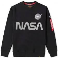
NASA’s iconic logo has been used a lot of times. Not only has the logo been used in its own facility. But lately in the 2010s, it has been used in clothing. Both the “meatball” and the “worm” logo have been used in articles of clothing. It has been used in the fashion industry. Companies like Urban Outfitters, H&M and Alpha Industries. NASA has also a bunch of accessories that have both the meatball and worm logos. The logos are on mostly t-shirts and outerwear. This spreads the logo all around. Because of its popularity, the logo is easily recognizable.
This means that the logos are now a fashion trend. And it shows that these logos will be iconic and never will be forgotten. It even shows that the “meatball” logo could still be used as a futuristic logo, because it is still used today’s fashion. The meatball logo will now be loved even more with implementing the logo into clothing. Both logos still show their potential about being able to show that they are still futuristic logos.
SOURCES CITED:
“NASA logo evolution: meatball vs worm” LogoDesignLove
www.logodesignlove.com/nasa-logo
“NASA ‘Meatball’ Logo” National Aeronautics and Space Administration
http://history.nasa.gov/meatball.htm
“Who Made Those NASA Logos?’” Hilary Greenbaum
https://6thfloor.blogs.nytimes.com/2011/08/03/who-made-those-nasa-logos/
“Inside The Rise And Fall of NASA’s Beloved Worm Logo” Elizabeth Stinson
www.wired.com/2015/09/nasa-graphics-standards-manual/
“Rebranding the universe: ‘The Meatball’ vs. ‘The Worm’” Digital Ant Talks
https://blog.digital-ant.com/rebranding-the-universe-the-meatball-vs-the-worm-29f0ab35cd
NASA Apparel
https://www.impericon.com/en/nasa-worm-t-shirt.html