Descriptions
Design 1
The first word of the quote “life” will be capitalized, shaded with red color to catch the viewer’s attention and given with the decorative typeface. Beneath that, the texts from the “is” to “you must keep” will lay diagonally at the left side of the page in black color. Besides one word “balance” will be in green. The purpose is to stand out from the black. The main focus will be the word “moving.” It will go vertically across the page and to be seen it on one side. The first letter “m” will go off the page; the rest letters will follow it. The purpose is to create a sense of motion that the quote brings. The whole word “moving” will be capitalize and shaded with red color as well to create a color repetition for a strong emphasis.
Image link
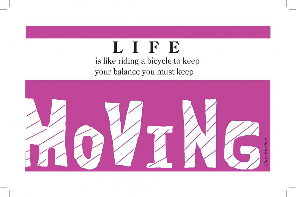
Design 2
The quote will arrange in top and bottom two parts. The central small word “life” will be capitalize, bold, black and given with old style typeface. The two lines of text below from “is” to “you must keep” will arrange in lower case letters in a contrast of capitalized and bold word “life”. The main focus will be on the word “moving”. It will occupy the most space of the page because that is the most important word. The font of this word will be extremely large. The typeface is capital letters. The background will be purple because purple is a lovely color. To show the viewers the motion, the letters of “moving” will arrange in one up and one down position like they are jumping. Each of the letters, there is a diagonal line across the letter to show the viewer the motion better. The tiny top bar in purple is just a repetition to the background at the bottom.
Image link

