Graphic design is what helps draw people to a message. It gives visuals to what a person, or people, wants to verbally say to others. People may not hear a message as well as they see it, and that is how graphic design can help with things such as politics. Politicians nowadays know that the right design can be powerful when they want to get their message through to the masses. There were many different designs in an exhibition at The American Institute Of Graphic Arts, that showed how designers helped with political views

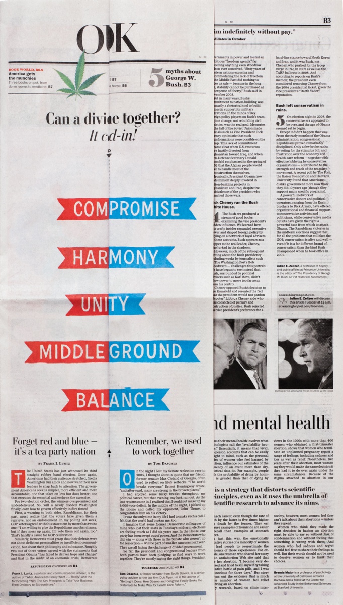 “Divided Washington” by Post Typography, which is an American design firm. The political issue was the 2010 midterm election. Their design showed how Congress was divided by political parties and but should come together. It showed three columns with words that dealt with America and it’s politics. The text was a san-serif type with red backgrounds on the left and blue backgrounds on the right. It was offset printed, which is when ink is pressed onto a rubber blanket and transferred onto the paper. The design is set up to make the reader interact with it, unlike most design I’ve seen. The instructions said to fold down the line to make the first and last column join together and cover the middle column to create a new word. The words were meant to represent the division of Congress, and how it can come together as one.
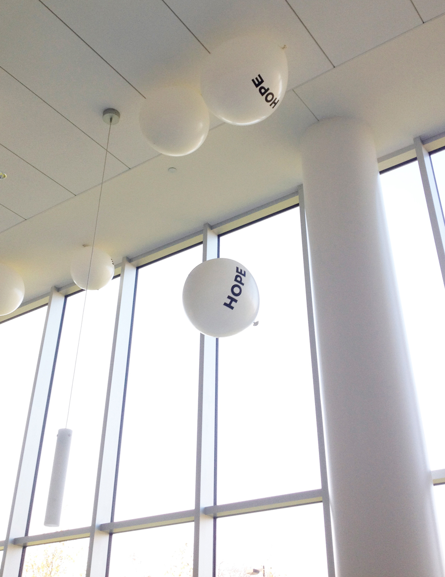
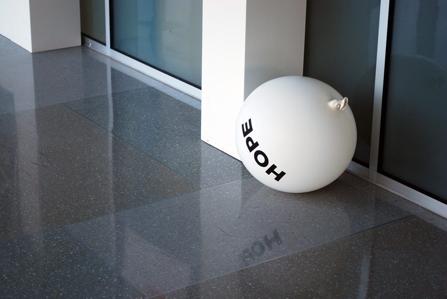 “Hope” is the title of three photographs of balloons with the word “HOPE”, in bold san – serif type, printed on them. The idea behind it was how the word, Hope, became a type of branding for the 2008 Obama campaign. It was created by Topos Graphics, an American design firm founded in 2005. The balloons that were used were silkscreen jumbo latex balloons. They were released during the We are Designers exhibition. The balloons represented the high hope that Obama’s supporters had for him, which is excellent due to the fact that they’d float high within the room. But with each photograph, the balloons began to lose helium and descend to the ground. This represented how some of those supporters would lose their hope in Obama during his term in office, since 2008.
“Nuclear Energy” was designed by Mirko Ilic and Daniel Young in 2010.  It was silkscreen
printed, which is when the ink does through a woven mesh and onto the paper. The ink the was used, was glow in the dark ink. The political issue in this design is the use of nuclear energy as electricity. Once again, in san-serif text, the statement is “Radioactive waste from nuclear power plants stay radioactive and deadly for hundreds of thousands of years. We can generate electricity in safer ways.”. The background is yellowwith the text and design in black, which catch people attention due to the bright color. The design itself is an atom, without the nucleus. The nucleus is replaced by shapes of what appears to be eyes and nostrils, and makes it look the there is a skull in the middle. It’s made to represent death by radioactivity, but doesn’t show a safer way to generate electricity.
Most graphic designers know how to plan out there visuals, and have people drawn to their work. This is why politicians ask of their help when they need to have a message shown to the people, or need a visual to represent them. Graphic design is what draws more attention to what a person, or group, is trying to relay to the people.

