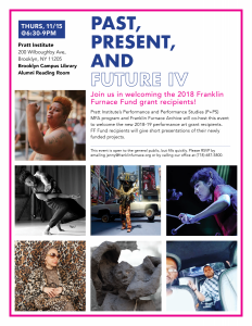
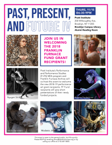
While working as an intern at Franklin Furnace, I used applications such as InDesign. Of course this is the typical adobe application for designers but for me, I hardly used it and it may be the software I use the least. I had to design fliers for Franklin Furnaces upcoming event that showcased multiple artist. This gave me a great opportunity to primary practice my use of the grid because that’s something I lacked skills on. I was given 7 images by another supervisor that worked there along with all the information for the flier. I used a 3 column by 4 rows grid. It does not seem like much compared those who consistently use grids but this was the most I’ve possibly used ever. I also had to make print outs and hand them out to students on Pratt’s Brooklyn Campus. Since I got an opportunity to work with grids, photographs and text, I made multiple copies and had my supervisor pick which one I should print. These were the top two of all five; they had chosen the second one. I was told the posters came out great but if I really wanted feedback to be nit-picky to arrange or flip each photograph in the direction of the text (as displayed in the second one). I was told since the photographs face the opposite direction, It leads the eye in another form straying off the page or just not to the text.


