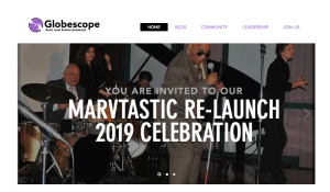
My supervisor, Harely, advised me to reach out to a Frankin Furnace Artist under our fellowship named Gary Coblin. He’s starting a business called Globescope Arts and Entertainment which revolves around artists with no recognition or opportunities due to their disabilities. Gary had reached out to be to meet in the office and I consulted with him one on one on his pitch.Gary has all the research and a ten year plan but wants to update his logo and start-up a website. Afterwards I was placed under his Globescope fellowship as their non-paid graphic designer but Franklin Furnace would pay me instead by allowing me to use their hours to work with him. Within the next week into this, Globescope logo has been updated (ever so slightly) and I have in the works of developing his website further. Every Wednesday, I will continue to work on Globescope’s website and other social media platforms. The following Wednesday, he came in to meet with me to give me a review of the logo and what he thinks so far about the website. He wanted the incorporate mostly purple and having a bold yet simple font that is also modern.
Gary had sent me his original logo which did not even have his brand name on it. It was just an icon of a hook and a hand with a purple and white gradient behind it. When I checked his current website, which has now been shut down until the relaunch and will be completely new, there was no grid, five different colors of purple, multiple different fonts, his brand name was not aligned with the icon. His brand name was a serif font that he had decided to use based on Wix.com’s default font but did not like.
(updated logo)
(website in progress)


