Choosing brand colors
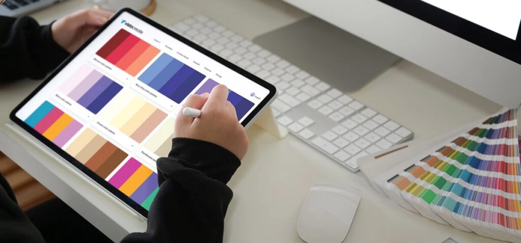
This week, I spent some more time editing their anniversary carousel post. I had hit a bit of a block when it came to choosing the colors due to them only really having one brand color to work with. I went through 3 different color palettes before getting to the one that seemed to work the best. Their main brand color is a very deep green, so I first started with using orange as a complimentary color but it didn’t seem to flow well with their organization. It seemed too bright for a more nature-based non-profit, being on a farm working with both animals and people. I then tried a tan color with the green, but then the post just seemed too dark and serious with the dark green as the main background color.
Using their brand color green, I took tones of it and used those as the other brand colors, giving them a monochromatic color palette. Using a lighter, almost-white green tone for the background, it gave a more fun feeling to the post, which is what the non-profit really seems like. It helped with the hierarchy development of the post layout as well because the text is the darker green, drawing the attention to where it needs to be.
Social Media Tasks
Besides the anniversary post edits, I managed their socials some more. From our meeting, I was given some accounts to look into and possibly follow, such as a non-profit called Next for Autism. I was also advised to follow Sosie Bacon, the daughter of Kevin Bacon, due to her being very involved in equestrian organizations and farm life. Along with the recommendations, I followed some more accounts based on what I found through other follows, going down a non-profit rabbit hole. After trying to network through their accounts, I created a social media data chart to help keep track of followers on Facebook and Instagram and see how much we grow within each week.
After my social media tasks, I went back to design work and began editing a website pop-up graphic and an email newsletter graphic. We discussed wanting to gain more traction on their newsletters, so I thought it would be good to create some graphics to hold people’s attention more while also separating the information more efficiently. People get discouraged from reading something when the text seems very dense. To help with this, I began working on what I could create to separate the topics within the newsletter. Having a nice website pop-up graphic to get people’s attention of the newsletter would hopefully help with more sign ups to the newsletter.


