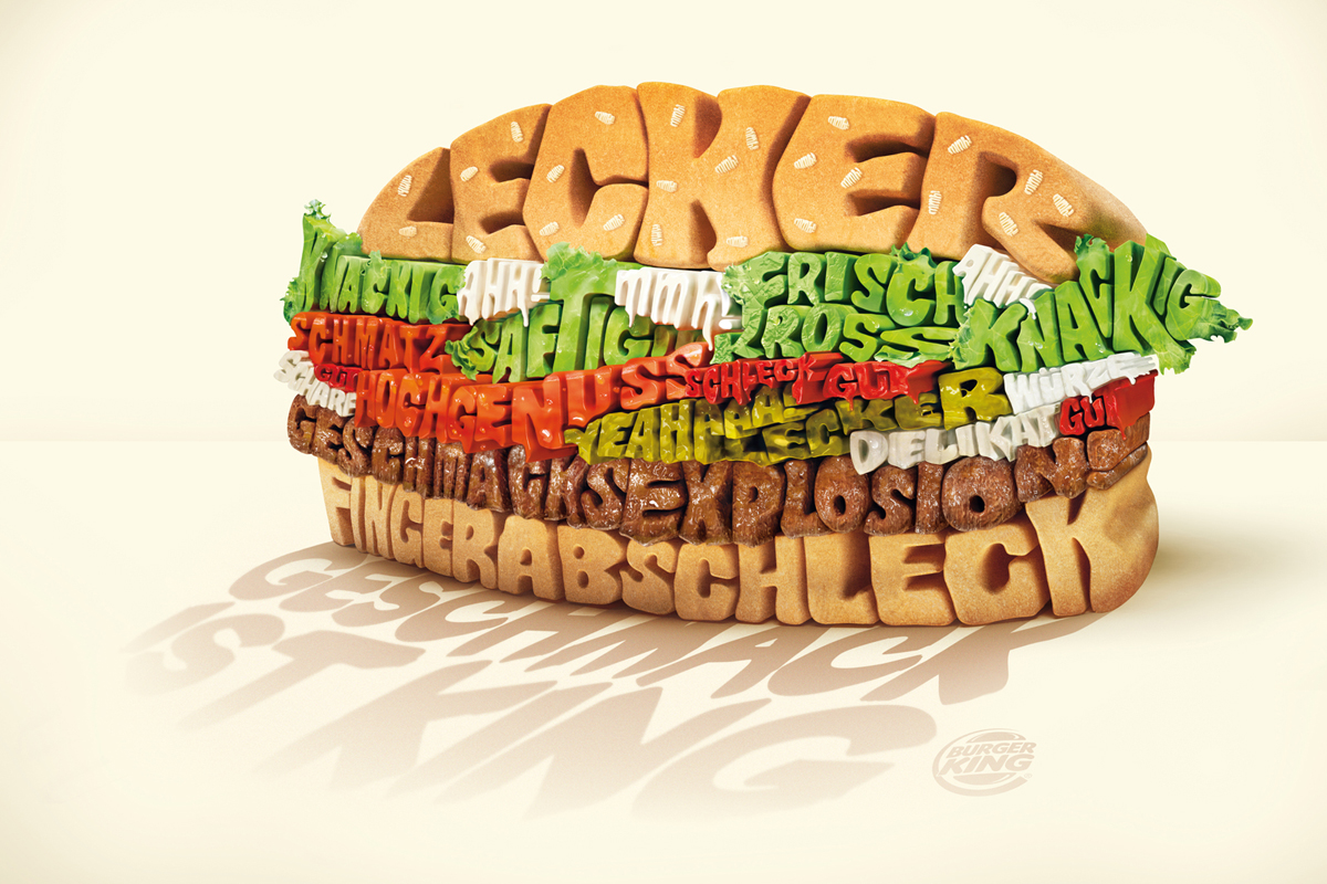
I have always been a fan of descriptive typography, so when I saw this I fell in love!
I have always been a fan of descriptive typography, so when I saw this I fell in love!
The OpenLab is an open-source, digital platform designed to support teaching and learning at City Tech (New York City College of Technology), and to promote student and faculty engagement in the intellectual and social life of the college community.


super creative – the shape and color of the type is perfect to make it look like a burger. This is definitely more artistic of an approach then we do in class, but great to be inspired by. Plus – lunchtime – we need hamburgers!