Zhuolu Tan's ePortfolio

A Communication Design Portfolio

Page 4 of 5

Project 4-Value and Texture: Monochrome color Collage

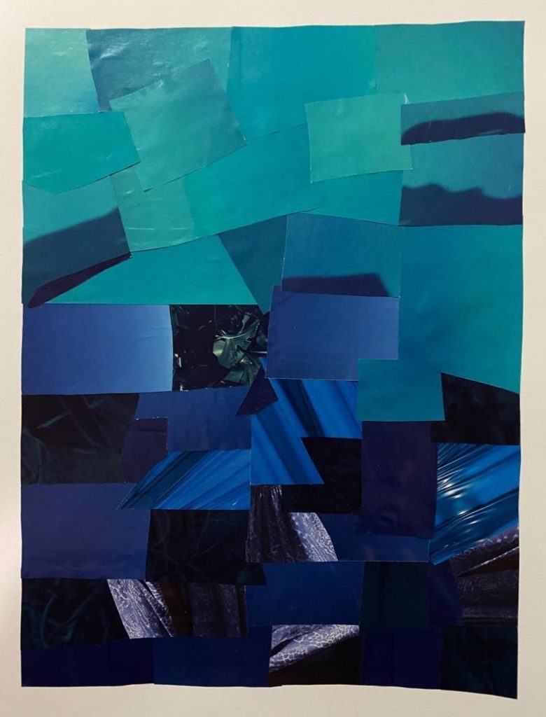
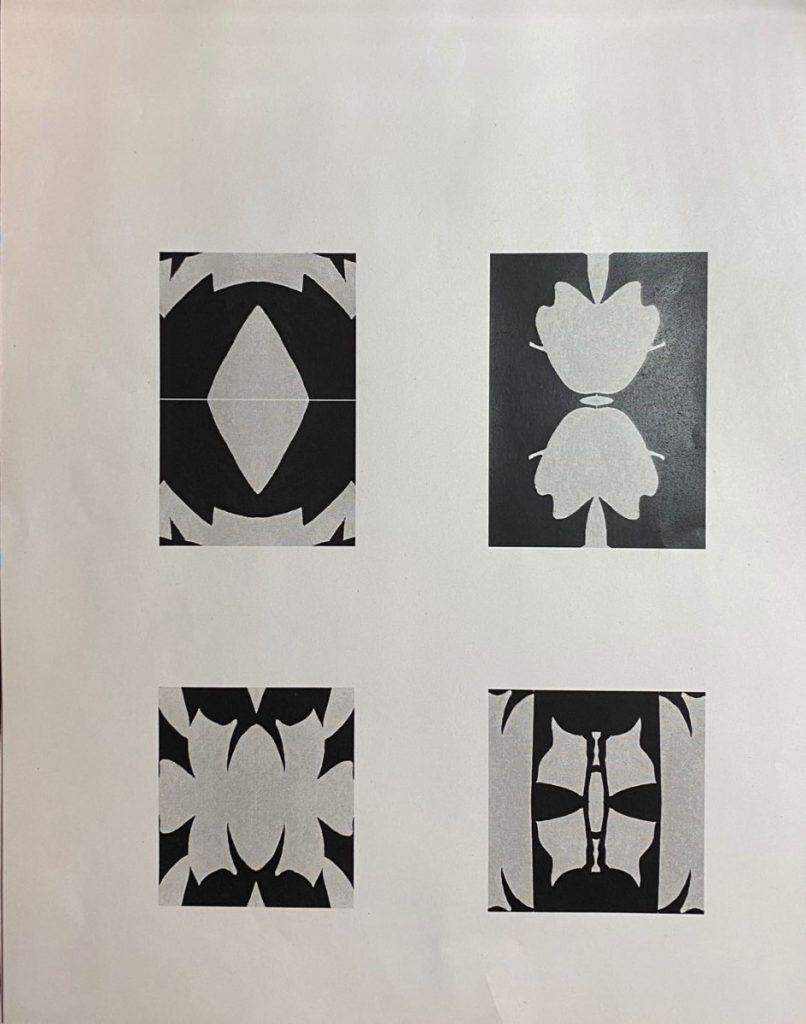
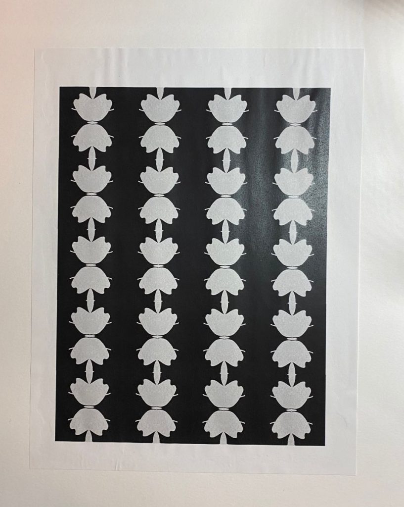
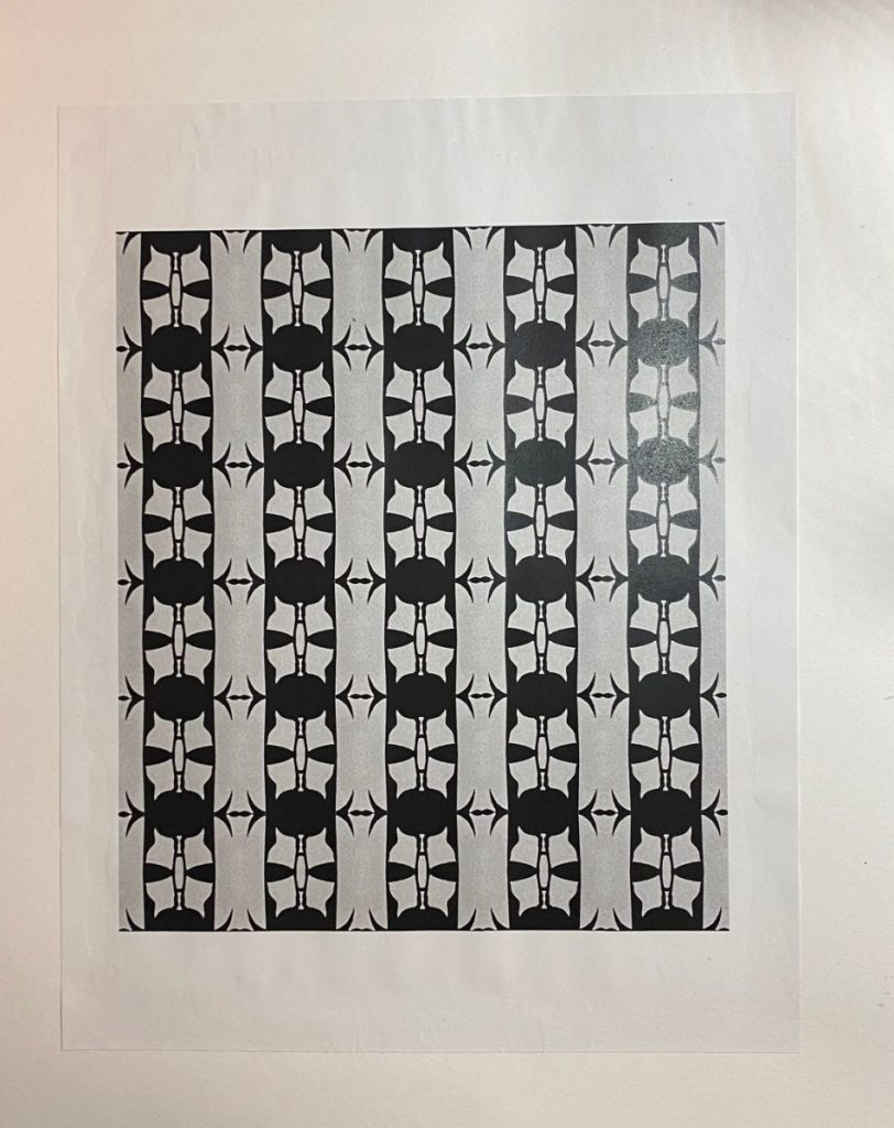
This project was similar to project 3. They both had to show the value, gradation, and contrast of color (hue). The difference was this project was making up with color I liked.
For this project, I chosen blue. Then I had to use the pieces that I had cut from the magazines to show the value of blue, and the gradient from blue green to purple.

Project 3-Value Texture Collage

In this project, we used the pages of magazine with value of black to make sense of range of value. First, we had to choose the pages of magazine with value of black that we were interested of. Then we cut the pages in small pieces. After that, we arranged these pieces in order to show the value, gradation and contrast.

Project 2-Shapes, Neg/Pos Space, and Symmetry

This project taught us how to use negative and postive spaces. In this assignment, we have to choose an organic (plants, such as flowers, leaves). And then we drew it into the bristol paper, and design where is negative and positive spaces.

After we drawing out the plant, we had to crop some pieces from it, and do the symmetry of them in adobe illustrator. Then, we did the repetition.

« Older posts Newer posts »