Zhuolu Tan's ePortfolio

A Communication Design Portfolio

Page 3 of 5

Project 7- Form and Space

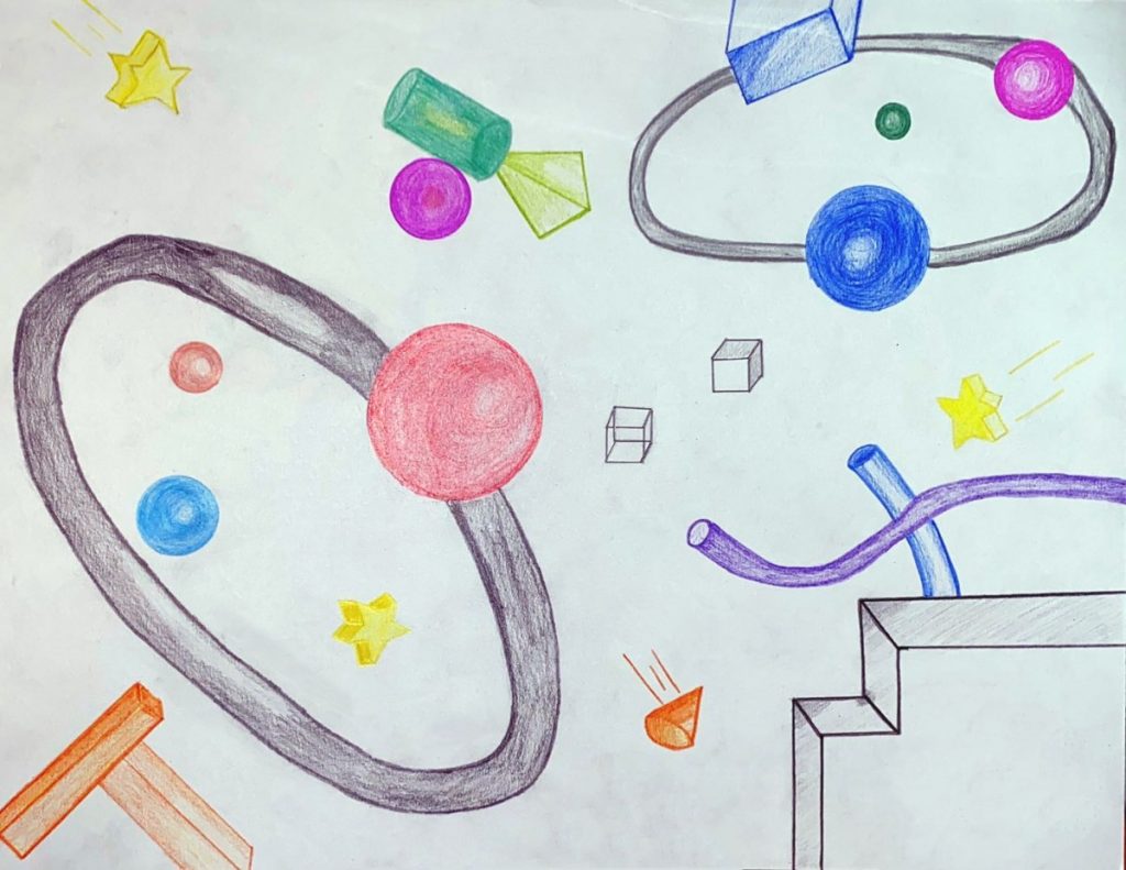
In this project, we need to create 3D forms in illustrator. First, we had to make the forms we liked and arrange them in the order we liked. 
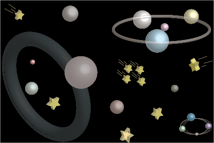
After that, we needed to sketch the forms we made into bristol paper, and color them. This was the hardest part of this project for me, because the 3D forms were difficult to sketch, when I color the forms, it was hard to represent the feelings of 3D forms. I had to made color carefully.
Project 6-Transparency

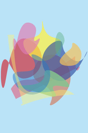
Transparency makes different objects in one layers, not seperated. In this project, we have to use shapes to make sense of transparency. We used adobe illustrator to make differents colorful shapes (2D)  and overlap them each other, and used opacity tool to mixed the color of shapes to show the transparency.

After that, we needed to research some photos we liked, and overlap them in illustrator. Them used the opacity tool to show transparency.

This project was interesting, it combined different photos to show the transparency. The new picture gave us different feelings of the organic pictures.

Project 5 – Color Palettes

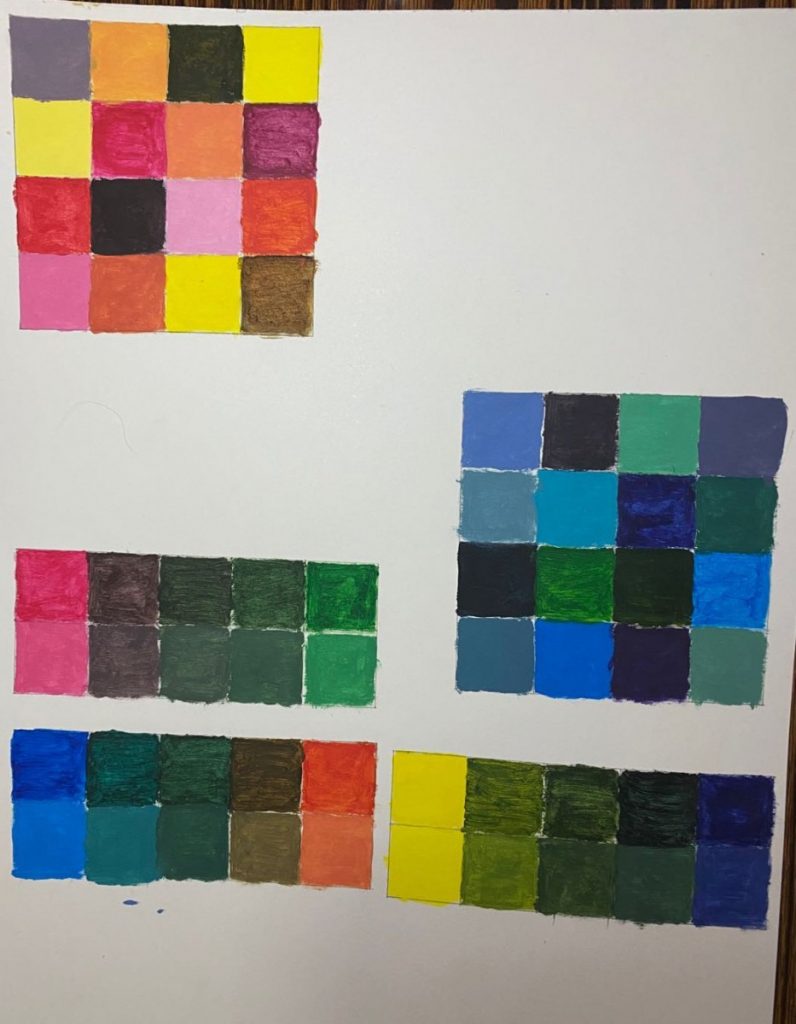
For the part one of this project, we needed to create color palettes (warm and cold) . When I making color palettes, I learned how to make tint and shade color, understood how to make saturation color by mixing different color.

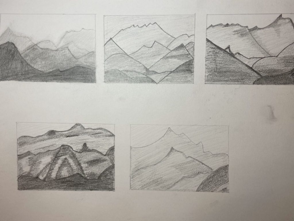
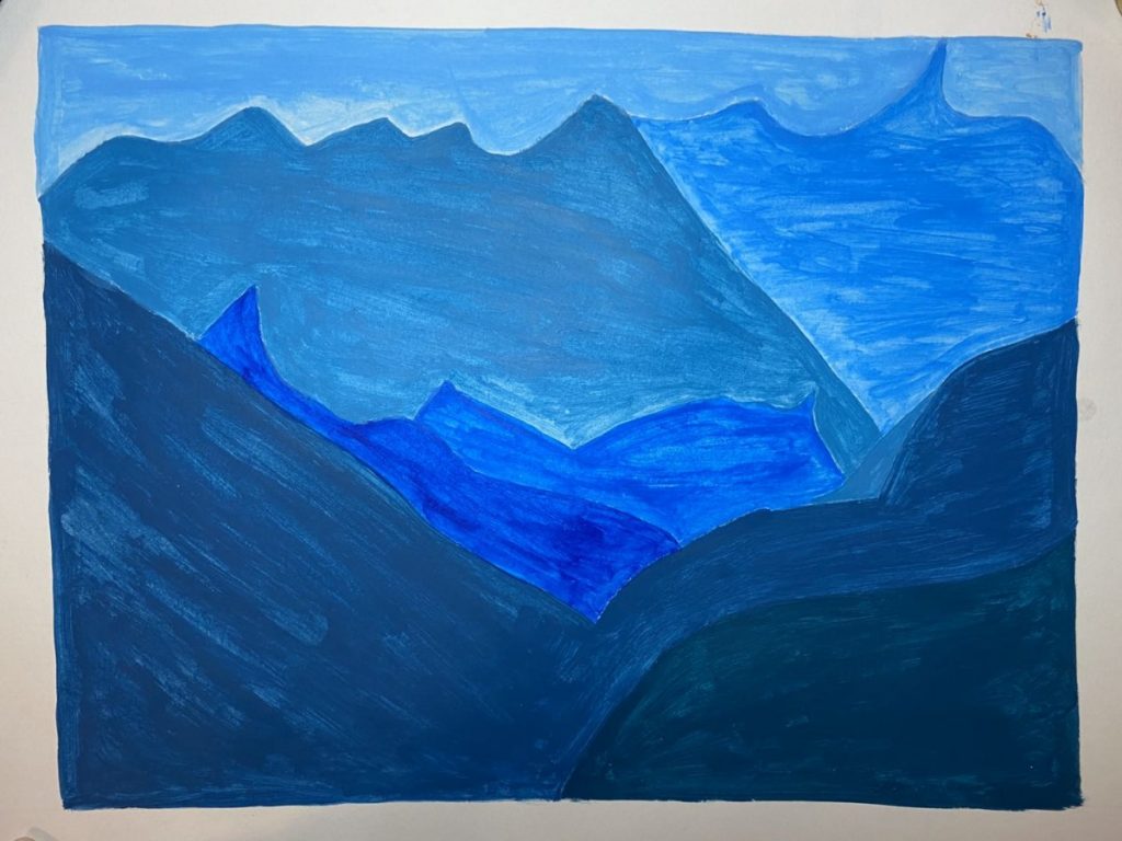
For the part two of this project, we needed to create a landscape by one color with value and saturation. First, we had to research the photos we were going to use, and make thumbnail sketches in a paper, then chosen the sketch we liked and draw it in the bristol paper, and use the color we likes to paint. In this project, we also used the skills of space (scale changes).

« Older posts Newer posts »