A Communication Design Portfolio

Category: Graphic Design Principles 1 (Page 2 of 3)

Project 5 – Color Palettes

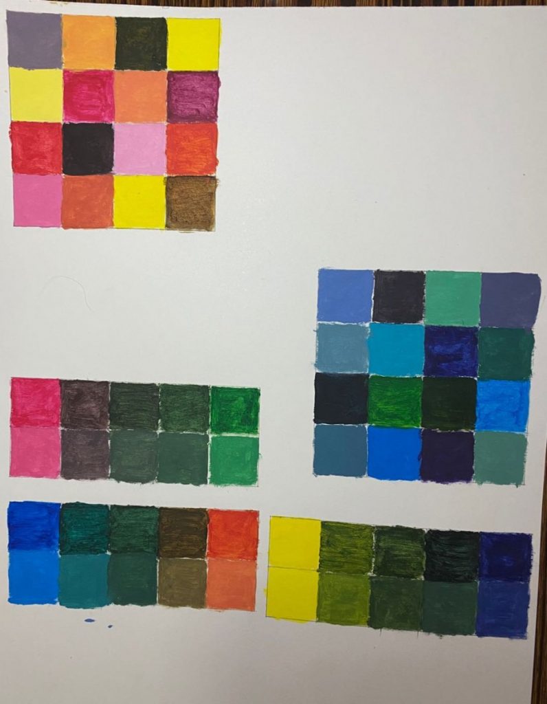
For the part one of this project, we needed to create color palettes (warm and cold) . When I making color palettes, I learned how to make tint and shade color, understood how to make saturation color by mixing different color.

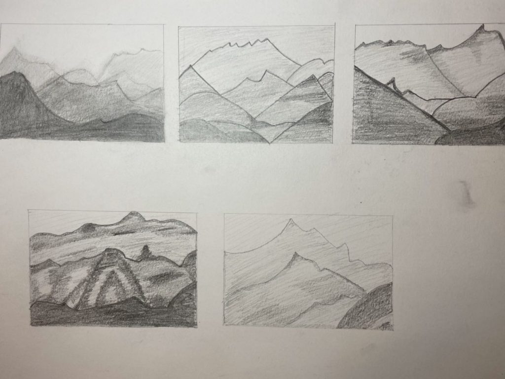
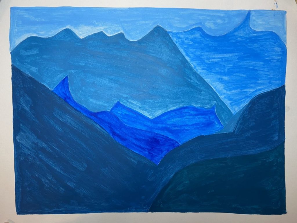
For the part two of this project, we needed to create a landscape by one color with value and saturation. First, we had to research the photos we were going to use, and make thumbnail sketches in a paper, then chosen the sketch we liked and draw it in the bristol paper, and use the color we likes to paint. In this project, we also used the skills of space (scale changes).

Project 4-Value and Texture: Monochrome color Collage

This project was similar to project 3. They both had to show the value, gradation, and contrast of color (hue). The difference was this project was making up with color I liked.
For this project, I chosen blue. Then I had to use the pieces that I had cut from the magazines to show the value of blue, and the gradient from blue green to purple.

Project 3-Value Texture Collage

In this project, we used the pages of magazine with value of black to make sense of range of value. First, we had to choose the pages of magazine with value of black that we were interested of. Then we cut the pages in small pieces. After that, we arranged these pieces in order to show the value, gradation and contrast.

« Older posts Newer posts »