

I found these three examples of contrast below.
TEXTILE, PARADIS TERRESTRE (EARTHLY PARADISE), 1925
This is a textile. It was designed by Jean-Georges Beaumont andmanufactured by Tassinari & Chatel. It is dated 1925 and we acquired it in 1931. Its medium is silk and its technique is compound satin. It is a part of the Textiles department.
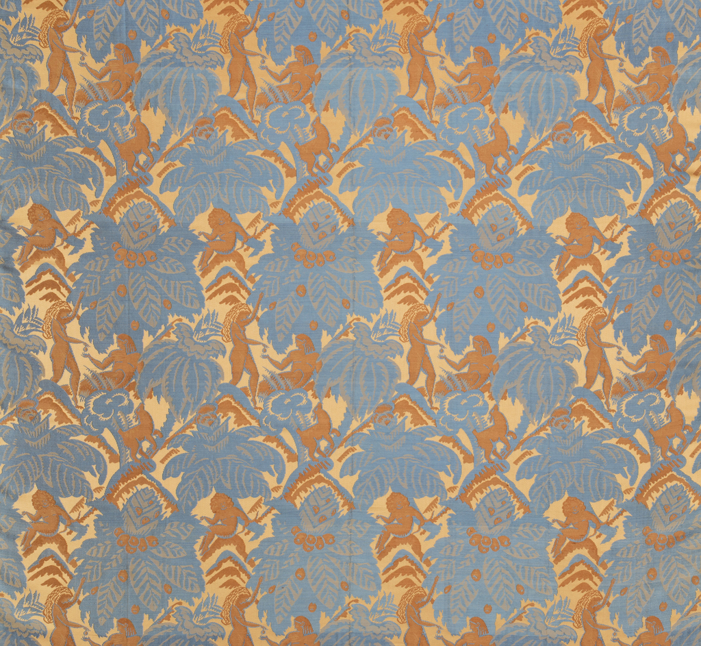
I like that there seems to be 3 patterns overlapping, using pastel colors to contrast each other. This looks like it could be couch material.I think that the colors and textures contrast each other as well as the figure ground when looked at closer.
POSTER, INTERNATIONAL DESIGN CENTER NAGOYA: TANAKA, LATE 20TH CENTURY
This is a poster. It was designed by Ikko Tanaka. It is dated late 20th century and we acquired it in 1996. Its medium is offset lithography. It is a part of the Drawings, Prints, and Graphic Design department.
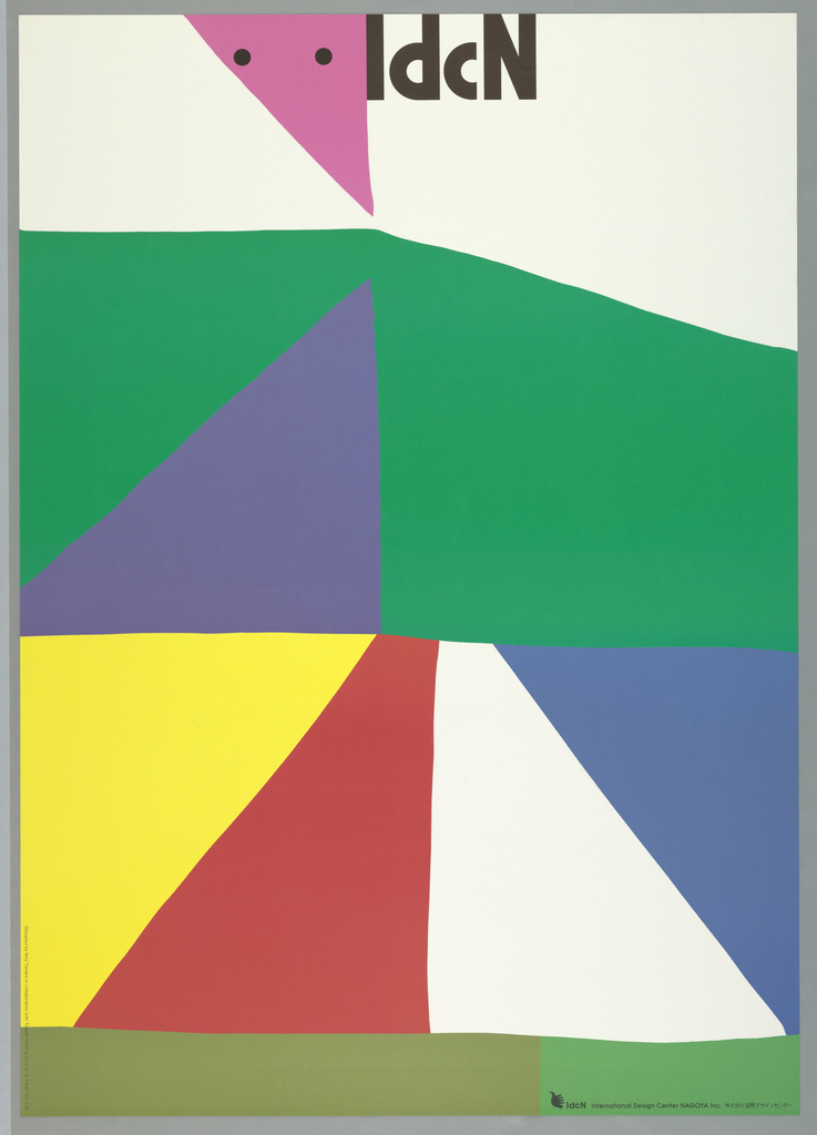
I like that this plays with off white and primary colors as well as different geometric attaching shapes. it has great use of contrasting primary colors as well as geometric vs. organic shapes.
- Poster, Jazz Willisau: Bob Stewart, Arthur Blythe, 2005
- offset lithograph on paper.
- Gift of Niklaus Troxler.
- 2009-3-7
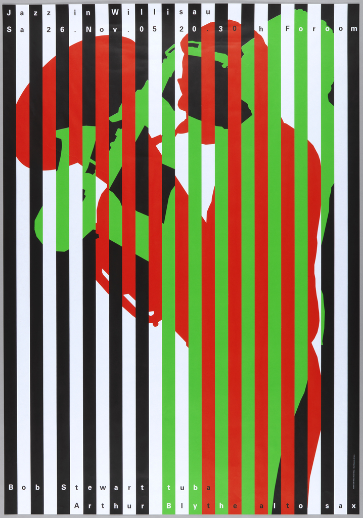
This 3rd one: is very visually appealing and take a bit of focus to figure out what this image is. I like that it plays with bars, black+white as well as the bright green and red then how these colors are all mixed in together differently throughout . My eyes are playing tricks on me!

