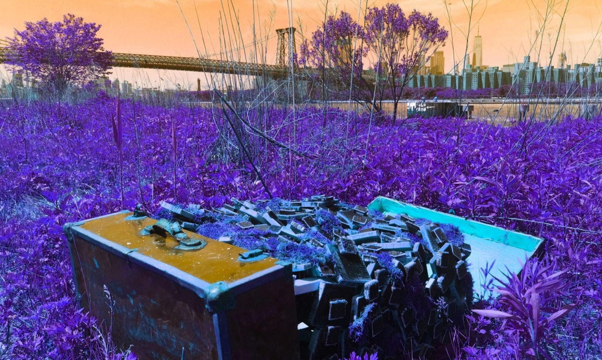
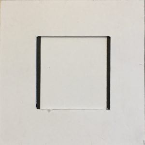
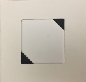
The layout of these projects limited me to only be able to crop in a way that gave these compositions a lot of empty space. I feel like shaping the figure ground works better when aligned with a tighter placement. If my objects were closer together, it would be much easier to crop. I also feel that when these were framed even the slightest little bit off center will make the cropped composition look crooked.


