TRANSPARENCY AND COMPOSITION
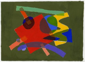
this project mainly shows how important composition and color are in any work of art. we also had to make sure there were 3 or more instances in the composition where 3 of the shapes overlapped which would later contribute to a Tertiary color. the hardest part wasn’t finding a color that would work for each of the shapes, rather it was the composition of the shapes.
The background was another thing that I had to worry about. There were two colors that i was going to choose from, which were blue and green. from those two colors i had many different shades and tones and from those colors i ended up choosing this color.
TEXTURE/ FIGURE/ GROUND
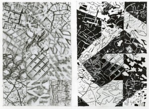
This project probably took the most time to complete. from collecting textures from all over the place, to choosing the best 12 to put on the left side and finally rendering it in 50/50 black and white on the right side. the hardest part was probably rendering it in black and white on the right side.
To render it we had to first figure out which part of each individual square was going to be black/ white while also accounting for how it was going to look like as a whole. then we had to figure out how to turn the textures into shapes. finally we had to follow through with our layout and finish the design. In the end i was very happy with how everything turned out. some textures where harder than others to render but I still had a lot of fun making it.
GRID TRANSPARENCY
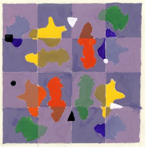
this is one of the many projects where we started off blind. we were told to take out black ink and a paintbrush, then dip the paint brush all the way in and randomly spot the drawing paper with the ink and “let the brush do the work”.
after we got 3 or 4 good looking spots we were told to cut them out and we were finally given the assignment paper. that was the easy part. the hard part was finding the exact color for each spot’s transparency. all in all it was a fun project and I’m happy with what i ended up with.


