Objective
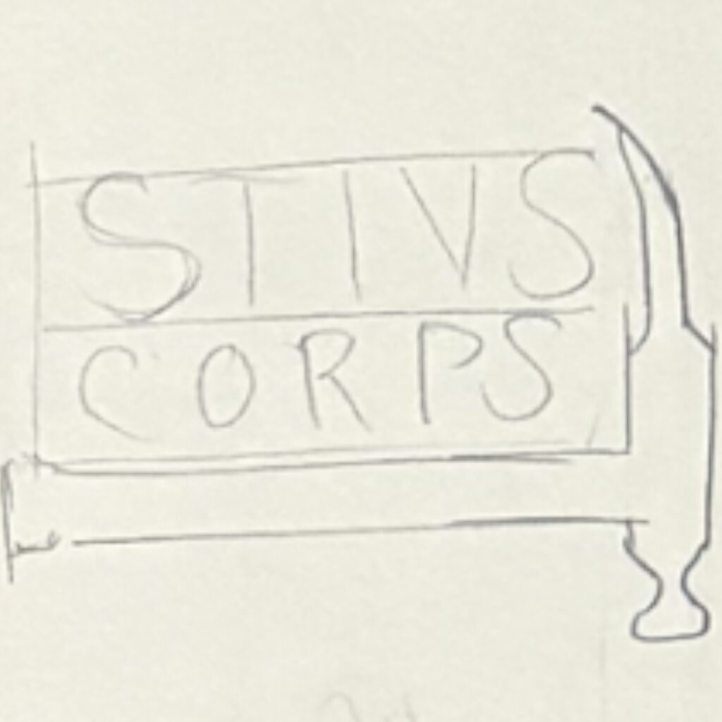
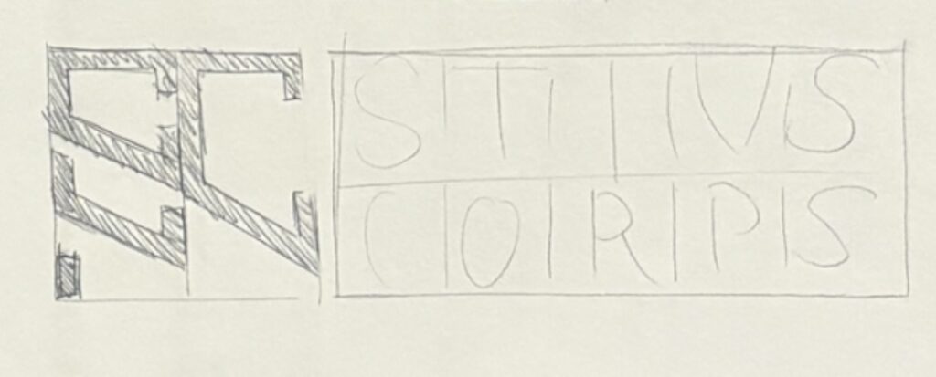
ROugh sketches/ layout


A Communication Design Portfolio


Create a memorable logo that reflects a modern carpentry company’s craftsmanship and integrity, appealing to residential and commercial clients.
The logo for Stivs Corps embodies the essence of skilled craftsmanship and reliability, combining traditional woodworking elements with a contemporary aesthetic. The goal was to convey a sense of quality and professionalism that resonates with the target market.




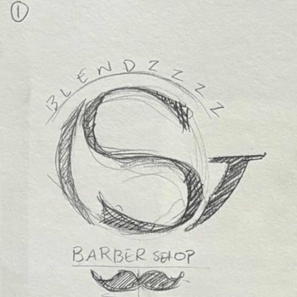
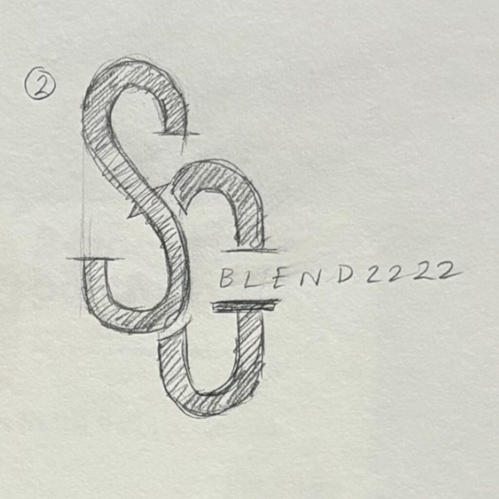
Develop a dynamic logo for SG Blendzzzz that reflects the unique personality of the barber shop and resonates with its target demographic of style-conscious individuals.
The logo for “SG Blendzzzz” is a fusion of contemporary design and classic barbering elements, aimed at creating a memorable brand identity. The concept revolves around the idea of blending traditional grooming with modern flair, capturing the essence of a stylish grooming experience.
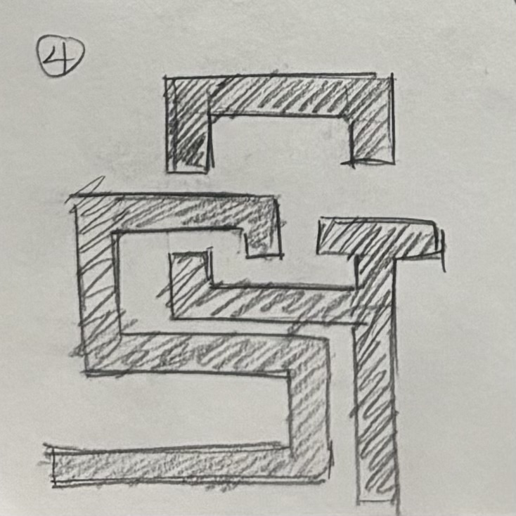

Concept 4


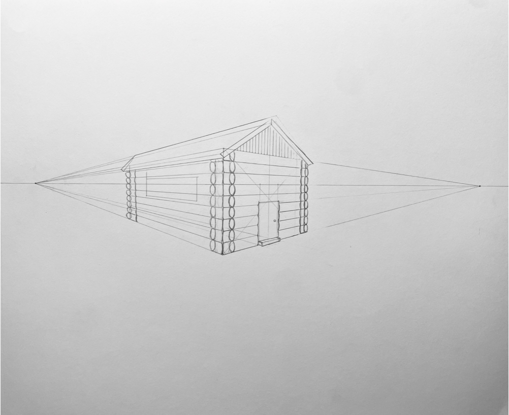
It represents an exterior setting like a street scene, a shopping mall, or an outdoor home in the woods or by the lake. You are invited to create an imaginary setting. Any theme or subject must show your knowledge of 2-Point Perspective and show your drawing skills using line, tone, composition, contrast of light and dark, and color if you choose.


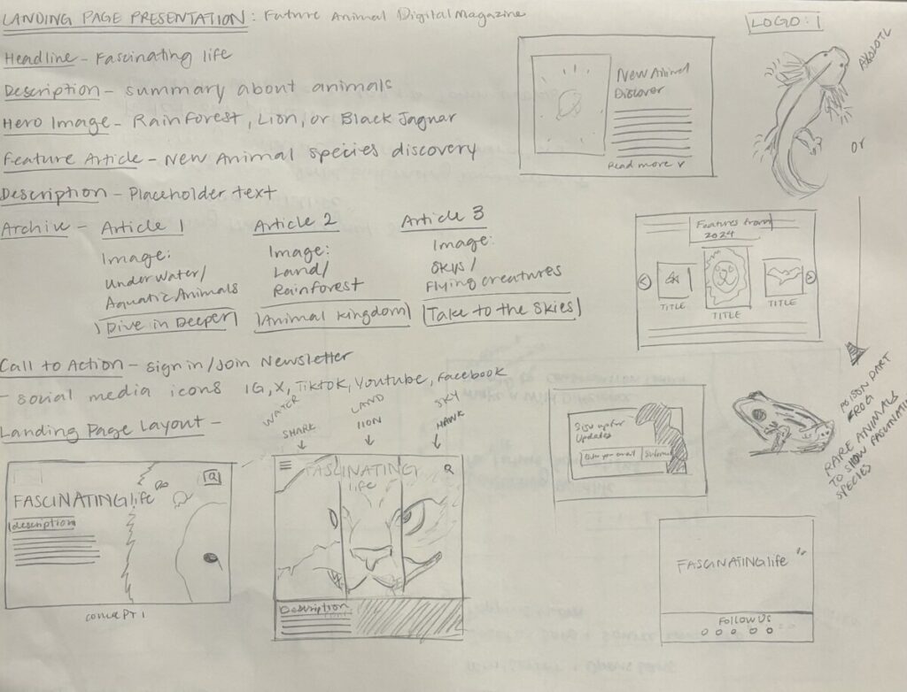
Create an engaging and user-friendly landing page for a digital magazine.
The landing page should include essential elements such as a
Header, Footer, Feature article, Navigation, and Archive.
Header:
Include the digital magazine’s logo.
Design a navigation menu with links to key sections (e.g., Home, Categories, About Us).
Implement a visually appealing and functional search bar.
Footer:
Include copyright information.
Add links to important pages (e.g., Privacy Policy, Terms of Service, Contact Us).
Optionally, include social media icons linking to the magazine’s profiles.
Feature Article:
Display a visually appealing grid or list of featured articles.
Include images, titles, and brief descriptions for each article.
Ensure readers have a clear call-to-action (CTA) to explore each article further.
Navigation:
Create an intuitive and user-friendly navigation system.
Implement dropdown menus or other navigation aids to access magazine sections or categories quickly.
Ensure that the navigation is responsive and works well on various devices.
Archive:
Design a section where users can explore the magazine’s archive.
Organize articles by categories, dates, or any other relevant criteria.
Implement filters or search functionality to help users find specific content.
User Experience (UX):
Prioritize a seamless and enjoyable user experience.
Ensure that navigation is intuitive and users can easily find the information they want.
Visual Design:
Use a consistent color scheme and typography that aligns with the magazine’s branding.
Incorporate high-quality images to enhance the visual appeal of the landing page.
Responsiveness:
Design the landing page to be responsive, ensuring it looks good on various devices (desktops, tablets, and mobile phones).
Accessibility:
Consider accessibility principles to make the landing page usable for everyone.
Ensure that text is legible and navigation is accessible using keyboard inputs.
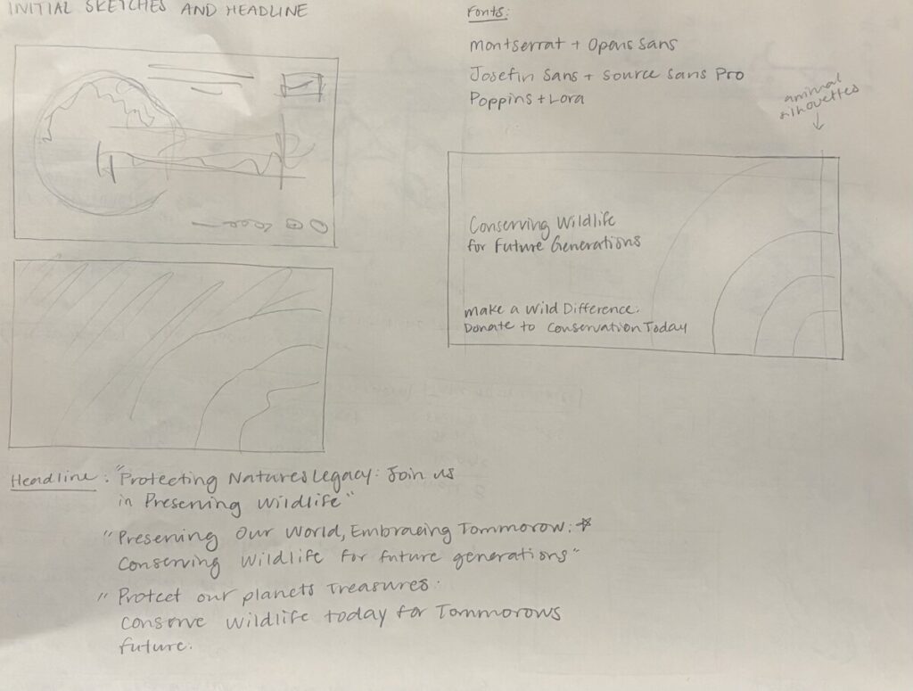


This homework assignment aims to challenge students to extend the visual and conceptual elements of their previously designed magazine to outdoor advertising by creating three distinct billboard designs. Students will develop headlines that encapsulate the essence of their magazine content and employ effective visual communication strategies to engage and captivate a broader audience.


