Getting Appreciated

Internship Journal #9:
The hard/long way is the right way.

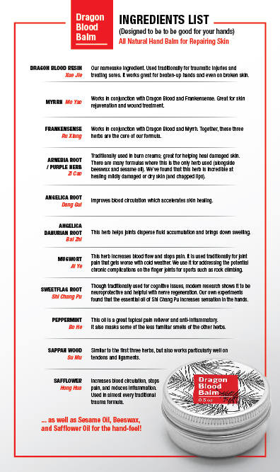
I had the task of designing a small retail sign to display next to a new product line we are carrying. It would be an ingredients list of the each product from that line. Dragon Blood Balm is the product and they have their own website with a page of their ingredients. Originally I thought it’d be easier to simply copy and paste the chart straight from their page. However, it wouldn’t make it visually interesting and it technically would not be my design. So in the end I made initiative to create the chart from scratch. When we received the finished print, my boss complimented me on how good it looks. I am also pretty happy with it as well.

Packaging Design

Internship Journal #8:
Taking on projects you hate

I was assigned the task of making a draft label for a new product line called, Tooth from the Tiger’s Mouth. It is yet again, another herbal ointment/supplement product. The formulator gave clips and thumbnails of tigers he wanted incorporated in the label. At the same time, he wanted a paragraph description of the product in the front and back. It is a bit frustrating to work with since the images and style has traditional Asian qualities. As a young designer, of course we strive to create modern designs. The amount of content provided is also a challenge. I came up with a draft and they did were not crazy about it. So I created another. I realized interning from interning here, you will not always like the task you are assigned to do, but it is important to compromise while giving your best efforts.


Overlooking Simplicity

Internship Journal #7:
Simple Designs can be hard.

I had to create an ad to put on our carousel of Kamwo’s online store. We are carrying another new brand. It is a company that makes teas in a unique packaging. I struggled to start or come up with an idea. Upon realizing the packaging and products are already so unique; I didn’t have to over design it. So I added a few things to show an organic dreamy atmosphere.

iContact/Launch Party Ad

Internship Journal #6:
Kamwo & Dermatology M Launch Party

Our company recently decided to carry a product formulated by a popular practitioner from the UK. I got to create a fun launch party invite and learned to use iContact to mass email potential guests. I also created multiple platforms for guests to RSVP. This is a nice change from the typical ads I create. I came across a few obstacles fitting all the content and the wording itself needed some work. I also had to revise the imagery too. I was told the first design gave off a “sweet sixteen party” tone. The marketing team and I compromised. I definitely come a long way when it comes to criticism and learned not to take anything personally. I am happy with the end result.


Website Design

Internship Journal #5:
Web designing, Squarespace, and CSS

The older designer moved Kamwo’s previous Volusion (web design platform) to Squarespace. Although using Squarespace is not very professional as a designer; it is easy to manage and maintain. Especially considering the entire website would be managed by only two people. It is easy to use and we also use custom css to change the template slightly. I have to be reminded to check the mobile view. Just because it looks great on the desktop, it may appear odd on mobile.

Organization and Filing

Internship Journal #4:
Emails, Organization, and Filing

At work, we use Basecamp to manage all our tasks and projects. It is easy enough on that platform. However, organizing our the files in our shared server and google drive is complicated. There can be many different versions of the same label. The designers in the past were very messy and named the files vaguely. Moving files can be a problem, especially if they are After effects or Illustrator files. All the images linked are lost. I decided to embed all the images used in my Ai files unless they’re extremely large. As a designer and creator of my files; I would want to name and organize my files properly.

Website Advertising

Internship Journal #3:
Badger Balm Ad

I was told to create an Ad for the home page of our online retail shop. It was to promote the brand Badger Balm, and Kamwo is a reseller for that brand. I have also seen it being sold in Whole Foods. I believed the best way to sell the product was to showcase the products with a family shot of the products together. I learned quite a lot from the older designer there at the time. He showed me many resources for obtaining new fonts and mock-ups. He also demonstrated quicker ways to crop out backgrounds of an image. In the end, I was happy with what I created.

Products and Packaging

Internship Journal #2:
Meridian Biologix Essential Oil

I was grateful for the opportunity to create my first product label for Kamwo Meridian Herbs. I needed to create a tiny sized label for an essential oil line they were formulating. The bottles are small. It was difficult to incorporate all the details and information the marketing and production team wanted on the label. At the same time, I had to consider leaving extra space for the bleed margin and the inner margin. Since the canvas size is small, print margins are extremely important when it comes to printing in large quantities. A slight error can mean cutting off a big part of the label. I made the mistake of working on the label in photoshop. There were many different scents and versions of the product I had to create and using Indesign or Illustrator was definitely a smarter choice.


Interning at Kamwo Meridian Herbs

Internship Journal #1:

Kamwo Meridian Herbs is a company that believes in natural healing. They create their own products, sell them along with raw herbs, and other eastern forms of medicine. They also have a clinic and all of their design work is done by me and one other Senior Designer. My first week working there, I created a brochure and had it printed. It was the first time I had ever had any of my design work printed in a large quantity. It did not turn out as good as I hoped. I learned to pay close attention to bleed margins and color. What we see on our monitor screens may not translate as well when it gets printed.