
8PARALLEL LINES AND MOVEMENT PROJECT
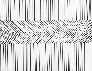
Parallel lines that show movement
The parallel lines imposed motion in the center of the drawing. The dramatic changed in the direction of the lines creates an optical illusion of movement going from left to right. How complex it is to show movement with just lines was my first thought, so I decided to keep it simple and just draw thin lines changing drastically to then go back to the first neutral position at the top.
TEXTURE/FIGURE/GROUND, 50/50 b&w and PATTERN PROJECT
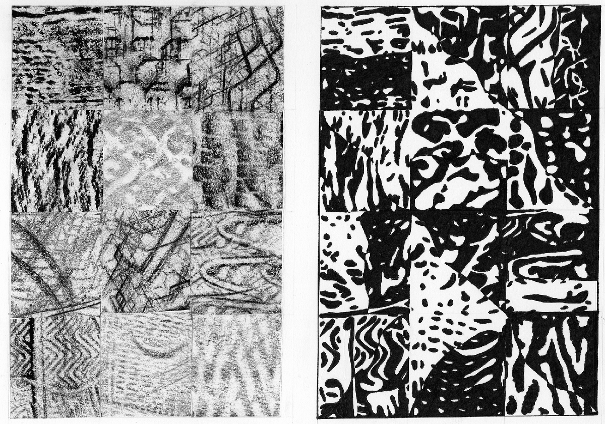
Rubbings arranged and final composition
This project consisted on 12 rubbing textures arranged on a 14″x 17″ grid with no spaces in between. After I was pleased with the composition created I traced and transferred the 12 rubbings into Bristol paper to ended up filling the traced parts with marker. The idea of this project was to use a 50/50 ratio of black to white so it would reflected a high contrast between night and dark all around the composition.
When I started working on the textures I focused on different elements, from shoes’ soles, tables, chairs, and even trees and leaves. After finding the right textures I traced carefully every rubbing to conclude with the filling. Before I used the marker I was a little concerned about the 50/50 result, not only because it sounded confusing and difficult but now I feel the contrasting result gives the composition a terrific effect.
THE “SPOTS” PROJECT
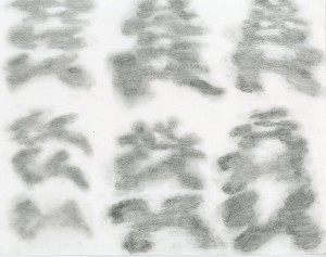
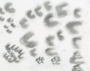
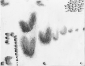
These drawings were the hardest project I had. They consisted of creating three drawings, each one with a certain amount of variables that had to be represented through the composition. The spots of each drawings were a challenged, I had to create spots with no specific shape and had to just play with a pencil and eraser. I used shadows, overlapping and different sizes to result in the variables.
At certain point I was concerned because reproducing spots that I didn’t even remember how I drew them and had to draw then again no less than 20 times per composition. It was kind of difficult. But this project made me realized I have to pay more attention to details in order to create powerful and strong designs. I liked the idea to use spots and no shapes because this shows creativity as the designer creates a unique piece.
TRANSPARENCY PROJECT
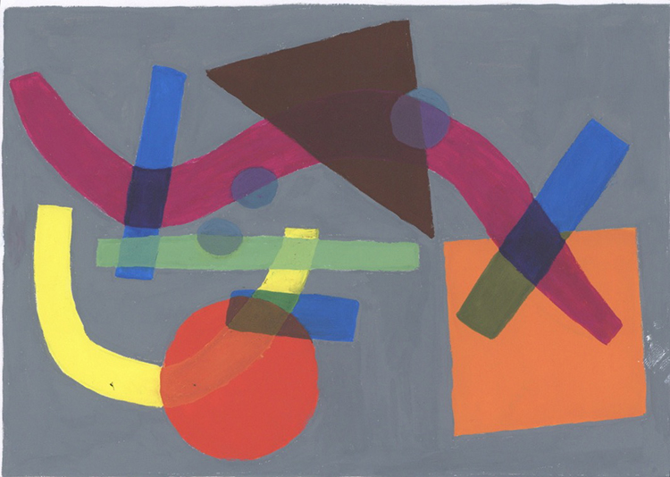
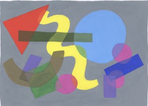
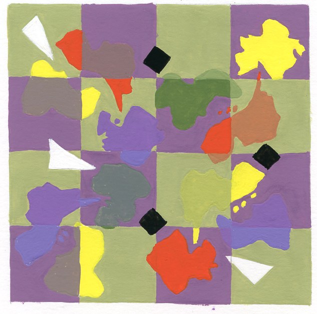
This project was my favorite overall the coursework. When the professor asked us to randomely draw different kind of shapes on a big piece of paper I never expected it would ended like this. When I started drawing my first composition I wasn’t that concerned about the position of the shapes, after the first critique during class I realized the shapes needed to be arranged in a position that expresses flow and harmony. Also. The color decision of the background, as well as the shapes plays an important factor when producing the paintings.
What I liked the most was the result of my second composition. The lighter grey background doesnt affect or opaques the shapes, instead is eye catching and neutral for the public.
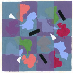
PATTERN TRANSPARENCY PROJECT

