Blogroll
-
Recent Posts
Recent Comments
- NewBruno7 on The Copenhagen on Laight St.
- dauly cuello on MakeSpace.com Poster
- Behzod Hamidov (Beka) on MakeSpace.com Poster
- Chris on styrofoam type
- bajanboy on MakeSpace.com Poster
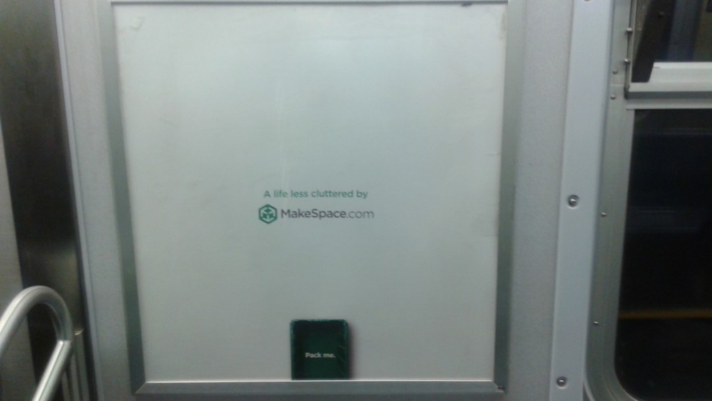
MakeSpace.com Poster
This entry was posted in Uncategorized. Bookmark the permalink.


wow thats small
All this negative space works so well for this advertisement.
I have this opposite of claustrophobia thing, and this makes me really uncomfortable.
I love this! works well
This is a great poster. I like myself working with negative spaces. Maybe i got that inspiration from Apple’s add.
I’ve seen this poster in the train and even though is mostly empty, it grabbed my attention because it was so different from the rest so it stood out the most.