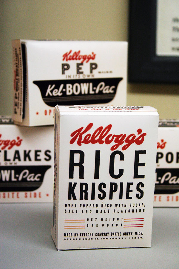
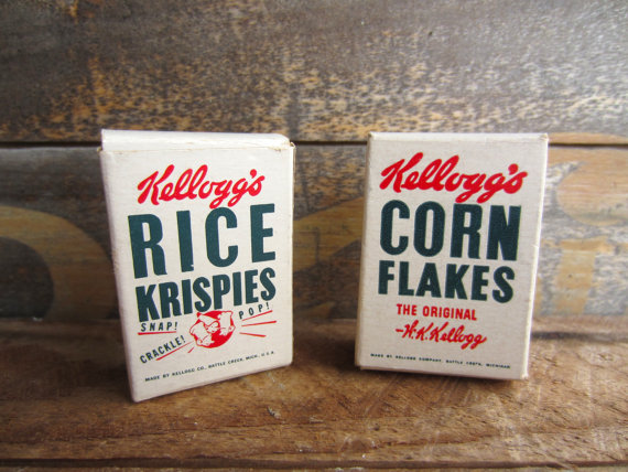
So occasionally I get these craving for different kind of foods. It can be on a daily basis, weekly basis, or even hourly basis. Recently it was all about Rice Krispies. So then I came across these beautiful Rice Krispies box cover design. I was surprise on how appealing the box cover is without having Snap, Crackle, and Pop (characters) or any images as the main element of the design. It strictly consist of just typography. The overall design works really well especially the color scheme: Red and Black font on a white background. Amazing. In terms of the typography, both images used only a sans serif font. Both images have the sense of hierarchy; allowing it to direct our eyes to see “RICE” first. The one on the right appear to be much bolder than the one on the left. So at the end, I wish I can get my hands on these.


I really like the way they used the fonts it goes well with the design.
great observations Kelman! and beautifully written. I hope you find the Krispies you are looking for!