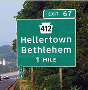
This is a long, but really interesting article regarding the readability of signs, and the use of the typeface Clearview.
Blogroll
-
Recent Posts
Recent Comments
- NewBruno7 on The Copenhagen on Laight St.
- dauly cuello on MakeSpace.com Poster
- Behzod Hamidov (Beka) on MakeSpace.com Poster
- Chris on styrofoam type
- bajanboy on MakeSpace.com Poster


