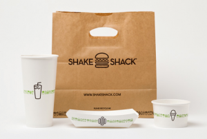
Hamburger or cheese burger? onions or pickles? never enough ketchup! Read up a bit about Shake Shack’s branding and look – designed by the awesomely amazing Paula Sher at Pentagram designs. You’ll be hearing her name again this semester – she’s one of the living legends of design today! FYI it is the dream of many designers to work at Pentagram!
Blogroll
-
Recent Posts
Recent Comments
- NewBruno7 on The Copenhagen on Laight St.
- dauly cuello on MakeSpace.com Poster
- Behzod Hamidov (Beka) on MakeSpace.com Poster
- Chris on styrofoam type
- bajanboy on MakeSpace.com Poster


I always thought their logos looked was straight to the point. I have never eaten Shake Shack but I have sat in there store and watched as others were enjoying their meals. I happen to look around and had seen how the logos were nicely and neatly designed. I want to be able to make my own well know branding and logo one day.