Personal Flag

Flag


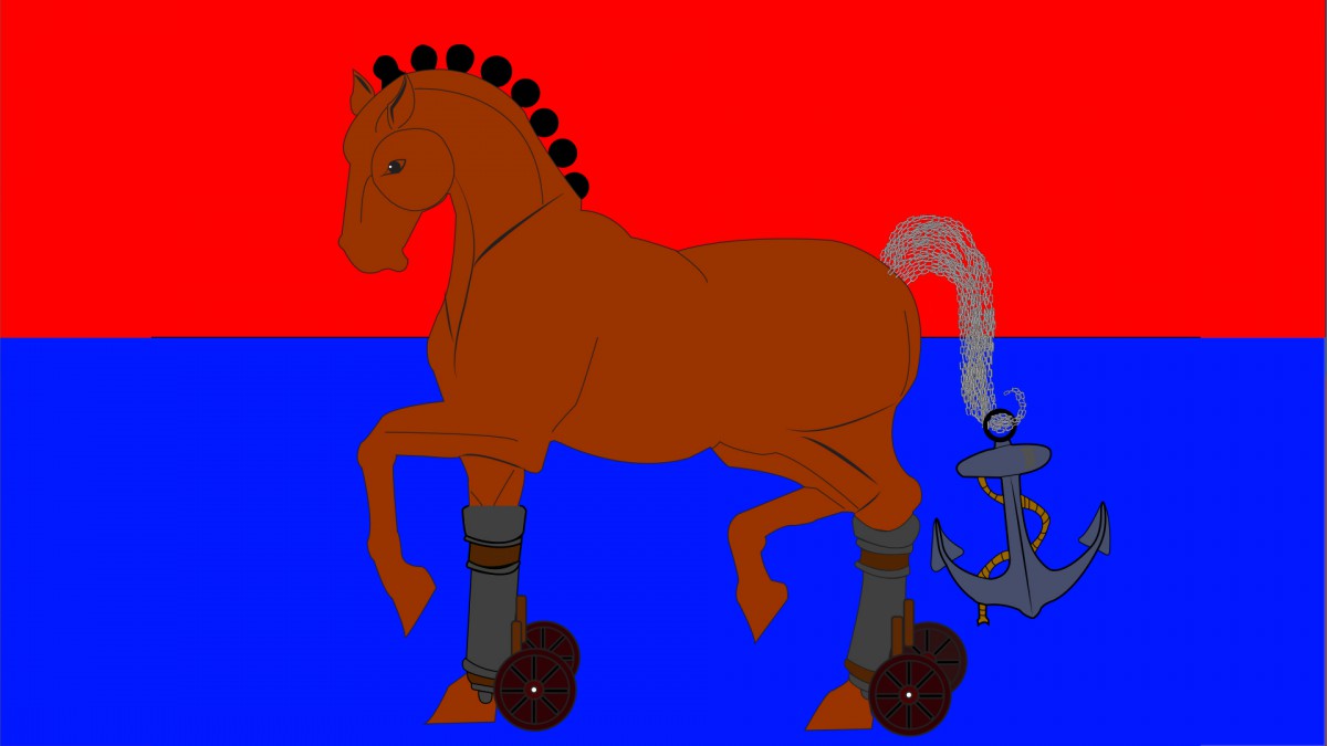
As a Haitian in an American body, truth be told, the connection with my Haitian side is weak. For that reason, being able to understand why the Haitian flag hues are red and blue, that’s a story I can’t tell. Based off of history, those hues stand for union. For now, I reveal my experience of being a Haitian in a personal flag called The Power of A House. The goal of this assignment was to reveal our interest, religious, and our personalities.

The process of creating this image was not a simple task. After a sketch of the horse, it was imported into illustrator to being giving it its organic lines. By using a rectangle (tetradic) color scheme, which were blue, red, orange, and green, it created a good balance between warm and cool colors in the design. The red stands for passion, joy, love, and action and as the blue stand for trust, loyalty, wisdom, and the sea. Each shape placed on the horse represents something. Starting from the infused legs, add canon to the leg represents speed. As a track runner, being as fast as a ball fired from a canon was very importance. The hairs on the horse are the balls for the canon. The balls on its head reveal the ability to ignore pain.

The patterns of the chains are a representation of past successes and failures. Those broken chain seen on some parts of the horsetail are failures, which occur due to the weight of the anchor or stress. However, the weight of the anchor never prevented me from moving forward. According to Deuteronomy 17:16, it says ā€œThe king, moreover, must not acquire great numbers of horses for himself.ā€ In this text, the horses are viewed as strength, a trusting in flesh reliable.

After completing this assignment, I gained a lot of knowledge about using organic lines of the horse. By using a great number of chains on the horseā€™s tail, it gave a sense of depth and fullnessā€™. Although, the image is not symmetrical balance, the weight of the anchor allows for an asymmetrical balance.


Uses of Line and Curves

IMG_0077 copy

This artwork is called Play and Work. The uses on lines and curves are an important tool for drawing. Line is a continuous mark made on a surface, by a moving point. A line could be horizontal, vertical, diagonal, straight, curved, thick or thin. In this illustration, the task was to create a ā€œplay or workā€ zone using line in only one direction.

The two boxes on the left are both play and the two boxes on the right are work. At the top right left box, this image only uses curves. Using curved lines off of a feeling of freedom and relaxation. This image seem like a wallpaper from the 1990s. The next playful image at the bottom left reveals a maze. A maze might seem more stressful and less playful, however, it depends on the level of difficulty of the maze.

Now, we will review the work or stressful drawings. The first image at the top right is work. This drawing exposes its strong presents of order, organize, and program. It reminds me of a game as both side try to balance a cord in the middle. For the last drawing at the bottom right, itā€™s also an image of order and foundation. There is more tension in drawing for that reason of two opposes head charging towards each other.

Letter Design fused with Complementary Colors

Comlimentary_color-w

Here you see a design, which combines letter design and color harmonies. Completing this task was not as simple as it might seem. There are many ways for combining basic color from a color wheel and complementary is one technique. Complementary are colors on the opposite side of each other on the color wheel. Letter design or typography is the arrangement of type, but thereā€™s more than just that. Red-violet and Yellow-green

After search relentlessly for a typeface, the Lucida Handwriting in italic seemed as great choose for alignment. The ā€œWā€ allow me to create a visual connection and enough space for positive and negative space. Depending on the color chosen, complementary colors could enhance or worsen the text. My reason for choosing Red-Violet and Yellow-Green as a complementary are because of the vibrant look the yellow-green give off when place in front of the red-violet.

Welcome!

This is the first post on your Learning Blog. Edit or delete it, then start blogging!

The ePortfolio is both a Learning Blog and an Academic Career Portfolio. Use the Learning Blog to document your learning experiences and class assignments each semester.Ā As time goes by, add content to the Academics and Career sections to show your department, graduate institutions, orĀ future employers how well prepared you are for your chosen career.

NOTE: Remember to add appropriateĀ CategoriesĀ and TagsĀ to your posts. This will help your professors and other visitors find the content they are looking for. The Categories “Coursework” and “Field Trips” and the Tags “OpenLab” and “City Tech” have already been applied to this post. Feel free to make changes!