
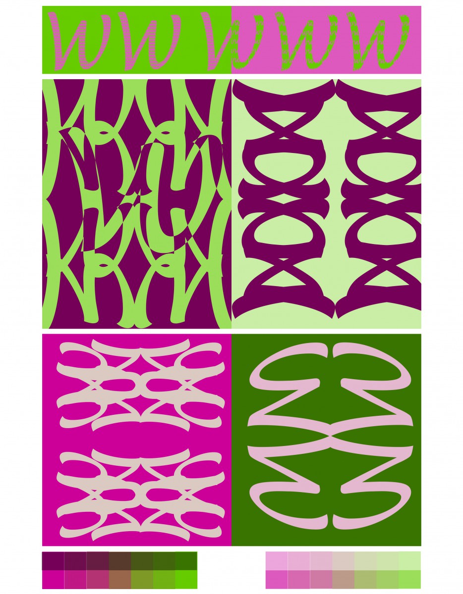
Here you see a design, which combines letter design and color harmonies. Completing this task was not as simple as it might seem. There are many ways for combining basic color from a color wheel and complementary is one technique. Complementary are colors on the opposite side of each other on the color wheel. Letter design or typography is the arrangement of type, but there’s more than just that. Red-violet and Yellow-green
After search relentlessly for a typeface, the Lucida Handwriting in italic seemed as great choose for alignment. The “W” allow me to create a visual connection and enough space for positive and negative space. Depending on the color chosen, complementary colors could enhance or worsen the text. My reason for choosing Red-Violet and Yellow-Green as a complementary are because of the vibrant look the yellow-green give off when place in front of the red-violet.

