Visual hierarchy is used to structure content on a page using spacing, labels, and headings. Typically, the most important element of a page is displayed first and in the largest/most bold font.
Look at this example from the New York Times:
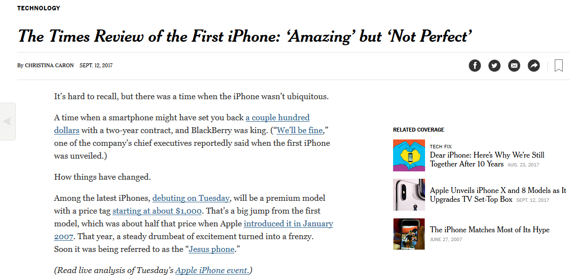
Observations:
The title of the headline is the largest, drawing your eyes to it.
The byline is situated at a higher status, and the content is given the least status. The “Related Coverage” is placed on the sidebar with image thumbnails, prompting users to conduct an action (clicking on the images).
This page is designed to give your eyes a path. Its basic structure is used for most New York Times web pages. Consistency is important because it facilitates less effort for the user to learn how to navigate the page. It is a successful example of “chunking” information to improve flow for the end-user and creates consumable sections of information.
OERs can be designed in a similar manner. WordPress (and HTML) facilitates this visual hierarchy with the heading and paragraph tags (see the drop down menu in the “Visual” tab at the top of the WordPress the tool bar).

