Audience
It’s important to write content of your OER in mind of a global audience. Anyone can find your site, and since it is an OER it may be used for an audience outside of your classroom.
Use accessible, easy language when possible.
Readability
Readability is the ease at which text is read. Reading and writing for the web is very different than reading or writing hard text. To examine how well content is readable, the Hemingwayapp App to test the reading level of a web page’s content.
“Chunking”
Chunk information into digestible sections for web readers.
Readers don’t want to read long pages of text on the screen.
Information chunks can also be organized into lists and secondary pages.
For example, let me describe what I pick up at the grocery store. I usually get some fruit like apples, bananas, and grapes. I can also pick up a loaf of bread, some vegetables, pasta and pasta sauce. I can describe it in this one paragraph.
However, I can also describe it by using lists.
At the grocery store I picked up:
- Apples
- Bananas
- Grapes
I also picked up:
- Bread
- Vegetables
- Pasta
- Pasta sauce
Scanning
Writing on the web is different than writing for print. For instance, we typically scan a web page rather than reading word for word.
Column Width
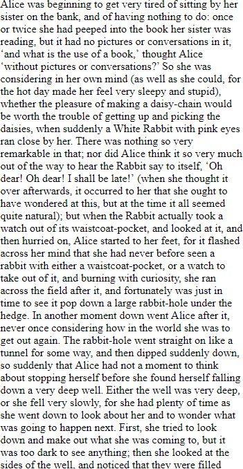
Ever read a website that contains text in columns that are too wide? Or too narrow? This is an example of poor usable content.

Columns of text that are too long, say from one end of the page to the other, may be difficult to focus on.

Narrow columns may break a reader’s flow, since their eyes have to repeatedly go back and forth.
Text Length
Succinct, conversational style, active sentences are best for the web.
One of the advantages of the web is the ability to hyperlink content into several pages. “Long and detailed background can be relegated to secondary pages (Nielsen, 1997).
Another rule of thumb is to cut the length of text in half, then cut again. However, this is a general guideline and not a strict and fast rule.
Bibliography
Nielsen, J. (1997, March 15). Nielsen Norman Group. Retrieved from https://www.nngroup.com/articles/be-succinct-writing-for-the-web/
Recommended Sources
“Readability: the Optimal Line Length.” Baymard Institute, 1 Nov. 2010, baymard.com/blog/line-length-readability.
Felder, L. (2012). Writing for the web: Creating compelling web content using words, pictures, and sound. Berkeley, CA: New Riders.
Fenton, N., & Lee, K. K. (2014). Nicely said: Writing for the web with style and purpose. San Francisco, CA: Peachpit Press.


