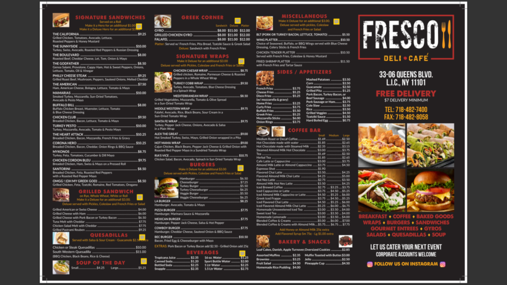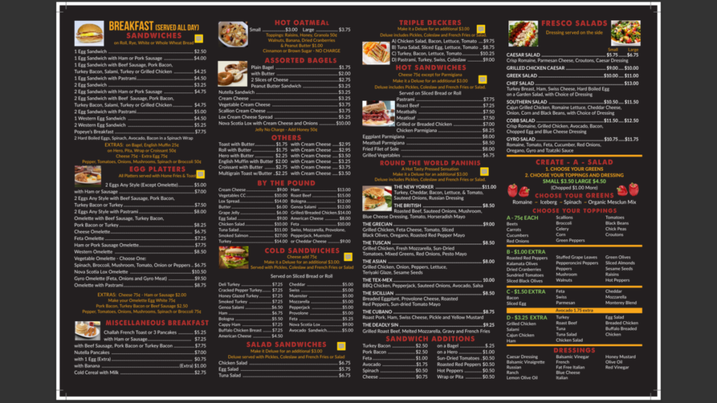

So I recently had to go back to a menu from The restaurant called Fresco. They wanted some new price changes to some of the items on their menu. I had to make changes to the Breakfast, Egg Platter, Triple Deckers, Cold Sandwichiwes, and quite a few other sections. Unlike the last time, these changes took less time since it wasn’t required to change the majority of the prices on the menu.
As far as the look of the menu, I like the contrast between the black background and the bright colors like white, yellow, and red. The organization of the menu also looks great. As far as the logo, I did like the addition of the fork and knife utensils.


