I had never been to the Cooper Hewitt Design Museum prior to this trip. I had only initially known it existed because I had happened to walk by it in the summer. After spotting it, I fully intended to go, I just never planned when, until now.

It was very interesting to see the range of items they had. When thinking and studying design, I’ve only thought of it in terms of a digital realm. It’s easy to forget that design isn’t just about posters and web logos. It also has to do with more physical things, such as houses, furniture, and technology.

My favorite exhibit was the Pixar one. I love cartoons and knowing how much time and effort goes into each one of Pixar’s movies, it was interesting to see concept sketches for characters and how the ideas, trial runs and outside inspirations got them to what we know them as today.

Another image I saw at the exhibit that caught my eye was a poster, Salzhaus by Felix Pfäffli. While I appreciate the interesting combo use of colors, the closeness of the letters (tension) made it uncomfortable to read. According to it’s webpage on the Cooper Hewitt site, the poster was “intended to ‘distort, warp and disassemble.'” I believe Pfäffli was very successful in designing his piece.
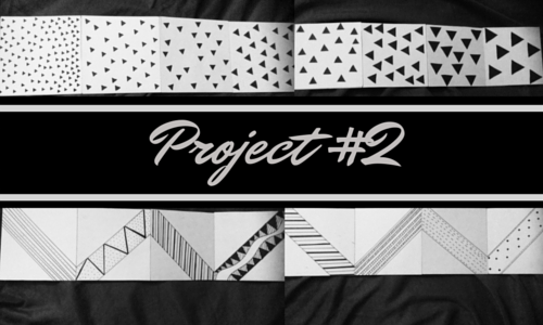
In this project, the goal was to explore movement.
First, we had to choose a song that inspired us. Unable to choose just one initially, I created a playlist of songs on my iPod. The song I ended up choosing was “Very Loud” by Shout Out Loud. We were to listen to our chosen song and create thumbnails of movement in relation to the music we were listening to. We then had to narrow it down and choose two contrasting movements to recreate in our “song books.”
What I learned in doing this assignment is that visually implied movement is best created with diagonals, but can also be done with simple shapes rearranged in a space as well. Also, figure ground relationship with the latter is very important to keep in mind when creating design.
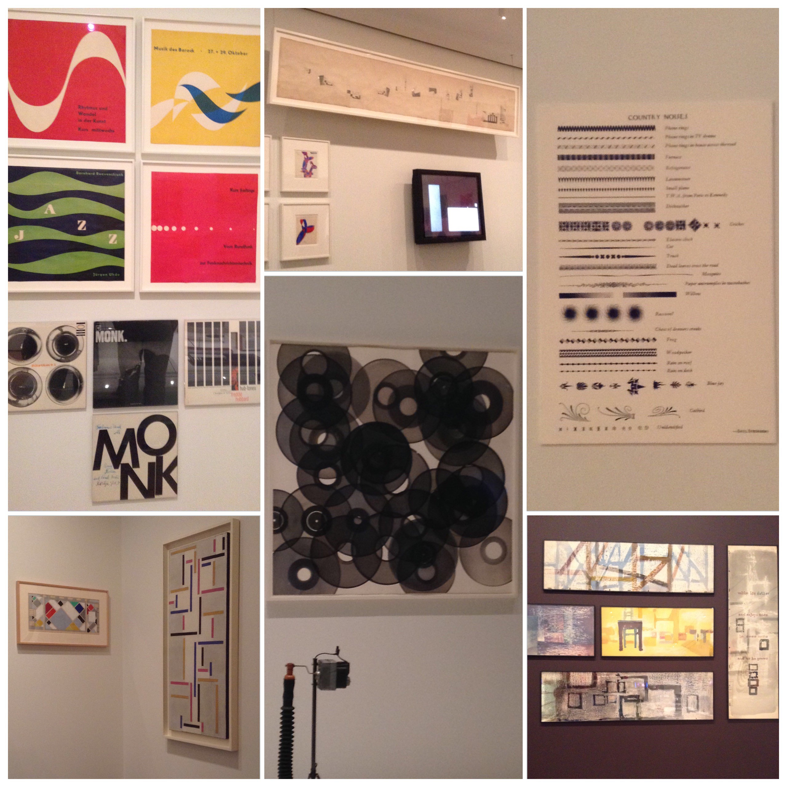
Visiting the “Making Music Modern” exhibit at the MoMA let me see how implied movement with sound can help increase the images’s ability to seem as if it were moving. There was one video that had a few images moving, one of which was static, but since it popped up on the screen and was paired with music caused it to successfully be seen as having movement. If the image was by itself, with no sound, the implied movement may not have been so clear.
It was also interesting to see how a few shapes placed together, whether it be through layering, transparency, spacing, and scale could help imply movement in a non-moving image.
My favorite pieces within the exhibit were the ones using lines. It’s easy and simple to use a line to imply movement. The eye can easily follow the line of implied movement. This just reminds me how simple versus complex can be just as effective when creating designs, which is something people tend to forget because everyone wants to be unique and stand out.

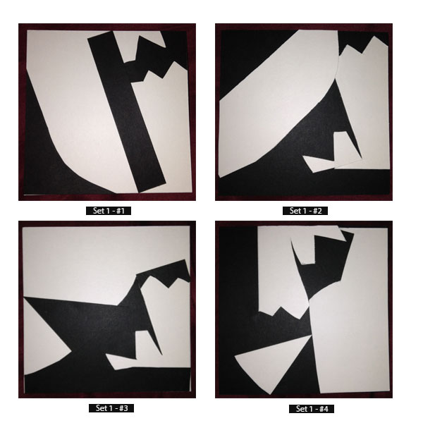
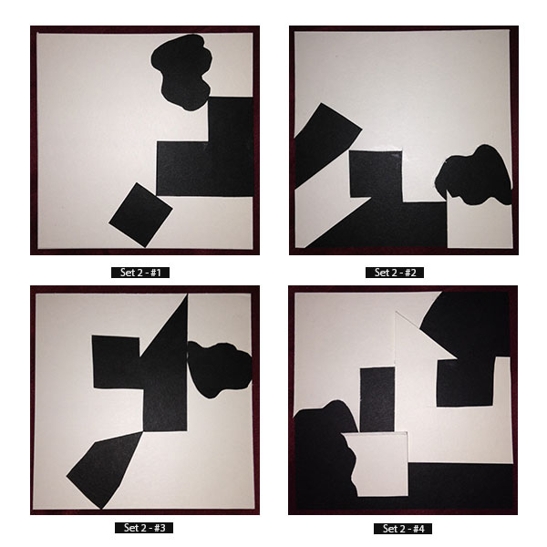
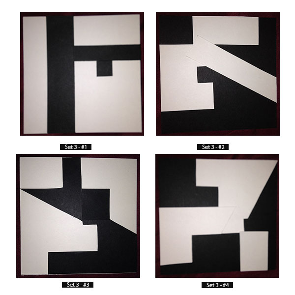
In this project, we were to explore the relationship between the foreground and background using positive and negative space.
By placing simple geographic shapes within the frame, it was easier to see how both the black shapes (positive space) and the shapes formed by the background (negative space) can manage to compliment each other.
Once the four different windows were filled, one window was chosen to help create a pattern. The window in the top right corner is the one I chose to use.
Just by looking at it, it may not be so easily seen how that image managed to create the pattern in the middle. By rotation it every so often, the images pieced together to produce the pattern seen above. Being that the image originally had a reversal-ground relationship, it , maintained that relationship and causes the viewer to not only see the black inking as positive space, but also the white space as the potential positive space.

If this texture was ever used in digital form, I feel like it could be used in a couple of different ways. It could be used as a background fora website or character profile. It could also be used as a textile pattern or even as a decorative fill for a font. It could be one solid color or an assortment of colors.
The OpenLab is an open-source, digital platform designed to support teaching and learning at City Tech (New York City College of Technology), and to promote student and faculty engagement in the intellectual and social life of the college community.

