Archives for category: Workshop 2017_02

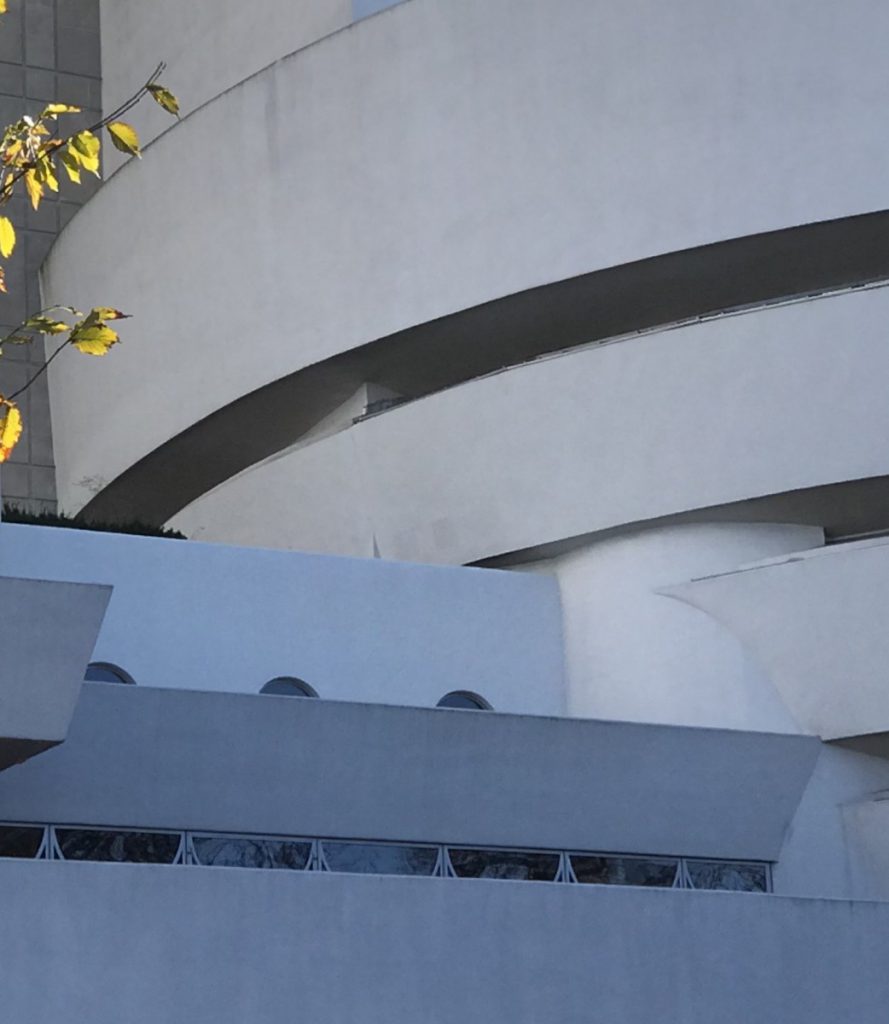
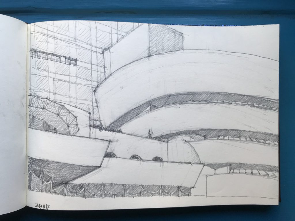
The Guggenheim is a particularly challenging due to the curvature and the complexity of the multiple planes as well as the canted surfaces. The complexity does facilitate, however, the triangulation of the elements enhancing the reading of the negative spaces and proportions and geometry of their intersections. Sketching a building of this complexity offers a case study of the power of careful observation. Here I was able to observe a tiny massing detail of the rectangular core (visible above the top level of the curving mass) that protrudes from the penultimate level of the rotunda due to the combination of the decreasing radius of each level of the rotunda and the canted surface. A detail of this sort was likely not designed or anticipated but was “discovered” during construction.



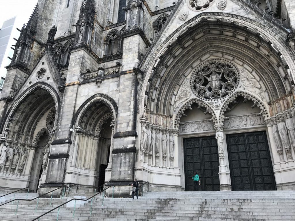
There are few architectural works of greater power and craftsmanship in New York. Magnificent scale, proportion, intricacy, sculptural expression. For students of architecture who have not yet had the opportunity to make a grand tour of Europe, this place provides an equivalent experience.

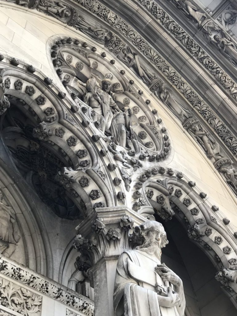
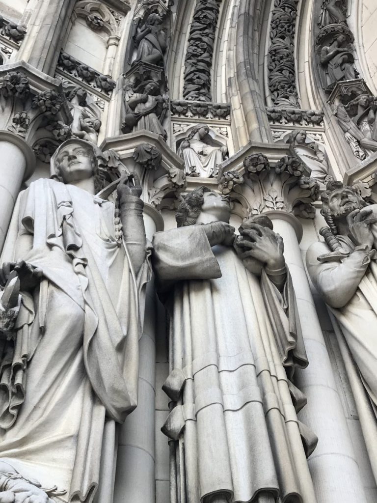
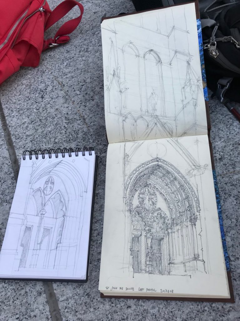
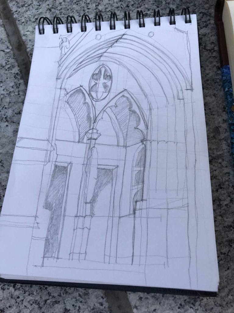
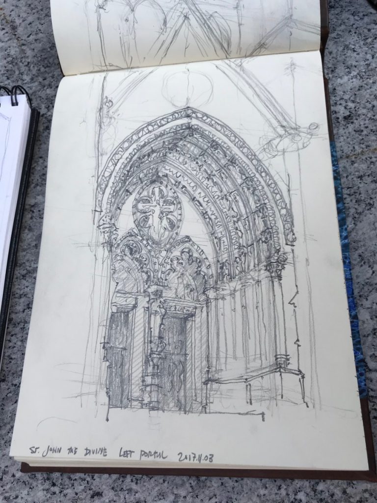
The portal design is such a critical component of the Gothic Cathedral. St. John the Divine applies a layering of sculpture and architectural form at the portals to intensify the shadows and relief through a screen of arches and sculptural apertures.

We positioned ourselves on the steps below the portals and sketched viewing up, enhancing the majestic presence of the massive entry wall.

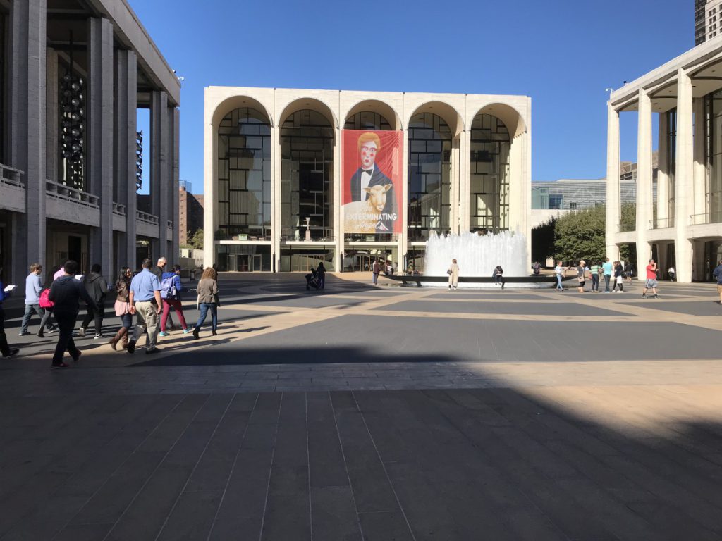
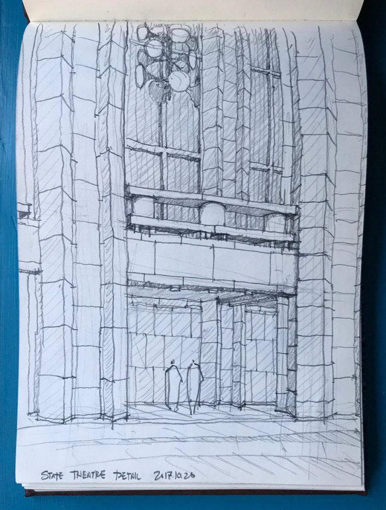
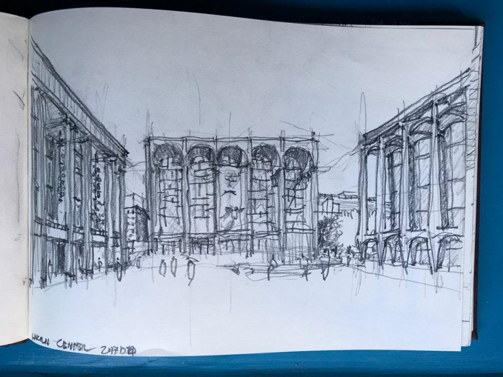
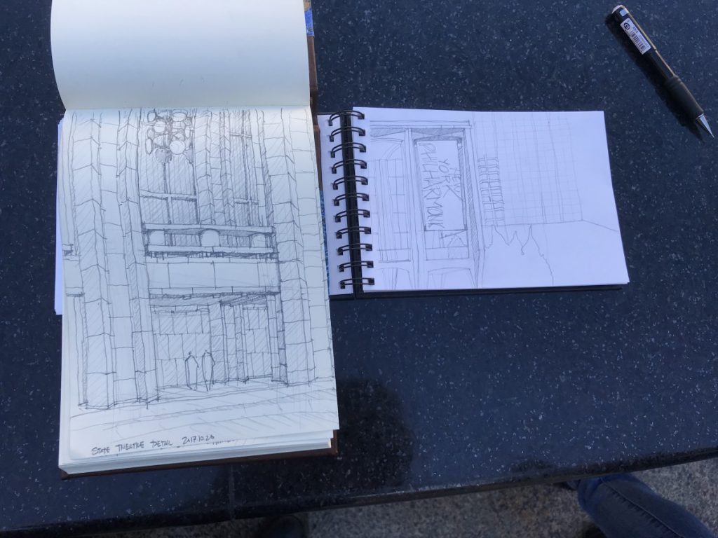
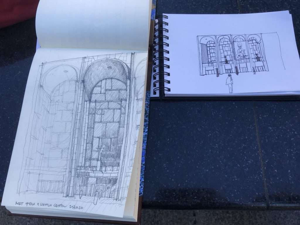
Lincoln Center provides an opportunity to study an urban set piece composition with architectural variations on a theme of a stripped down ‘modern’ classicism. The architecture, while presenting an impression of simplicity and almost caricature, has subtle details of stone work, layered ordering systems, and play of light and shadow. Here our sketching work focused on urban space at the macro scale and detail and proportion at a more focused scale.

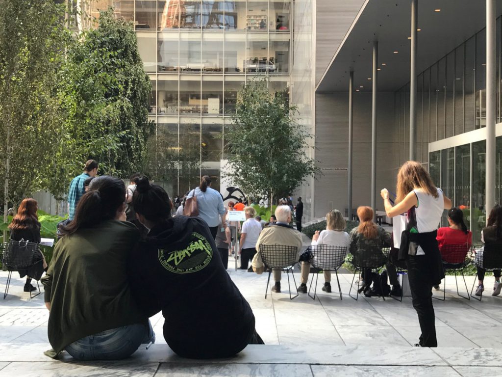
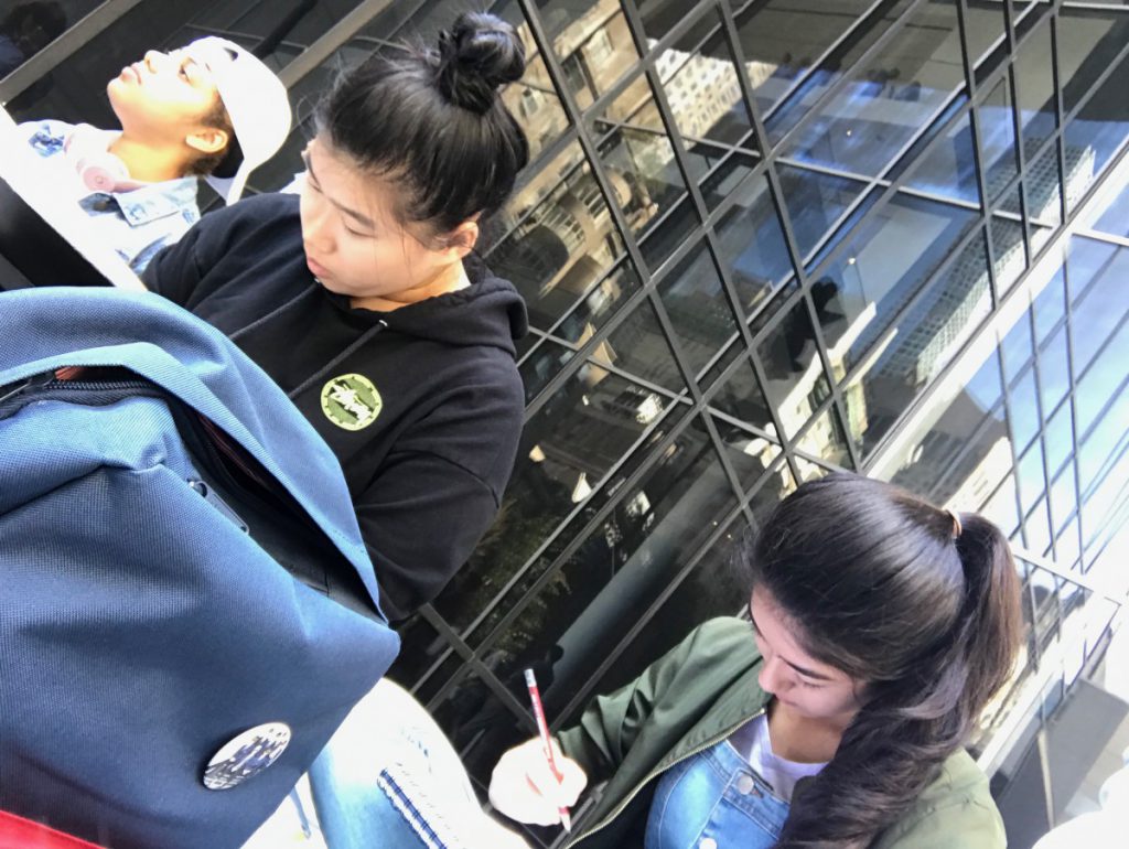
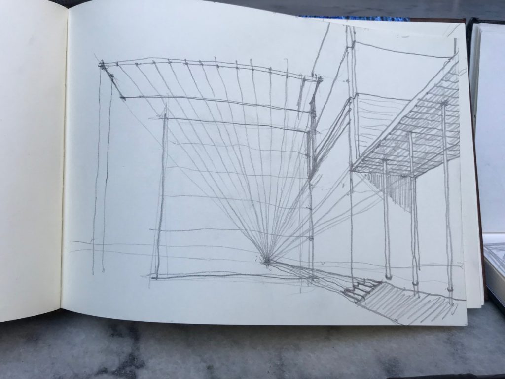
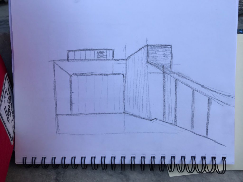
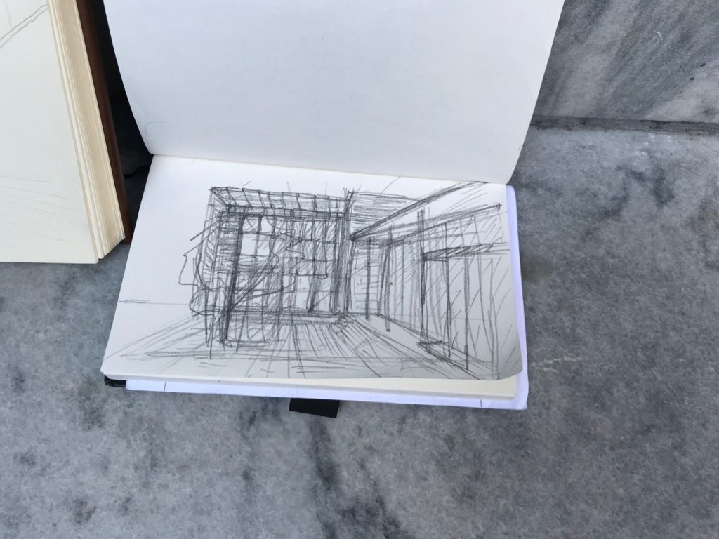
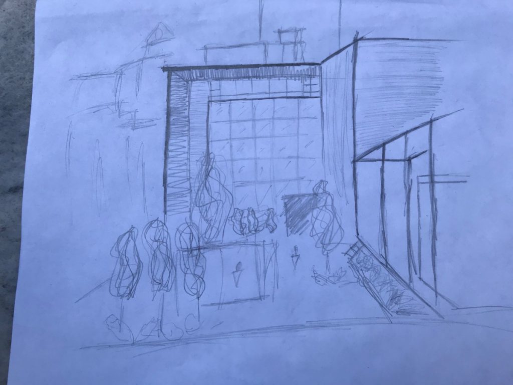
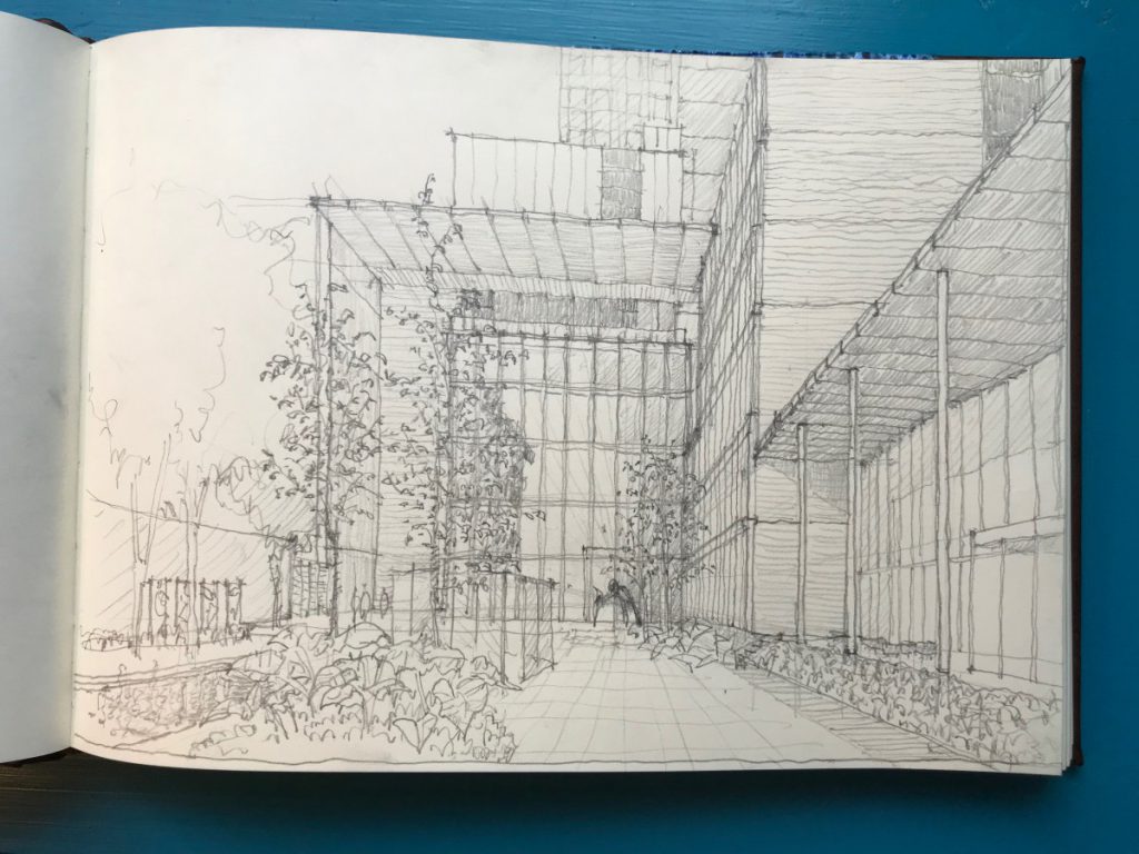
It was a beautiful October day to sit in the MoMA sculpture garden for a few hours and sketch. Three students and I concentrated on a one-point perspectival view of Yoshio Taniguchi’s architectural ensemble surrounding the garden. We worked on recognizing the vanishing point, the horizon line, and the discipline of observing the relationship of the parts, including the negative spaces between things. While the rigorously gridded space seemed like it should be straightforward, the proportions and complexity of the elements were challenging to “get right”.

Samples of the Sketches we worked on:

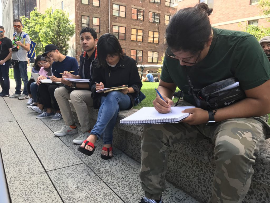
Seven students joined me (Prof. Montgomery)  on the Highline to kick of this workshop series. There will be 5 workshops this fall, and 5 this spring.

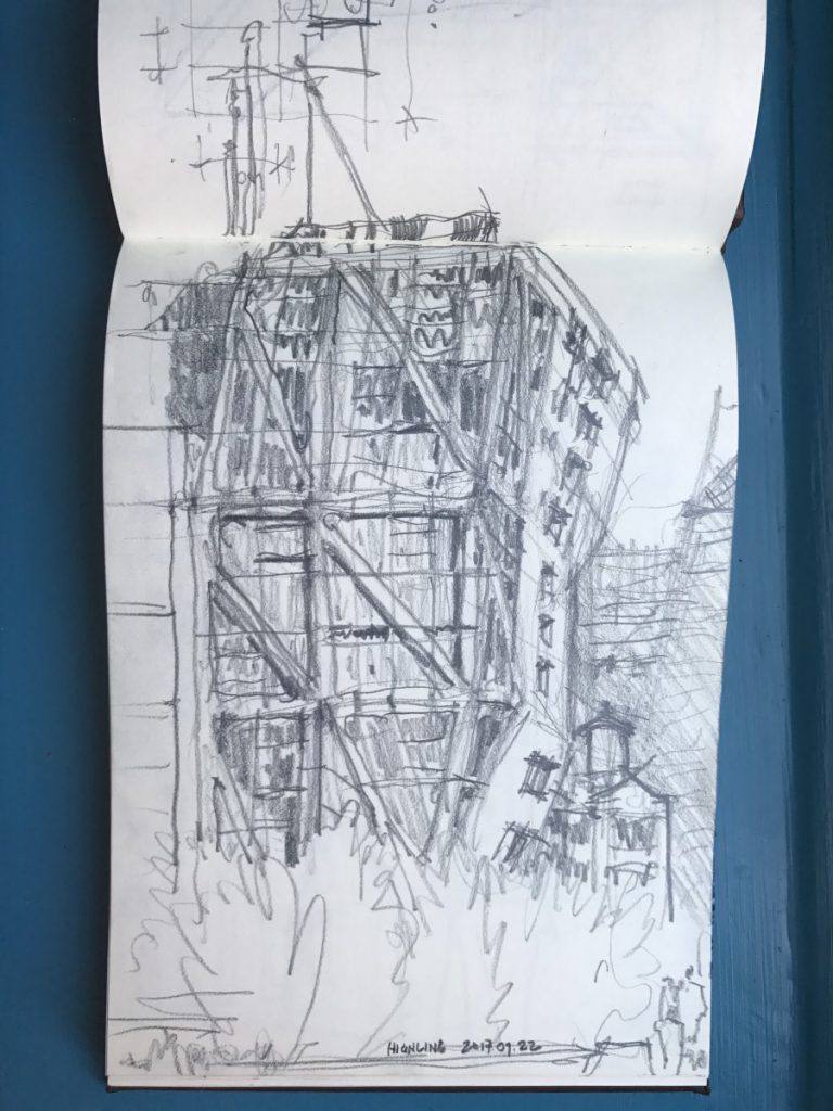
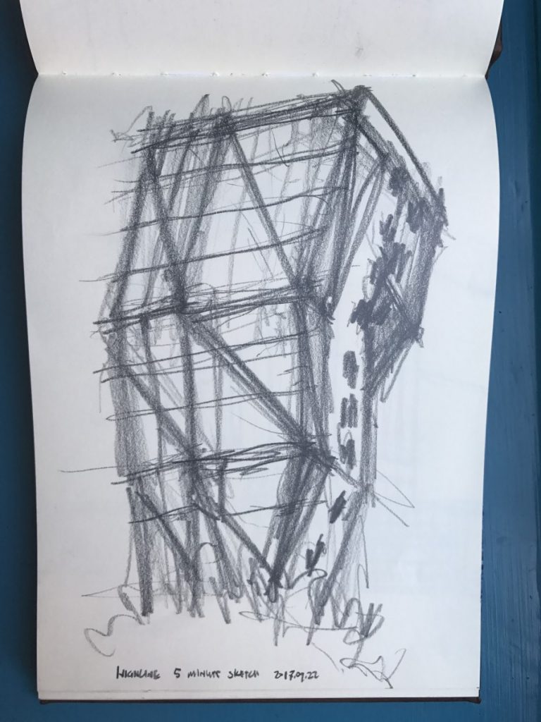
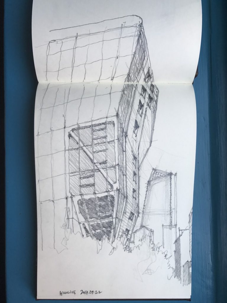
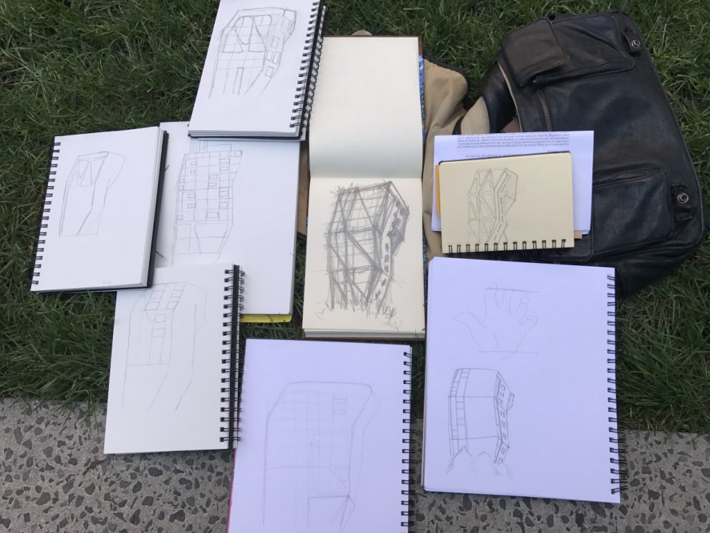
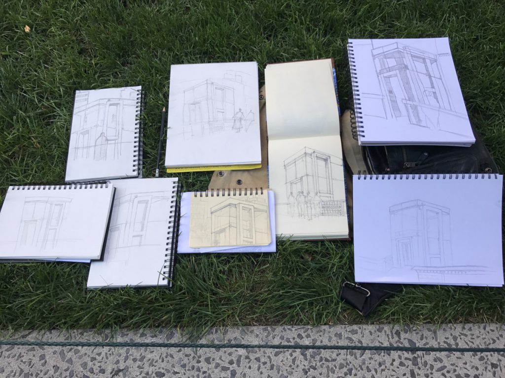
We talked about perspective, did a warmup continuous contour drawing of our hands, and then worked on multiple sketches of the elevator pavilion and the Highline 23, the dramatic building by Neil Denari that leans out over the Highline in a gesture with anthropomorphic overtones.

Below are the sketches we executed on this beautiful September day.