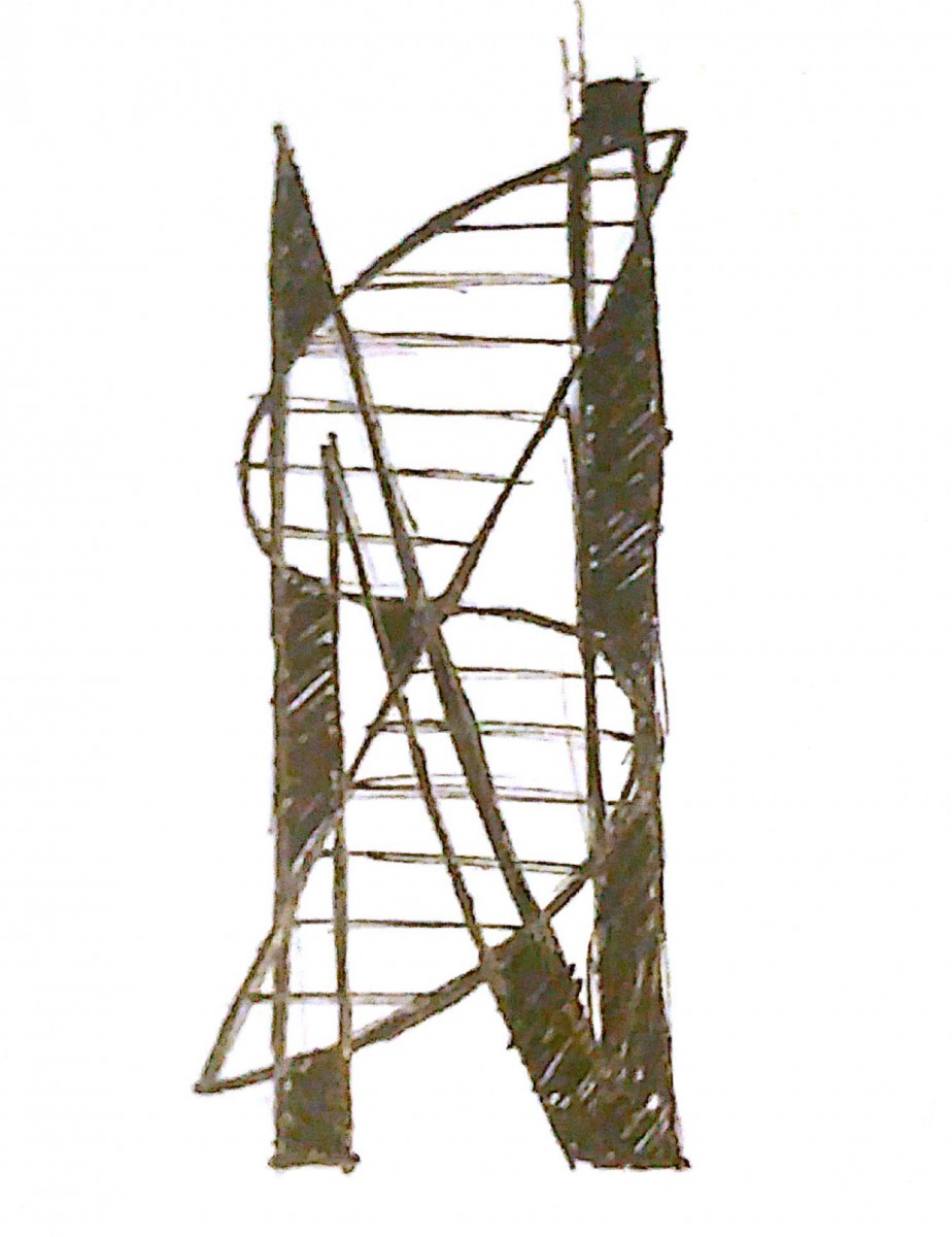
Design 1

This first design shows my two initials, each with a connecting line to close them in as shapes. I chose to include a horizontal line pattern to represent the process for a finished product. I did not choose this for my final design because it seems limiting in terms of color.
Design 2

This design used the same idea as the first, but instead of horizontal lines, I used a repeating line pattern to repeat the shapes of the letters. This however, did not appeal to me in the same way as the previous one. I also wanted to make the letter ‘N’ more recognizable.
Design 3
This design took elements from the previous ones, but added new ones as well. I took the ‘S’ with the horizontal line pattern and overlaid it with a bold letter ‘N’ instead of having both as shapes. I also made the overlapping areas of the letters be black and white in order to better distinguish them.
Final Design
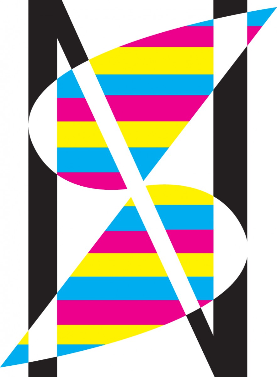
Thought Process
For the final design, I took the elements of the sketch and added color to it. For each stripe created by the horizontal lines inside of the ‘S’ shape, I included the colors cyan, magenta, and yellow. For every area that the ‘N’ did not overlap, I colored it black. I used these 4 colors to represent the colors used in printing (CMYK). Every area that the letters overlapped was white to help separate the two. I do however think that the design could have been better in terms of the colors. I wanted to use the CMYK colors together to represent printing, but the way i arranged them seems to be a bit overwhelming.

