COMD1112-Designer Research
Original file link with images:
“Give me liberty or give me death”
——Seven, the artist with freedom and rebellious
Seven, or we should call him “切尸红人魔”(the red devil is cutting death body), is an illustrator. We can sense his Bohemian, free-loving soul from his name. His real name is CAI Qi’an, a low-key and introverted boy from Zhejiang province who graduated from Beiyi Environmental Art Major. He become a high-profile young cartoonist in recent years, published several early on a need to comics, then signed a contract with sen rain culture, have issued a “Red Angels”, “Chinese Queer” such as reputation and sales are good works, his painting style, his works well to achieve a balance between the artistic and commercial. Now he lives in Hong Kong. The cartoons of this young Chinese artist are deeply rooted in the social reality of China. As a film lover, he was inspired by contemporary Hong Kong cinema. His book, The Red Angel, was published in France in 2016 by China City Press. Although Seven is in a young age, his paintings are not at all immature, sometimes a bit decadent, a bit dark, and sometimes filled with youthful atmosphere.
Seven’s painting style is very recognizable. However, his comics published in 2013 “Did you eat shit today?”, it doesn’t seem to have a trace of his recent painting style, it can be said to be a recognizable lower Japanese comics. In 2014, he published a short comic “The hills,” it made great changes have taken place in the upper works. Seven’s painting style in this work has started to take shape.In his words, “The painting style of “Have shit” was still popular in that period. At that time, I was still in high school, and I could only touch the computer once every half a month. So I drew casually. When I drew “The Hills”,that was in my freshman year. But why so much difference, in fact, I do not know.May be, in senior year, I participated in a variety of training, broaden a lot of horizons.” Seven failed the college entrance examination in 2014 and went to a third-rate university. At that time, his failure in the college entrance examination hit him hard, so he didn’t paint for almost half a year after entering the university. Seven had also tried to stick on the bar for contributions, but from beginning to end no one asked. Later, during the winter vacation, he published a short cartoon, which contained all his thoughts during that time, including disappointment, madness and some things he wanted to say to himself. It was because of this short story that we first got to know him.
Since the end of 2019, Seven have published 1 to 4 chapter of “Chinese Queer”on his Weibo( A Chinese blog web), which is composed and painted by him. “Chinese Queer” tells a story that Tian Fushi , senior students before graduation,is a gay who is more than two hundred pound. He never left the city he live since he was born. He will be all life’s happiness and unhappiness comes down on the city, in loose in the university, he met some people, have a few things, finally to decide whether to leave, in another life. Many people attach great importance to the label of “gay” in “Chinese Queer”. In fact, in Seven’s words, it is not. This label is the weakest in the story, and the concept of love in it is the same with heterosexuality. The protagonists also talk about love, will be dumped, will have sex, but the object is a man. And the theme of the whole story has nothing to do with gays, it’s a state. But then again, it’s not unusual for people to care about the label, because in today’s Chinese society, the role is so marginal that it’s hard not to be surprised to see it on the stage. In 2020, “Chinese Queer” is selected for the Angoulême International Comics Festival Award.
From Seven’s paintings, we can feel his rebellion against life and society. He wanted to express something that other people could feel. He created his unique style by using sensitive subjects and used paintings to express his ideas.
Some Seven’s works:
Sources:
Paint lover, “What seven brings me”, Sohu blog, July26. 2018, https://www.sohu.com/a/243529880_100127162
Sarbacane, “Chinese Queer”,Book edition website, Sept 2.2020, https://editions-sarbacane.com/bd/chinese-queer
“Comic strip, Angoulême Festival 2021: the official selection”, Nov 21.2020, https://www.world-today-news.com/comic-strip-angouleme-festival-2021-the-official-selection/ No author
Madaoooo, “A strange buYt funny Comic”, comment blog,Aug 30.2018, https://book.douban.com/review/9623954/
Egunbilu, “Interview of Seven”, Nov 28.2020, http://www.drh2010.com/news-7/36795755.htm
Seven’s profile ,Youyaoqi Chinese comic website, https://i.u17.com/2390882/
cute meme
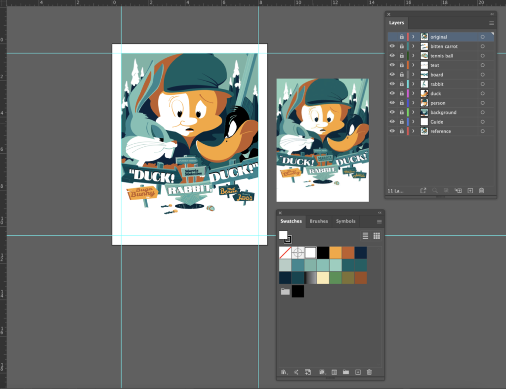
facsimile of cartoon poster in AI
COMD1112-Logo history research
Original file link with images
Since Google changed its logo on Sept 15,2015, it has changed six times with 7 logo versions. I chose it because google has been changed many times to their logo. And they will redesign its logo for every special date or event which is “Google Doodle”. What made Google change its logo and how did “Google Doodle” be created are interesting things I want to find out.
In the very beginning, Google was not called “Google” but “BlackRub”. In 1996, Larry Page and Sergey Brin, the co-founders of Google, developed a search engine called BackRub. It ran on Stanford university servers for more than a year. The BackRub is Google’s predecessor. The original Logo was created by Larry Page with a red BackRub on one hand.
On September 15, 1997, the domain name Google.com was registered. Google, the name comes from the mathematical term “Googol,” meaning the number 1 followed by 100 zeros. At that time, the logo was a bold font with a red shadow, and the Google letters were also used in the logo for the first time.
In 1998, when Google was launched, the Logo was finally joined with the words “!” To Yahoo! Salute.The logo used Baskerville Bold with shadow and rounded. But before that, there was an original logo that the initial G was Green. This 1998 version of the color sequence is still in use today, although there are different tones and fonts.
The Catull font logo was created in 1999 that removed the exclamation point.” We had more colors,” Kedar says, “but in the end we went with a primary color.” The final Logo was also used by Google until 2010. Google grew between 1999 and 2010, when it used that version of the Logo, and on April 28, 2004, it had the biggest IPO in history at the time. Before this final logo, Page and Brin invited Kedar to help them design the logo. She used Adobe Garamond typeface to design a black logo and removed the exclamation point. Page and Brin loved her use of the Chinese finger trap element. Then Kedar also tried out the catull font design, adding color and interlocking Os. After several attempts at design, Kedar used shadows and bold lines. The final version of the design was used in 2010.
In 2010, Google introduced the new Logo again. This version of the Logo is based on the previous version, the shadow has been removed, the letter O changed from yellow to orange, appears more bright.
To keep with the growing trend of “flattening” in the tech world, Google introduced a new Logo in 2013 that went on to remove the letter highlights from the previous version.
In May 2014, Google introduced a new Logo. Does it look much the same as the previous Logo? Take a look at the diagram below. The new Logo has only a few changes to the position of the letters “G” and “L”, as shown above. The second “G” moved one pixel to the right and the letter “L” moved one pixel to the right and one pixel to the bottom. According to a Google spokesperson who contacted Gizmodo, they tweaked it “to make sure it looks its sharpest regardless of your screen resolution“. After this modification, the alignment of the Logo has been enhanced. This also reflects Google’s pursuit of detail from the side.
In 2015,the font of this new Logo has been changed. The original serif font changed to a redesigned sans serif font, which makes the whole Logo look more concise. As for the reason why Google changed its Logo this time, it has something to do with the fact that Google is now one of the subsidiaries of Alphabet.
It’s the biggest change to Google’s Logo in more than a decade. In this sense, Google’s Logo change is conservative and cautious. But that’s because Google has another space where they can let their imaginations run wild in the Google Logo. That’s the “naughty” Google Doodle.
Google Doodle, also known as the Google Doodle, is a special Google design based on the original Logo. Before the company was founded, Google’s two founders were visiting the Burning Man Festival in the Nevada desert. They created a Doodle after the second “O” of the word Google. In 1998, before the company was founded. Google’s two founders, visiting the Burning Man Festival in the Nevada desert. They created a Doodle after the second “O” of the word “Google.”
So far the Doodle team has created more than 2,000 doodles on Google’s homepage around the world. These Doodles, also to the regular trademark for Google, have added a variety of brand images.
Therefore, from 1996 till now, as Google continues to program and improve their search engine, they are also exploring how their logo will look to the public. And Doodle gives people a platform to show the design used in the Google logo. It not only formed the Free and diverse Culture of Google but also from a unique perspective, the interpretation of the Internet spirit of this era.
Resources:
Feinberg,Ashley, “Google Changed Its Logo This Weekend and You Didn’t Even Notice”,GIZMODO, May 12, 2014,
https://gizmodo.com/google-changed-its-logo-this-weekend-and-you-didnt-even-1582005359
Frost, Aja, “The Secret History of the Google Logo”, HotSpot, 2019,
https://blog.hubspot.com/marketing/google-logo-history
“Get the story behind Google’s Doodles” ,9to5 google, july 2011, No Author
https://9to5google.com/guides/google-doodle/
Gill, Rituraj, “5 Crazy Facts About Google Logo That Will Blow Your Mind”, designhill, Logo Design, May 2, 2018
https://www.designhill.com/design-blog/crazy-facts-about-google-logo-that-will-blow-your-mind/
Kastrenakes, Jacob, “Google has a new logo”,The verge,sep1, 2015
https://www.theverge.com/2015/9/1/9239769/new-google-logo-announced
“The History of the Google Logo, from 1997”, PC Steps,2015, No Author
https://www.pcsteps.com/4694-the-history-of-the-google-logo/
Original logo company website:
Our mission is to organize the world’s information and make it universally accessible and useful, 2020, https://about.google
Google Logo, Wikipedia, 2020https://en.wikipedia.org/wiki/Google_logo
Google’s New Look, Doodles Archive, 2018, https://www.google.com/doodles/googles-new-logo
COMD1112-Visual Quotes project
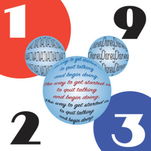
“The way to get started is to quit taking and begin doing.”——-Walt Disney


The basic idea is wanted to point out Walt Disney’s idea that makes him succeed.


