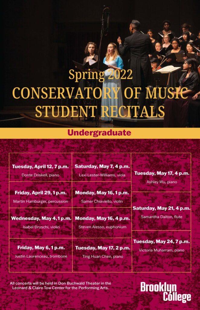
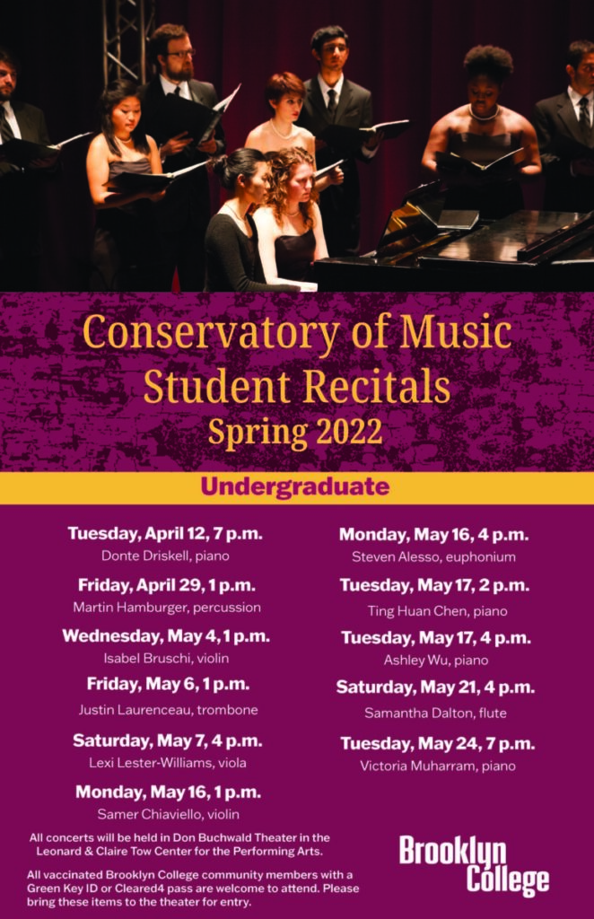
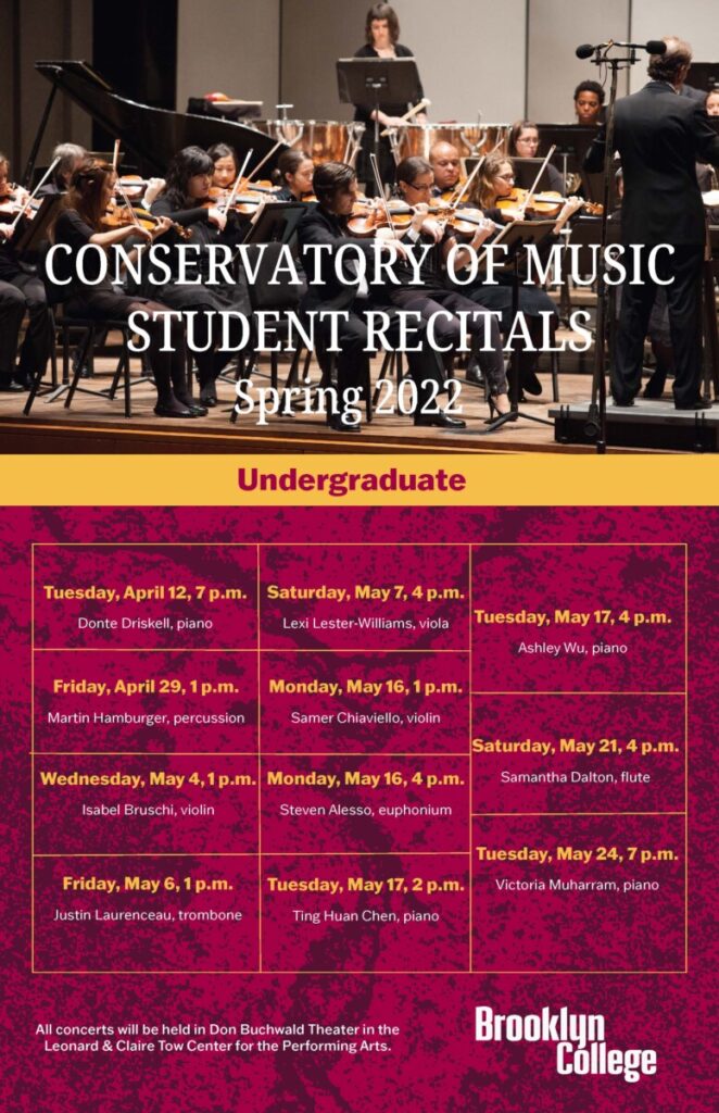
During, the internship I was given an assignment that would get me accustomed to the brand guideline that I would be using throughout my internship which was first to make a poster based on a talking panel that would be at the school, detailing information as to who would be there, information about the guest speakers and how to get more information about the event. In the beginning stages of making the poster, I had to make various iterations of the poster which both can back with editing notes on how I could improve on the poster, such as how I should be viewing my color choices, type layout, and the spacing in which I should be used to give the poster breathing space in terms of type, photo, and logo placement.
This soon led me to my second assignment, which, was to make two posters based on an upcoming spring 2022 student recital for undergraduate and graduate students. I start off making poster-based off work that I had previously seen done by using certain colors, textures, and fonts. With various versions I learned that I had to be aware of making the posters readable; the use of texture can’t be so present in your work, and to beware of your photo choices and font placement. With the various editing notes, I was given I was seen made aware of how much of their work was to look like one person had made them all with the use of brand guidelines.


Leave a Reply