
McDonald’s
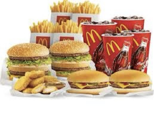
McDonald’s is one of the largest famous chain of fast food in the world. It’s famous for its hamburgers, cheeseburgers, french fries, soft drinks, milk shakes and other desserts.
 The first McDonald’s was opened by two brothers named, Richard and Maurice McDonald. They used to work in their father’s food stand in Monrovia, California, where they sold hamburgers. In 1940, two brothers moved the restaurant to San Bernardino, California and named it “McDonald’s Bar-B-Q”. Even though the restaurant was mainly for barbecue, they realized that most of the profits came from hamburgers. Therefore, they decided to sell hamburgers, cheeseburgers, fries, shakes, soft drinks and apple pies. In 1948 they reopened the store and shortened the “McDonald’s”.
In 1952 they started franchising. In 1954, Ray Kroc bought a franchise and from then McDonald’s starts its expansion. By 1958, McDonald’s Corporation had 34 restaurants and by 1959 – 102. Ray Kroc bought out McDonald brothers in 1961. In 1962, McDonald’s got its, famous Golden Arches logo and a red-haired clown, appeared in 1963. McDonald’s had skillful marketing and was very fast in responding to customer demands. They experimented with new types of hamburgers constantly and some of them succeeded while others didn’t. Big Mac appeared in 1968 and became popular immediately.
A significant part of the success of McDonald’s is associated with its striking logo design.Famously known as the Golden Arches, the emblem of McDonald’s has a fabulous story that 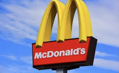 should inspire every graphic designer. The journey of McDonald’s logo begins with the rapid growth of its business. Those Golden Arches are among the most popular things on Earth’s surface. Through North America and the Middle East to Sub-Saharan Africa and Subcontinent, McDonald’s restaurant logo can easily be identified from any geographical perspective by anyone. McDonald’s logo was redesigned several times before it went through the final redesign in 2003. The famous arches, however, remained a part.
When Ray Kroc took over the company in 1961, the two arches were merged to form the new McDonald’s logo which looked like the letter “M.” For their logo design, McDonald’s uses the Golden and Red as primary colors. The Golden color reflects its first franchised restaurant’s iconic arches, while this company’s food industry is represented by the red color. McDonald’s logo uses the McLawsuit font in its name. The simplicity of the fonts makes McDonald’s name look attractive to the eyes.
Reference:
https://corporate.mcdonalds.com/corpmcd/about-us/history.html
https://www.google.com/amp/s/www.history.com/.amp/news/how-mcdonalds-
became-fast-food-giant

