Journal 1 – The beginning
Hello my name is Ronald Rodriguez I am a Graphic Designer who specializes more in Illustrations and Fine Arts. But I am very well versed in the Visual language of Graphic Design that you would find in logos and ad campaign. Next semester the spring semester of 2022 is my last semester. The company I am working for is called All Graphics being supervised by Marla Gotay. Taken place in the Fall Semester. I found out about this opportunity thanks to the school COMD 4900 Open lab page. It was resource I used to help find a job instead of spending hours tryin to get one threw indeed and who knows when they would bother to write back to you. Although its not focused specifically in fine arts and illustrations I am extremely thankful for the opportunity and learning how to manage my myself in a real work environment a long with other alumni student’s.
Journal 2 – The application process
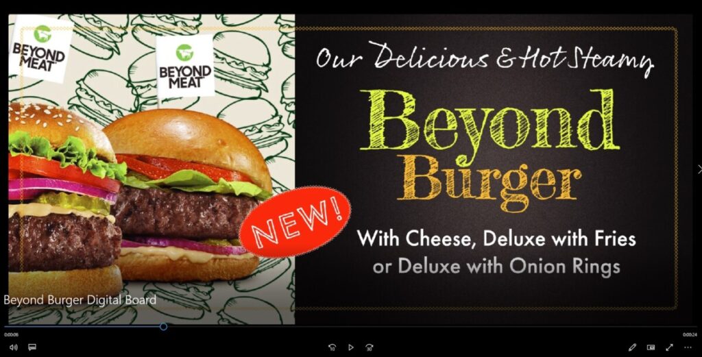
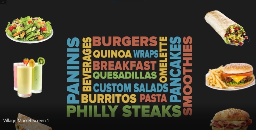
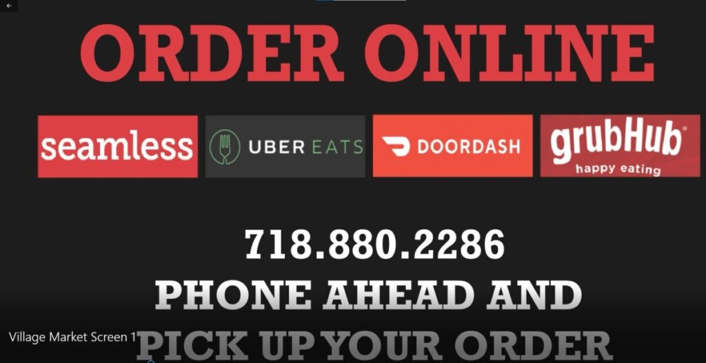
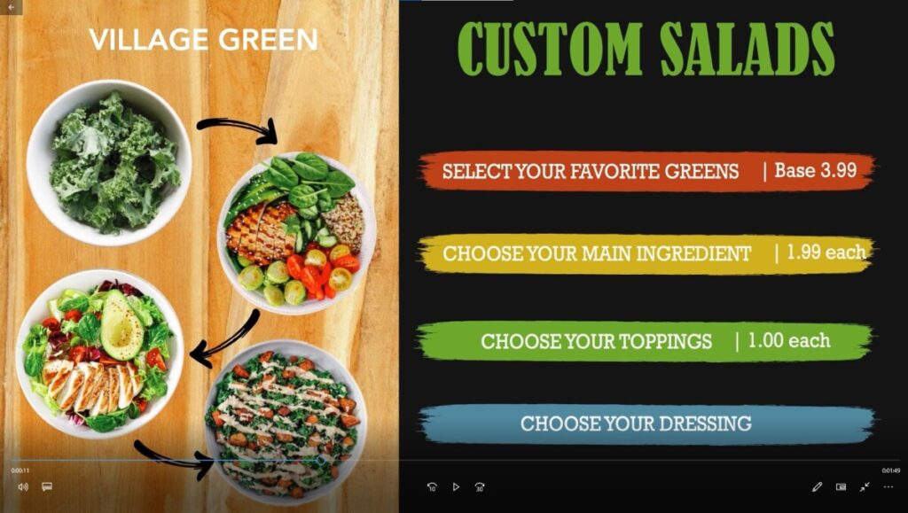
Once I found my internship on the COMD4900 Open lab page and applied by sending an e-mail of my resume and a link to my portfolio I got the job. We had a zoom meeting the following day to let me and the other alumni what’s to be expected and basically we went head first into a our first project. I work for Marla along with other Graphic Designers that go to City Tech. We work on projects for her clients. The first project, which I am currently working on is a digital menu board, just like the ones you would see if you walk into a McDonald or any other fast food place. I am using after effects make this happen. The overall experience of the first week been pretty cool to begin with and what’s even better is I have fellow alumni students that go to City Tech so the connection feels a lot more easier and more natural instead of trying to communicate to someone you meet only once on zoom call. Furthermore, the team environment is great, for asking them questions of they went about certain situations and getting feedback.
Journal 3 – Project 1
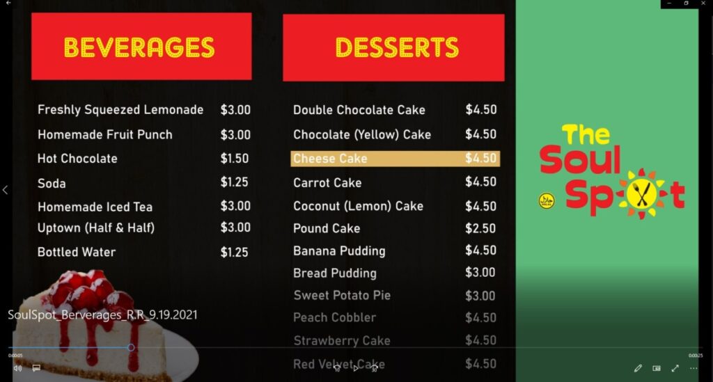
Now that I got the first week under my belt. It was time to focus on project 1. Project 1 consist of creating a digital menu board on after effects. My thought process went as such. I first like to get inspired and look at other works that have been done by professionals in the field. So I looked up Digital menu boards to get a sense of how other professional handled menu boards and a common theme between all of them was the layout. They all had 2 or 3 colors at most and they were all nice a clean to read (San serif font most of them) and they also gave you enough time to stop and stare at the menu board, which is crucial for customers to make there choice. Once i got a grasp of the idea, I jumped straight into the adobe programs such as illustrator and InDesign to first layout my composition of the menu board . I later created outlines for each component in the layer and brought it over to after effects. In after effects I would animate each layer to resemble a digital menu board in which you would see in a restaurant or fast food place and that concluded project 1. As for what’s next I am getting started on my next assignment which is creating a wall design for the restaurant. Should be fun as there is a lot of creative freedom involved here.
Journal 4 – Wall Spot
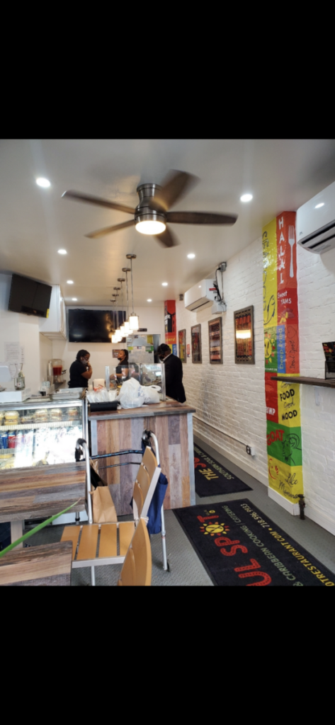
As mention before I wrapped the first project and moved on to the next assignment which is creating a wall design for the restaurant. Basically I had to create 3 different wall designs for 3 different separate walls and come up with several ideas that would look nice but most importantly cohesive with each wall and brings out the theme and ideal of the restaurant. One of the hardest hurdles was without a doubt was creating a wall design for 3 different walls that are vertical not horizontal. So many of the ideas that i had sketch up and looked on the internet had a horizonal format. So I was stuck in the drafting stage for a while but later came up with a solid solution for that could be done for more than 3 walls if needed. The constant was gathering different words that fits the theme of the restaurant. So I would pick a bunch of different words that are meaningful to the to restaurant and words that the client liked or wanted to be apart of the wall design and gave most of the words there own individual font and image or turned it to funny play on words and got it done for all 3 walls.
Journal 5 – Back to the basic
Now that I completed my second assignment which was received so well that, that not only does owner of the restaurant loves it. I even got paid for it even though it this a unpaid internship. That made me feel really good and gave me more confident in my work and in my abilities. Now that I got that over with I moved back on to doing digital menu for a another client. This process was very smooth. As not only am I getting more comfortable working from home and but communicating with my advisor Marla so we could both figure out what’s the best way to go about the menu board. The process was fairly the same with using InDesign and illustrator to set out my thought process and than transitioning the layer over to after effects to animate the layers. the biggest difference between the first project and this one is the process was a lot smoother and faster than before. I used the feedback of before to simplify the boards as the first felt like there was too much on the page going on. Furthermore, to think bigger and to try really fill up the page.
Journal 6 – Lessons to be aware of.
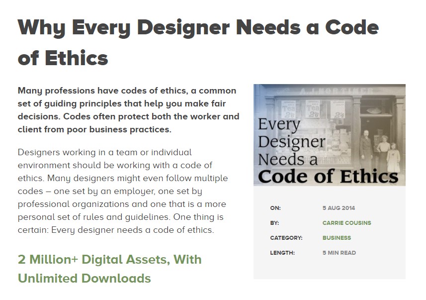
This week it was a fairly calm week it was more of the same, only different is that we have more alumni working in the internship which is cool and getting to know new people having them on board and seeing their process and how they approach a creative idea. Which made me reflect on the article I read for COMD 4900 as a discussion board “Why Every Designer Needs a Code of Ethics” one point that stood out to me was how designers interact with each other. In college most of your projects are going to be worked on separate so you wont have much experience with working with other designers, so you could very easily just ignore other peoples idea or even feedback since your not use to working in a team environment and think your choice is the best choice, but is so important to bounce ideas off each other. Why? Because of competition. I’m somebody who can relate to seeing others people work and wanting to do a better job. Its what makes this fun. Furthermore, they speak about designers responsibility to the public. This is significant as I remember reading a graphic design book an the author mentions what separates a graphic designer to an artist is the graphic designer serves and helps society by combining the communication skills and their industrial skills to further push society forward.
Journal 7 – Business as usual w. some Business Etiquette
This week has much like the previous week has been fairly slow and more so of the same as the other weeks. Doing more menu boards on InDesign. Furthermore, I did get to create a group of flyers for a restaurant prompting some of the foods they are most well known for. For this i used my comfort of photoshop. When ever I get put on a project that gives me a creative lead to do what I like I kind of just default to photoshop since is the program I’m more well versed in. For the most part I am very much enjoying the internship.
In these more slower weeks I tend to reflect more on readings that have been given to me by professors and how I can use these lessons to make me not only just better as a graphic designer and artist but also a better partner, or leader. In the article I read this week about Business Etiquette called Virtual Office Etiquette: 10 Common Sense Tips, I learned that is important from when I first join a the zoom call to say good morning to my advisor and peers small communication queues like these can brighten anyone’s outlook to the day. Furthermore, from the time we get together and give feedback to each others work a golden rule I believe most artist were taught especially in city tech is first tell your peers or student what’s working and why you like it and than give 1 critic on what is not working and how they can further improve on it instead of just saying “I don’t think this” or “this isn’t working for me etc…” Reasons being is that being an artist there is a sense of pride and attachment you feel when you make any sort of work. No one wants to hear this is bad or this is not working. Is important to explain wrong by being critical and explaining fundamental design concepts that maybe lacking like composition, use of space or color theory just name a few. You could also approach it as you like this concept but if you take it into this direction your concept would be better understood. Is important to understand people and how certain could react.
Journal 8 – Internship and salary promotion
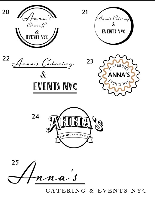
This week is has been a little better compare to the other last two weeks. There has been more client work for me. From designing logos, which is a first for me regarding to doing logo’s for this internship. I don’t normally get to work I mostly work on menu boards but it felt good getting to work on some logos is something that I have always enjoyed and reminds me of some of the work i have done from classes I have taken. I also started on working on more digital menu boards. It felt like so long since I worked on a digital menu board. Getting back o the logo design. The logo I was working on is called Anna’s Catering & Events NYC. Is the name suggest is a catering company and I had few concepts for the logo in which I mocked up. The client did mention that she liked more of minimalistic style to the logo and really liked script font. So I took the feedback and made logos that I felt cater to the company’s look and the clients desire. I also gave her different options to see which one she would lean on, some that weren’t focus on script. As for internship class I read an article called “Knowing Your Own worth.” This is something that many students underestimate. As they feel since they don’t have any experience, they could work for low wages or for free. It’s important to evaluate your skill set and how you stack up with other professionals in the field. If you find yourself creating work similar to professional standards you should get paid as such.
Journal 9 – Internship and navigating the highs and lows of the semester.
Last week was a bit stressful week as school projects, internship and personal projects are starting to get harder to manage. Im trying to prepare my illustration skills for senior project as that’s going to be huge for my portfolio. All that aside the internship been great. Its not as slow as previous weeks there’s actually a lot of work to be done but is fun more menu boards coming up with different ideas which represent each business likeness and tone. I am currently at around 100 hours into the internship.
Furthermore, i read an article regarding to copyright and trademarks and i learned that there is a difference between copyright and trademark. For some reason I always assumed that copyright and trade mark meant the same thing, since you always see these words together. But the difference between them is Copyright is a form of protection for original works of authorship. Meaning that not everyone can use a piece that can be taken from a poem, music or film use it as there own. While trademark focus on a word, name, phrase, or logo that identifies a product of logo. Trademark is more associated with company’s or a person branding or likeness. It also helps by protecting me and other artist work from being stolen and letting someone else profit from your work.
Journal 10 – Reflection
I have currently completed my 120 hours im at 136 hours as of this week. I’ll be giving my time sheet this week to my supervisor. I am currently still creating digital menu boards. Furthermore, I have been given the option to stay on board with the internship. I haven’t decided as of yet if i do want to go back. Honestly, i just feel like I am trying to survive the semester. This semester has definitely been the toughest semester I had and just trying to find a balance between work, school, and personal projects has really been difficult but we keep going the semester is almost over. I have definitely taken a lot from this internship and learned a lot. From working in groups and communicating what’s needed from each other. To learning how to organize your flies for someone who doesn’t know the way you work would be able to comprehend it. To furthering my learning and understanding of After Effects. It’s been overall a very enjoyable experience. I felt I like I worked fast and accordingly. I do feel like i need to learn how to take criticism and better implant those critics into my work, is something I feel like I been trying to get right for sometime but I have gotten better overtime.

