
Raymond Lugo
9/14/16
Umbro: The evolution of the Rhombus
Umbro is a dominating company within the worldwide soccer circuit and provides a wide array of soccer gear and apparel, most important of all of the being cleats. They are not as well known as adidas or Nike, obviously, but nonetheless imperative and their logo is a very recognizable face of the soccer world.
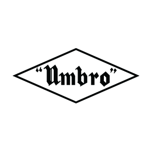
Umbro was formed in 1924 by Wallace and Harold Humphreys in 1924 as a humble football store. The name of the company is a slight portmanteau of their last name. Their first logo was a humble black rhombus with the company name inside of it. For some reason, the company name as dashes on either side. The name itself is in Old English text.
←–Pictured: original umbro logo
http://www.hdicon.com/wp-content/uploads/2010/05/umbro_1924.png
The 1930’s is when the logo began morphing into something that resembles the modern logo little bit more. With a change in font with the name, they got rid of the dialogue punctuation and made the rhombus frame a solid black. There is little change between the 1930’s logo and the early 1960’s logo except for the name of the company wrapping to the shape of a rhombus. Between the late 60’s and the entire 70’s, the logo saw a complete lack of the company name within the logo, much like the current Umbro logo. The 70’s is also when they finally came up with the double rhombus shape that is used to this day.
https://s-media-cache-ak0.pinimg.com/originals/34/38/b3/3438b3b9eec10cff39d162ebf8fa4e9f.jpg

