Society of Illustrators
On February 28, 2012, my classmates and I went to the Society of Illustrators exhibition as our first field trip. My experience going there was something new while having a rush of excitement. This exhibit cannot be compared to the well-known museum such as the Museum of Natural History, The Met, The Guggenheim, and MoMA. I’ve been to all of those museums, and it always has been the same every time I visit those. Despite the fact it’s a small place, I still had a good time and experience. The overall presentation of this exhibit is that many artists showcase their magnificent artwork to the public. Most of the artwork are illustrations, which the exhibit’s name is pretty much self-explanatory. Their purpose of establishing this society for people that wants to go into this field to get inspiration from known artists, and a place for established artists to come together and see their current work. For our field trip, we have to pick and choose three artworks from this exhibit.

Regan Dunnick
Design is Everywhere
Medium: Mixed media
Art Director: Cody Maple
Client: RCAD Design Center
Category: Advertising
This was the very first illustration artwork that caught my eye. It looks as though it has been drawn on a mere piece of a sketchbook paper. As if a student became bored in his/her class, and started to doodle around. I find this fascinating and intriguing because the main concept is pretty much self-explanatory, Design is Everywhere. We see and display numerous sorts of designs anywhere in our daily lives, whether it’s huge or tiny. Designs will never die out. It will continue onward to the future generations who want to go into any design fields.
Leo Espinosa
Nicolukas Holiday Poster
Medium: Digital
Art Director: Lucho Correa
Client: Nicolukas
Category: Advertising
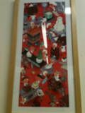
I find this piece of illustration artwork utter cutesy, and a feel of becoming a child once again. It looks as though those little people are working in a sweet factory preparation for the Christmas Holidays. Personally, I absolutely adore it. The reason is because there’s lots of relation between this artwork and I. My favorite holiday is Christmas. I like and enjoy eating sweets. Lastly, how it’s drawn is somewhat similar as to how draw, and as if I’m doodling around in my sketchbook.

Stephen Savage
Read Every Day. Lead a Better Life.
Medium: Digital
Art Director: David Saylor
Client: Scholastic
Category: Institutional
Why is there a seal casually reading and sitting on an iron ledge? It looks as though the construction workers don’t mind at all having a seal as part of their crew during their reading break. I highly find this piece of illustration artwork somewhat amusing and humor. Also, I find the title of it in a truthful way. Read Every Day. Lead a Better Life. Reading everyday will accomplish one’s future goal or career. If one has strong determination and confidence, he/she will have a successful life. Another matter I thought is that seal is reading. Does it mean that anyone and anything can or try to read? It could be a mere assumption, possibility I came up with.


