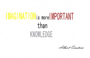
I selected this quote, because I think that with our imagination we can do almost everything. For the visual quote with background image, I selected the font Viner Hand. I took particular attention to the relation of the colors. As you can see the color for the word imagination matches the color of the figure and the color of the word knowledge matches the color of the shapes in the background. I am trying to convey the message that the figure is imagination and the background all the knowledge. The background image includes a 3d model that was edited in a 3d application. For the typography enhanced quote. I created and emphasized the size and color of the words imagination in yellow, important in red that are the most significant words in the quote. Also, I scaled the words and repositioned in the space to get the actual look of the quote.
Category Archives: Coursework
Research Report
Logo Research (Android):
Android is an operating system for tablets and phones created by the Open Handset Alliance. Android is a very popular system for smart phones since Google acquired it in 2005. According to famouslogos.us 400 million Android devices have been activated and 1 million activations are made per day as of mid-2012.
The Android logo is the shape of a robot in a solid green color, created by Irina Blok from California. The font used is the custom typeface Norad produced by foundry Ascender Corporation in Chicago. According to famouslogos.us the green color stands for growth, freshness and prosperity.
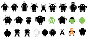
As you can see in the images above, this logo has always been subjected to different versions before its creation. As Irina Blok clarify:
“This logo is designed to be international symbol for Android, and it is open source, just like the platform itself. There are no cultural references to any other characters or cultural icons… The process was very simple – we talked to the founder of android and did a research on the whole android/robot theme. It was clear that the logo needed to relate to the name, and the first step was to create a huge mood board with all kinds of droids, robots that were inspired by the android operating system. Next step was to explore a variety of visual languages and directions – ranging from pixel based, realistic to cartoony. There were 2 designers working on this – but at the end my sketch was selected…it is ironic that the most basic symbol was chosen. In fact this was my first sketch that I created in 5 minutes, and after that we spent weeks ideating and sketching more. I think the simplicity of this mark really made a statement, this became an international symbol of android (just like airport signs: men, woman, android)…”
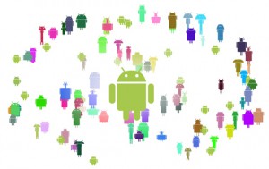
As per thenextweb.com, the Android logo was used by other Google members to practice their design skills as you can see in the previous image. In addition this logo was created with the intention that everyone could customized as they want. For example there are the most recent versions of the logo that were made as a kit kat and another one with a lollipop. Also there are different versions with flags and other props to mention some of the variations.
Sources:
famouslogos.us Android. Web. 9 Oct. 2015.
thenextweb.com The Stories Behind the four World famous Logos. Web. 25 Nov. 2015.
Google images Android logo. Web. 9 Oct. 2015.

