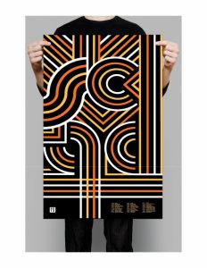
The designer on the left I like her work because of how simplistic, yet creative her design is. It look very colorful and metro along with very commanding and draws your attention to it. On the other hand you have the artist to the right where his design is very modern and simplistic, and his design theme gives the feeling like this is Redbull for dogs and your dog will turn hyper. I also like the contrast going on with the gold silver design. It is very subtle in it way that it grabs your curiosity. Neither is overly complicated be easy to be moved by.


