Author Archives: QiyorkChen

Line Design

Scans-05-13-2015-195113_1_of_5

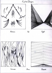
This was our very first project. We had to evoke certain feelings in our art using only lines- Two up feelings and two down feelings.

I chose Ascension and Flight for my up feelings. Although These two are kind of related, I chose them because I felt like I could really emphasize the differences between them. Through the use of curved lines directed toward a singularity at the top, I tried to convey the feeling of being able to pierce the sky, to ascend into the heavens above. For flight, I used straight lines that focused near the center, to give the feeling of flying forward. And by controlling the relative concentration of lines in a certain point, I could really evoke the feeling of the effort involved with flying, from air resistance to turbulence. For my down feelings, I chose consume and pressure. Consume is supposed to emphasize the feeling of falling, being swallowed into the darkness – whether literally falling into the darkness of a maw, or figuratively. The spikes represent the mouth closing around you, trapping you within. For pressure, I utilized a relatively low concentration of lines at the top, however the even spacing creates a sense of enormous weight and, well, pressure. The bottom part features an increased concentration of lines, to evoke the chaotic feeling of using all the power you find against constant, unchanging pressure, however futile.

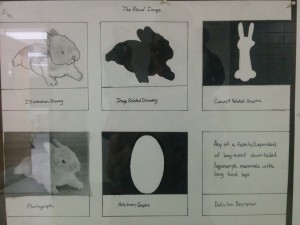
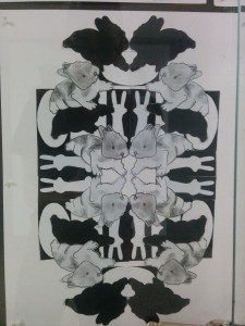
The Visual Image

IMG_20150415_200252IMG_20150415_200309

This project consisted of two parts – first we had to choose an image, and draw things that could be derived from it: first the drawing of the image, then the silhouette, then a concept drawing that represented the image, and finally an arbitrary shape that represented the image. Then we had to combine these individual elements into one image.

This was my favorite project, mainly because I was able to create artwork using a bunny, which is my spirit animal. Aside from that though, I was really amazed by what can be made from simply arranging a few basic shapes together into a pattern. This project really helped me learn how to utilize negative shape – by arranging elements a certain way, the image created by the background can really deepen the impact a piece of art has.

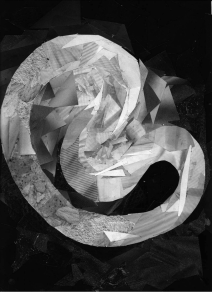
Monochrome Collage

Scans-05-13-2015-195152-2

For this project, we had to do a collage using only black and white clippings from magazines. This was so we could learn about monochrome color, and how to utilize gradation to lead the eye and create a sense of movement.

I enjoyed this one, even though collages are very time consuming, since cutting fine patterns with such an unwieldy tool as a scissor is very difficult, I felt that the end result was worth it. It was very satisfying to see how carefully chosen magazine cutouts could come together in such a satisfying way.

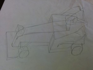
Paraline Drawing – Car

IMG_20150415_172143-768x1024


For this assignment we had to draw a car using the paraline technique. Although this car was somewhat hard, due to the unique shape and large amount of curves, I learned a lot about 3-dimensional objects, and how a box can be transformed into virtually any shape.


Two-Point Perspective Kitchen

IMG_20150513_023150-757x1024

For this assignment we had to draw a two point perspective drawing of our kitchen. I liked that we had to adhere to perspective rules while only being able to use relative angles to draw. It really shows how far we have come with sighting, since before we could only do things like this with a ruler to get guidelines for our vanishing points.


Rocks in the Forest, Paul Cezanne

For this assignment we had to find a painting that we liked in the museum, and try to draw it. I chose this one because I was amazed at how Paul Cezanne’s limited use of only a few colors really brought the painting to life. Consequently, however, this made my drawing somewhat difficult, because I was only able to articulate the subtle changes in hue with only a pencil, especially in the leafy areas of the forest. However, I was able to capture the negative space that the sky created pretty well, and that really added movement to the piece.

Painting Drawing[1]Painting[1]

Welcome!

This is the first post on your Learning Blog. Edit or delete it, then start blogging!

The ePortfolio is both a Learning Blog and an Academic Career Portfolio. Use the Learning Blog to document your learning experiences and class assignments each semester. As time goes by, add content to the Academics and Career sections to show your department, graduate institutions, or future employers how well prepared you are for your chosen career.

NOTE: Remember to add appropriate Categories and Tags to your posts. This will help your professors and other visitors find the content they are looking for. The Categories “Coursework” and “Field Trips” and the Tags “OpenLab” and “City Tech” have already been applied to this post. Feel free to make changes!