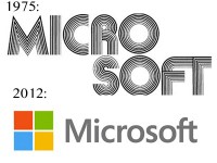
MICROSOFT LOGO; 1975 – 2012

HISTORY
The first Microsoft logo of 1975 is said to be inspired by the disco era of the 70’s. “According to Neatorama, Bill Gates, and Paul Allen designed the logo themselves using ‘BASIC’, a computer language program in less than a day.”
1975 -87: “In words of Kermit the frog, it is not easy being green”
The special “O” was named blibbet, upon finding out that blibbet would no more be 1987, Microsoft employed Larry Osterman to launch a “save the blibbet campaign.” Despite Osterman efforts, it did not impress BigWigs to maintain the blibbet.
1987 – 2012: “the ‘Pacman’ logo by Scott Baker was introduced.”
March 1987’s edition of consumer Reseller News Magazine “The New Logo” in Helvetica italic typeface has a slash between the “O” and “S” to emphasize the soft part of the name, and convey motion, and speed. The slash is said to look like a Pacman.
1994 – 2002
As part of a $100 million marketing campaign, Microsoft brightly added the tagline. By designer Wieden, and Kennedy.
The software giant experimented with various taglines
2012: After 25 years Microsoft finally updated the look of their longed varied logo. Here is how Microsoft explains it. According to Microsoft, the logo has two significant components, the type, and the symbol. The type used is Segoe, the same font used in the products, as well as marketing, and communication. The symbol significance is in a world of motion. The symbol squares of color are intend to express the company’s diverse portfolio of products.
There are also a few designs that never made it to public appearance.


