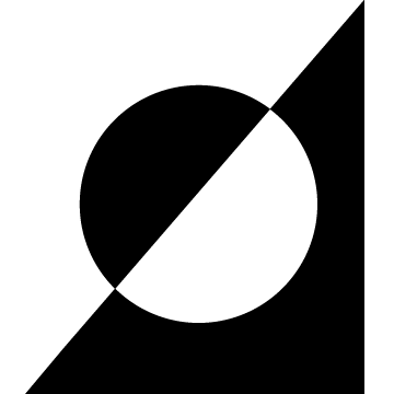
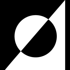
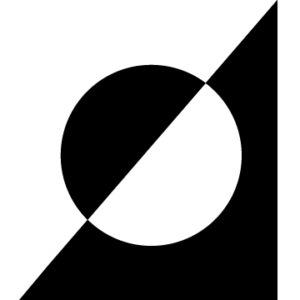
While creating this logo, I was drawn to simplicity. Using custom shapes or more shapes made the logo felt too busy/muddled especially when trying to stay within the theme of only using black and white in the logo. I also felt this would make it easy to invert the colors depending on the background it’s placed on. (Top image is the transparent version.)
The OpenLab at City Tech:A place to learn, work, and share
Support
Help | Contact Us | Privacy Policy | Terms of Use | CreditsAccessibility
Our goal is to make the OpenLab accessible for all users.
top


