Page 2 of 2
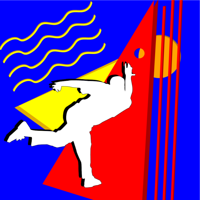
While working on this, my largest challenge was finding a good space to include a bowling ball. The advice to add a shape to the right while I was working on it was helpful in solving this challenge by turning that shape into a circle and turning what I initially had as a ball into a hole. Also, I made an alternate version for anyone looking for a bowler with a little bit more junk in the trunk:
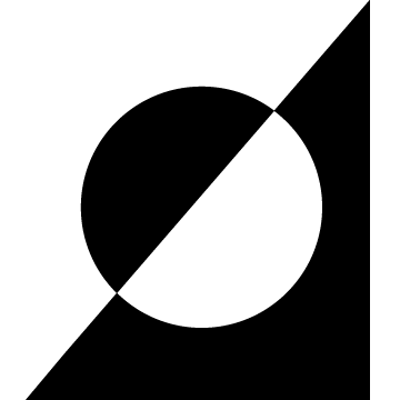
While creating this logo, I was drawn to simplicity. Using custom shapes or more shapes made the logo felt too busy/muddled especially when trying to stay within the theme of only using black and white in the logo. I also felt this would make it easy to invert the colors depending on the background it’s placed on. (Top image is the transparent version.)
Just get ready for all the posts that you are going to see in the near future here on this homepage!


