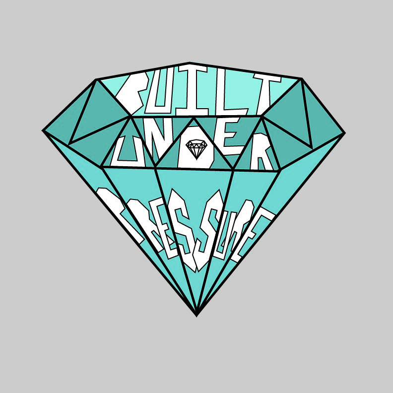
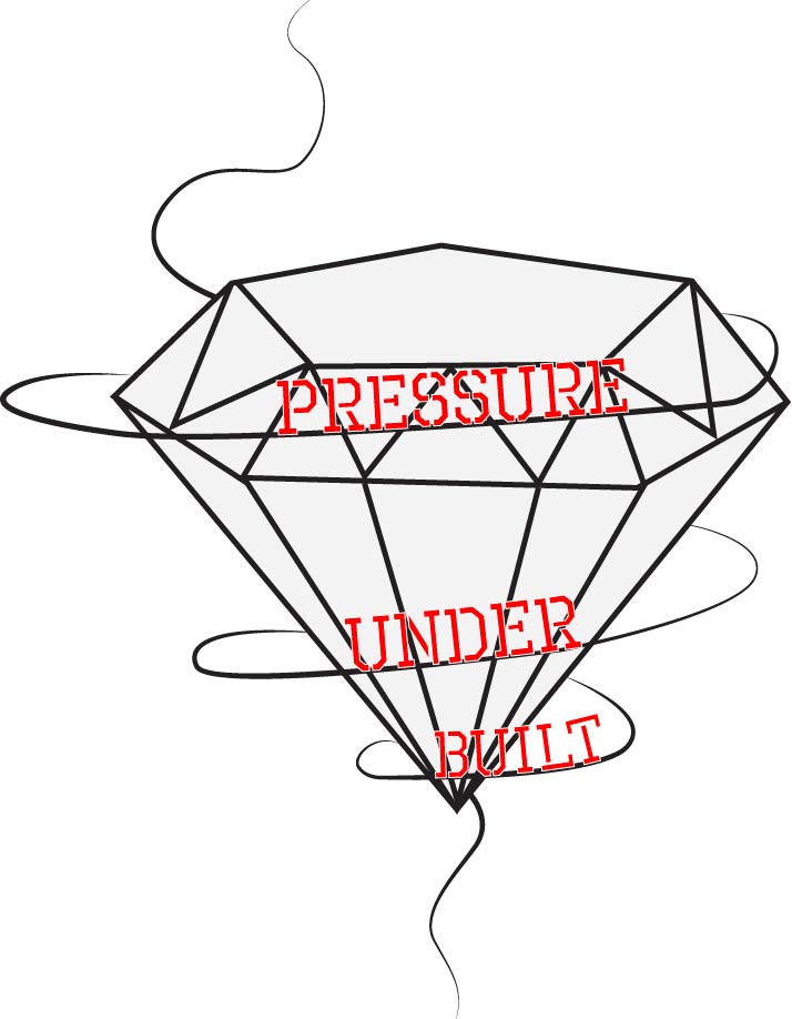
The idea on this graphic design was to visualize the words as shining light on the diamond. The quote itself is referencing the way that price-less diamonds are made. I kept the colors simple and the lines thick to emphasize the phrase.Following the theme of diamond, I changed the type to read bottom to top. The reverse movement and reverse flow was meant to give this design an edgy look. The red font is also supposed to look edgy against this black and white website. The swirved line going around the diamond should is similar to smoke I wanted to give it a free flowing feeling against this rigid structure of the diamond.For this graphic I recreated where diamonds are built. The gradient background is supposed to represent the ground and the depth where the diamonds are built. Darker=lower level= more pressure. The font i chose was similar to how diamonds are shaped so they fit nicely with the diamond graphics. Paired with the same color as the diamonds to tie everything together.