Project Description
Pick a quote from a song, a poem, a movie, or written work and develop over a 6 week period 3 concepts for visually enhancing this quote for a postcard of 8.5″ X 5.50″. Two concepts must have typography or typography with line art. The third concept may contain a photographic image. Writing about your design process for each phase of the project is required.
Reflection
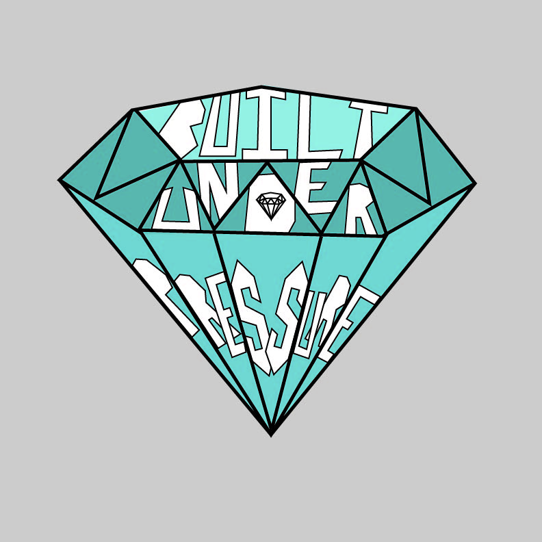
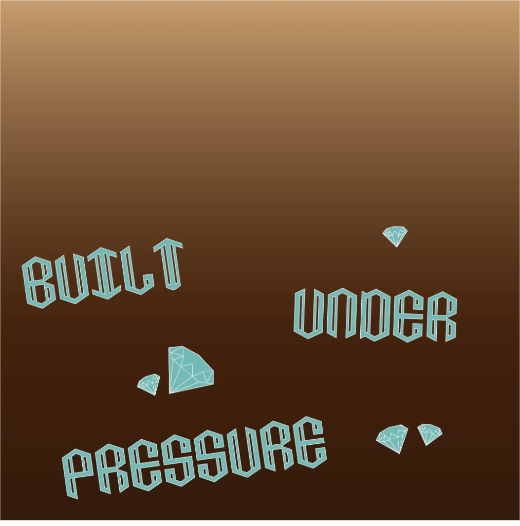
Graphic 1- This first concept I came up with because usually with diamonds there are many reflections coming off of it. I tried to make the letters look weird and distorted, like a reflection would have done to them. To make the actual design stand out more, I added some color to the diamond. I didn’t want to add color to the words however so that they didn’t get lost within the design. After discussing it, I went back and put a thicker line around the white text to make it more legible while keeping it white to ensure this. Overall I wanted this design to portray something beautiful (diamond) and something that hasn’t turned beautiful yet (the words). Graphic 2- In this design I wanted to make something that would be leaning more towards a logo design. I kept it simple to 2 colors because the main focus should be the phrase. I would like to see this design embroidered onto a shirt or bag. The line red lettering is supposed to pop on top of the white or black background. I put the letters onto the design using the type on a path tool so they could be swirling around the diamond. I wanted this design to portray something fancy yet fun. Graphic 3- With this final design, I was thinking more literal. Since actual diamonds are built underground, I thought it would be fun to incorporate that into the design. The entire background works to mimic underground, I used the gradient tool to make it look like you were going deep underground. Then, when you reach the diamonds, the letters are supposed to also be diamonds that have been built under the pressure of the ground. I went online and looked for a font that could resemble diamonds at least a little, because I felt the other fonts did not fit this design. Then to top it off, I added some extra diamonds to make it clear what environment the design is taking place in. This is my favorite design out of the three.
Additional Images

Placeholder 
Placeholder 
Placeholder


