Obed Ledezma
04/11/18
ARTH 3311
Professor Trofimova
For my Midterm paper I decided to write about Johannes Guttenberg and William Morris. Two men from different eras that convey strong similarities within their most notable works of press. I will be comparing both artists’ works and showing their similar styles and differences within graphic design and typography. Both of these men were at the forefront of their movements and were some of the many that led these movements into fruition. These eras were strong in terms of art because they revolutionized the art world on a global spectrum and influenced numerous around them. These men still today live vicariously through their art works and strong presence within the world of graphic design. Before I discuss the works of each designer I want to first start off with providing some information about the designers. To start, Johannes Gensfleisch zur Laden zum Gutenberg was a German blacksmith, goldsmith, printer, and publisher who introduced printing to Europe with the printing press. He was born in Mainz, Germany around the 1400’s. He was associated with the Printing Revolution – Post Gutenberg Era. He started off and introduced the mechanical moveable type printing to Europe that started the printing revolution. It is regarded as a one of the most pioneering things of the second millennium, leading in the modern period of human history. Participating and taking a key role in the development of the Renaissance, Reformation, the Age of Enlightenment and the scientific revolution, laid the material basis for the modern knowledge-based economy and the spread of learning to everyone. He was the first European to use moveable type in 1439.
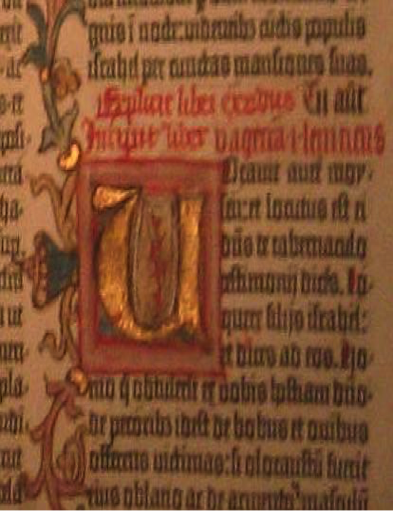
Gutenberg is known for the Gutenberg Bible; the Gutenberg Bible is his most notable work that I have chosen to write about. It started off as him having financial troubles while creating polished metal mirrors then with time he was able to come up with the secret of printing press. By 1450, his press was in operation, and a German poem had been printed, possibly the first item to be printed there. Gutenberg was able to convince wealthy moneylender Johann Fust for a loan of 800 guilders, which was the currency at the time. Gutenberg’s workshop was set up at Hof Humbrecht, a property belonging to one of his distant relatives. It is not clear when Gutenberg conceived the Bible project, but for this he borrowed another 800 guilders from Fust, and work commenced in 1452. At the same time, the press was also printing other, more worthwhile texts. There was also some speculation that there may have been two presses, one for the pedestrian, and one for the Bible. One of the profit making enterprises of the new press was the printing of thousands of indulgences for the church that was documented from 1454 to 1455.
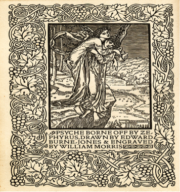
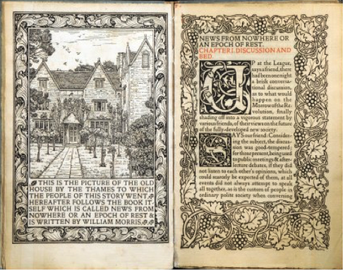
William Morris was an English poet, novelist, textile designer, translator, and socialist activist. He was born in Walthamstow, Essex to wealthy middle class parents. He was linked and associated with the British Arts and Crafts Movement and was a major contributor to the revival of traditional British textile arts and the methods of it’s production. His literary influences helped to establish the modern fantasy genre, while playing a significant role in broadcasting the early socialist movement in Britain. He revolutionized the Victorian taste. He is known for one his most notable works, which is titled “News from Nowhere”. William Morris was a creative writer of poetry, fiction, essays, and translations of ancient and medieval texts. His first poems were published when he was 24 years old, and he was polishing his final novel, The Sundering Flood, at the time of his death. His daughter, May’s edition of Morris’s Collected Works from 1910–1915 that goes to 24 volumes, and two more were published in 1936. Morris also invented three distinctive typefaces those typefaces are Golden, Troy, and Chaucer, with the text being framed with complex floral borders similar to illuminated medieval manuscripts. His work inspired many small private presses in the following century. I will now be comparing the works and pointing out the similarities The Guttenberg Bible and News from Nowhere have with each other. In the Guttenberg bible and News from Nowhere the text is centered. When texts are centered it is easier to focus and makes it more legible for the reader to read. Both books have variations illustrations. In News from Nowhere the book is filled with a cloying amount of illustrations that are black and white. The Illustrations take up a lot of space giving the reader a lot more to see than read. In the Guttenberg Bible there is also illustrations just not the same amount as the News from Nowhere but still a right amount that make the book appear more aesthetically pleasing giving it character. Both these designers included illustrations within their works to give them personality. Although they didn’t consume the same amounts they still used the technique to appeal to the readers and give the book a satisfaction to the eyes. They used illustrations within their illuminated manuscripts to decorate the typeface within their books. On the books, the illuminated manuscripts were made by hand. Both of the books used hardback covers. In both of these books the designers made them about terms that speak generally about strong beliefs that they believed and identified with. In the Gutenberg bible Johannes printed the book, which is intended and based off religion relating within regards to strong beliefs and connected to his ideals and within News from Nowhere by Morris he writes about Socialism. He was a firm believer of socialism and was apart of the movement. Both designers had a strong belief that is why I compared the two. Although you may not see it at first if you were to compare both designers’ works, you will spot the similarities.
The Gutenberg is a bit more upscale but still with a trace of DIY also with News from Now but a lot more decorations. The books are both worth a lot because only a few were made and also because of the elements of them being hand made. The difference with these books are they were made in very far apart times the Gutenberg Bible was created and printed around the 1400s and News from Nowhere was created around the 1800s. In the Gutenberg, color is used within the printing and the within News from Nowhere only black and white was used giving it a heavier contrast. Morris was more inclined within the arts and used heavy textiles and designs while Guttenberg was more inclined with being innovative with the production of printing press. On the Gutenberg bible the amount of decoration depended on how much each buyer could or would pay. Some copies were never even decorated. The place of decoration can be known or conditional for about 30 of the surviving copies. The vellum Bibles were more expensive and possibly for this reason they tend to be more highly decorated, although the vellum copy in the British Library is completely undecorated. The reason why I bring this up is because decoration takes a big part in each of these books as well. While the Gutenberg Bible was more based off of money in News from Nowhere, Morris based his work on the immense amounts of designs and illustrations. To conclude my essay, these men whose works are revolutionary and notable within the world of graphic design are still today celebrated and influence many within the world of graphic design.
The Gutenberg Bible by Johannes Gutenberg

News from Nowhere by William Morris