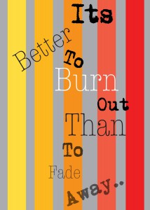
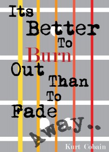
Before After
When updating this concept, there was not a lot of ideas coming into it. Other then the minimalist approach and gray background, the entire first concept was more towards experimenting. The idea of making the background the fret board to a guitar neck came late into the design processe. Following the fret board idea, I made sure I made each block more skinnier and tighter to look more like a guitar. Adding the circles and lines to the background really gave this concept more life and energy. Lastly the words became more organized instead of randomly being different shapes and angles. Just giving them a perfect flow of reading was the main goal and turning the “Away..” into a warp effect with a fade was the cherry on top.


