Archives for category: NYC Subway Series

Fig. 1. Image from: http://network9.biz/

Since 1904, when the subway in New York City first opened its doors, the world has been through a bunch of changes in graphic design norms. Art Nouveau, Minimalism, Cubism and Expressionism: these are just some of the art movements that happened in the 20th century. Unlike the Paris subway system, that displays deep inspiration of Art Nouveau in its architectural traces, the NYC subway remained mostly immune to any specific artistic style.

The typographic mosaic signs present in MTA’s subway system, previously mentioned here, are of Byzantine influence. Despite carrying some influence of an artistic style from several centuries ago, MTA’s subway stations are not overwhelmed by that one characteristic. That it so due to the way the mosaics are displayed next to modern-looking tiles and other neutral elements.

It wasn’t until 1966 that the visual identity of the New York City subway system was unified. As seen on the image above (Fig. 1), signage followed a rather anarchistic look, not following much hierarchy nor being really legible from a distance.

Fig. 2. Image from: http://cdn.stupiddope.com

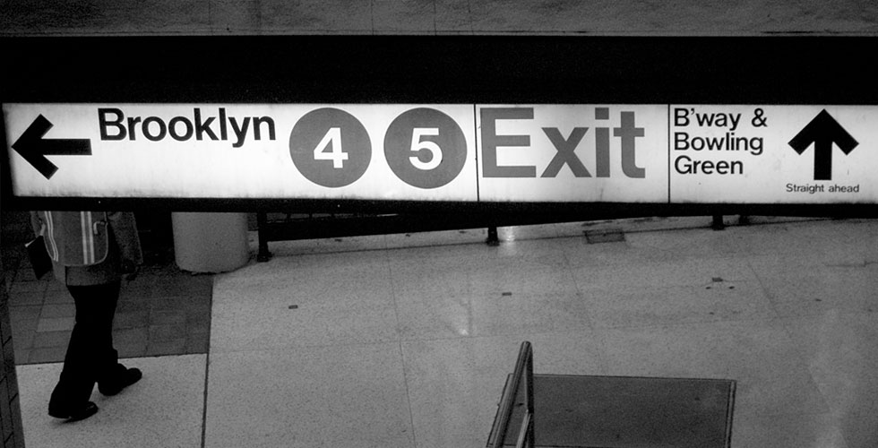
From 1966 on, the New York City subway visual identity has been following the design style pictured above, on Fig. 2. Signed by Massimo Vinelli, the communication identity of the transit system is much more simple than before, and more effective. When commuting in a fast-paced city such as New York City, an easy-to-read signage is key.

Image from: http://www.vignelli.com/

Nowadays, it’s impossible to think about the subway in New York City without having the iconic image of Helvetica come to our minds. Even if you don’t know much about typography and never heard of Helvetica, I’m sure you recognize the geometric lines of the most famous typeface in the world.

It wasn’t until 1966 that the Swiss typeface made its debut into the New York City subway signage. Massimo Vignelli, also responsible for the creation of the iconic American Airlines logo, designed the new visual identity for the transit company. His love for clean and legible lines was translated into simplicity and brought order to the typographic signs of MTA’s subway system.

Fifty years on, nothing much has changed: Helvetica is still omnipresent in MTA’s identity. And New Yorkers wouldn’t take it any other way.

Many New York City subway stations feature mosaic signs. Most of the ones we see now are either renovations or new versions of the original ones. They follow different styles: some stations have a more traditional look, with serif fonts, such as Christopher Street and Grand Central. Other, like Delancey St and Borough Hall, display modern sans-serif fonts.

Since it started running, in 1904, the New York City subway has been through inumerous changes when it comes to styles of signage. The mosaics, though, have lasted through all this time and don’t show signs of going anywhere. In fact, all recently renovated stations have mosaics, such as Jay St Metro Tech.

Durable and stain-resistant, glass tile is a great choice for subway mosaics. For hundreds of years, since their early development by the Byzantines, people have recognized the natural beauty of glass tile mosaics. And the fact that this piece of art history is still present in New York City is fascinating.

subway3__full

I’m going to write a series of posts on the typography work of the New York City Subway system. Since the transit company began running, in 1904, its visual identity has been through a lot of changes.

The following posts will feature ways typography turns into a piece of art with mosaics; the introduction of Helvetica as a key part of the visual identity of the NY Subway System; and an overview on the main changes in typography the company has experienced throughout the years.