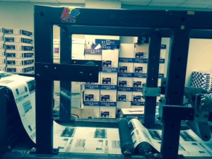
Visiting the United Federation of Teachers (UFT) was very exciting. Although I came late and missed the process of the first machine, the head of the printing lab went over it again at the end of our session. Most field trips that I go on with the school do not have a tour guide as informative as he was. My favorite machine there was called, “The Inserter”. There were also two more machines called the ESPON 9800 and near the end of the tour we saw a machine that disposes mail. The Inserter is my favorite because of how much time it saves by packaging envelopes. The EPSON 9800 prints images with the same quality as card stock paper. It’s also an ink jet printer according to our guide. Those 3 printing pieces influenced me heavily to want to create designs that would look amazing not only digitally but now physically.
Life In A Day
I came up with the ideas to film this video with the help of a friend who films skateboarding. I also figured I’d include them in the ending portion of the video.
https://www.youtube.com/watch?v=uq6fm8HD1k0
Visually Enhanced Quotes
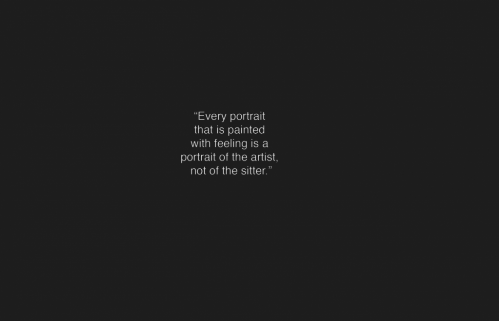
Step 1: The quote I chose was my favorite Oscar Wilde quote, “Every portrait that is painted with feeling is a portrait of the artist, not of the sitter.” The font I chose was a downloaded font from DaFont.com I considered using helvetica but it did not provide the look I wanted once I found the image shown in my second step of creating the visually enhanced quote.
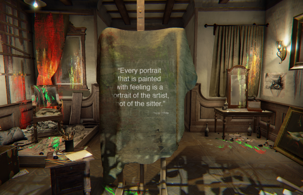
Step 2: I scrambled the internet for a picture of a blank canvas because the quote references that idea. After finding this background image I thought to create an effect with my quote that matches the mood and tone of the image.
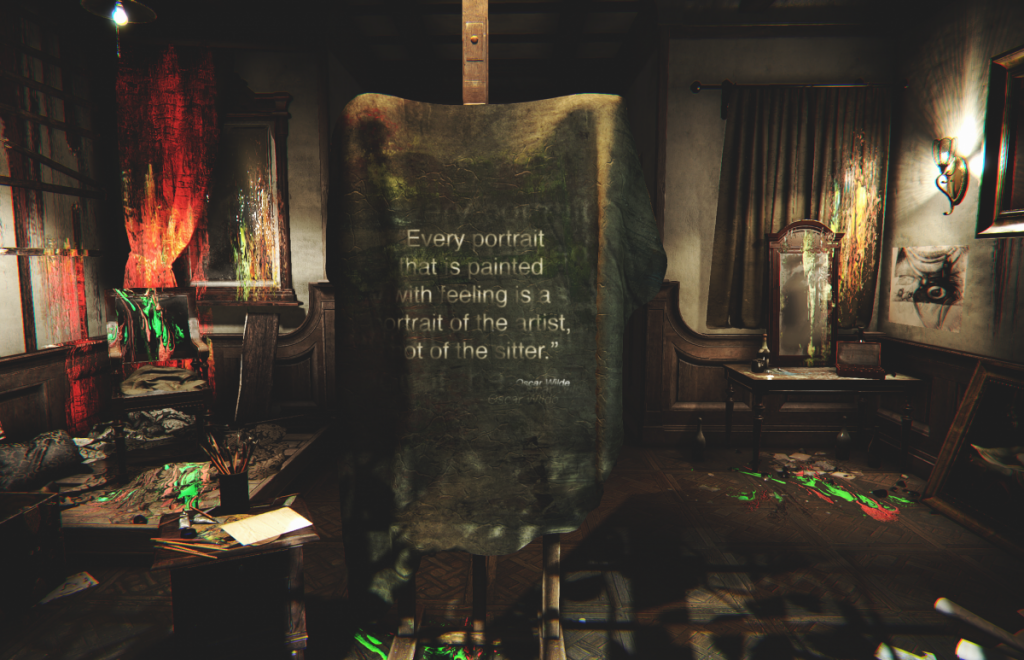
Step 3: Lastly, I adjusted the curves and vibrance of the entire project to blend everything together. I also used a vector mask to brush away at some of the text on the quote to create a dark and grunge look.
Logo Research Project
Personal Logo / Banner
My personal logo/banner represents me because it is the initials of my name, Niguel Douglas Jr. Though it may be hard to see, the end of the letter “d” in my logo has a circle after it symbolizing the “j” in my initials when looked at in a different perspective. I was skeptical as to whether or not I should keep the circle including in my logo but ultimately I believe that it works fluidly with the concept I had in mind.
Bio
My full name is Niguel Marcelle Douglas Jr. I am 21 years old and I have a Trinidadian background but was raised in New York City. Although I love art itself, I have a deep interest in typography and logo design. My aspiration for design became definite after working on concept designs for YouTuber’s during my High School years. I am focused primarily on creating photo manipulations and typography. In my free time I create personal designs for my skateboards and would like to possibly turn that hobby into a part-time job in the future.
Despite the fact that I have interest mainly on typography and photo manipulation, I am also interested in video game design. CGI has always grasped my attention, whether in video games or film. The work that goes into each intricate detail inspires me to continue working on my own art. I have worked with 3d modelling before using the program: Cinema 4D and I believe video game design can also be a career path I would enjoy following.


